A call-to-action bar at the top of a website can help drive traffic to focused links. This bar will appear on every page of the website; wherever a visitor lands, they will always see the most important call to action.
Compared to older methods, Full Site Editing has made creating a top call-to-action bar simple. Instead of requiring additional plugins or extra code, a beautiful CTA bar can be built into the header of a website through the Site Editor.
Top Call-to-Action Bar Example
Here is an example of a top call-to-action bar created with the Frost WordPress theme, although this tutorial will work for any block theme:

How to Create a Top Call-to-Action Bar
Let’s build a call-to-action bar using Full Site Editing! Here are the steps:
- From the WordPress dashboard, navigate to Appearance > Editor. This is the Site Editor. From here, we will have the ability to edit the Header, which will display across the entire website.
Quick Tip
Using the List View can help keep track of where you are placing a block, making it easier to combine blocks together into Groups, Columns, or Rows. Click this icon to open the List View:

- Within the List View, find and expand the Header. Click “Insert Before” on the top block.

- Add a Paragraph block and then type in your call to action.

- Next, we’ll want to make the Paragraph block into a Group so we can add a background, update the text settings, and adjust the padding using the settings panel on the right-hand side.

Here are the settings for the Group block used in the example:
- Color:
- Text:
#ffffff - Background:
#990099 - Link:
#ffffff
- Text:
- Typography:
- Size:
14px - Letter case:
AB - Letter spacing:
1px
- Size:
- Padding:
10px(top & bottom)
Which achieves the following look:

- Finally, ensure that your call to action links somewhere by adding a URL to the link settings for the Paragraph block.

You have now created a functional, top call-to-action bar! 🎉 🎉
Adding an Icon to the Top Call to Action Bar
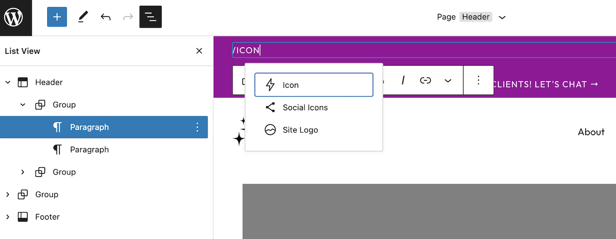
Consider adding an icon to the call-to-action bar for extra flair. We will be using the free Icon Block plugin by Nick Diego to accomplish this.
- Either before or after your Paragraph block, insert an Icon block.

- Once you choose your icon, you’ll want to combine the Paragraph and Icon blocks into a row to achieve the look shown in the example. Select both blocks in the List View, then select “Row.”

- Rearrange the blocks as necessary and adjust the Block spacing setting to bring the two blocks closer or further apart, depending on your preference.

Here are the settings for the Row block used in the example:
- Justification:
center - Orientation:
horizontal - Vertical alignment:
align middle - Block spacing:
10px
There you have it! A simple top call-to-action bar will be displayed on every page. The possibilities are endless – I can’t wait to see what you create. Be sure to tag @hellosammunoz on Twitter if you use this tutorial in one of your projects.

