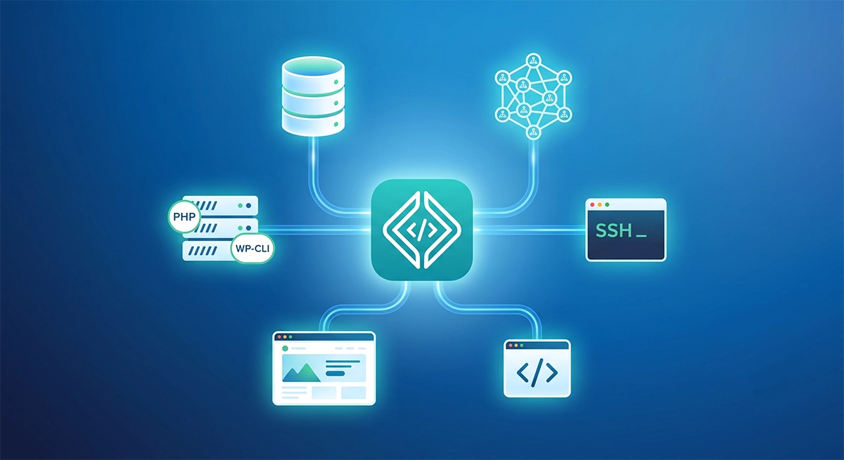
Dynamic Field Rendering with Gravity Forms in Headless WP & Nuxt/Vue

Francis Agulto Avatar

·

In part one of this series, we built a headless Gravity Forms integration with Nuxt/Vue by querying form fields via GraphQL interfaces and mapping each static type to its own Vue component—consolidating shared inputs into reusable InputField, DropdownField, and ChoiceListField components. While that approach gives you fine‑grained control and clear component boundaries, it also means maintaining a growing switch statement (and import list) whenever you add or customize a field type.

In this second part article, we’ll streamline our setup by leveraging the inputType property that WPGraphQL for Gravity Forms exposes on every field. Instead of manually importing and mapping each component, we’ll implement a single resolveFieldComponent(field) helper that dynamically loads the right Vue component. 

This makes our form renderer more flexible, reduces boilerplate, and automatically adapts to new or custom Gravity Forms fields as they’re added. 

If you prefer video format, please see below:

Prerequisites

Before diving in, you’ll need a working knowledge of the command line, headless WordPress development, Vue, and Nuxt

This guide is the second installment in my series. If you haven’t already, please read Part 1: Gravity Forms in Headless WordPress with Nuxt/Vue and explore its accompanying code repository to benefit from this article.  

Now, let’s dive in and refactor our Nuxt app for dynamic field rendering.

We will be refactoring the three files we will be using: the InputField. vue, useFormFields.js, and the pages/questionnaire/index.vue files.  

For your reference, here is the fully refactored project repo for dynamic field rendering.

The InputField.vue File

In your components/form-fields directory, you can safely delete EmailField.vue.  In the original article, we already consolidated TextField.vue, and WebsiteField.vue

Now, we’ll add the email field to InputField.vue to handle all three field types (text, email, and website). Here’s the full code for InputField.vue that you can drop straight into your project:

<template>
  <div class="field-wrapper">
    <label
      v-if="field.label"
      :for="field.databaseId"
      class="block text-sm font-medium text-gray-700"
    >
      {{ field.label }}
      <span v-if="field.isRequired" class="text-red-500">*</span>
    </label>
    <input
      :id="field.databaseId"
      :type="computedInputType"
      v-model="internalValue"
      :placeholder="field.placeholder || defaultPlaceholder"
      :required="field.isRequired"
      class="mt-1 block w-full rounded-md border-gray-300 shadow-sm focus:border-blue-500 focus:ring-blue-500"
    />
  </div>
</template>

<script setup>
import { computed } from "vue";

const props = defineProps({
  field: { type: Object, required: true },
  modelValue: { type: String, default: "" },
});

const emit = defineEmits(["update:modelValue"]);

// Use a computed property for two-way binding.
const internalValue = computed({
  get: () => props.modelValue,
  set: (val) => emit("update:modelValue", val),
});

// Determine the input type based on the field type (or optionally inputType if available)
const computedInputType = computed(() => {
  const type = (props.field.inputType || props.field.type || "").toUpperCase();
  if (type === "EMAIL") return "email";
  if (type === "WEBSITE") return "url";
  // Default to text input for TEXT or TEXTAREA, etc.
  return "text";
});

// Default placeholder text if none is provided.
const defaultPlaceholder = "Enter value...";
</script>

<style scoped>
.field-wrapper {
  margin-bottom: 1rem;
}
</style>
Code language: HTML, XML (xml)

I am not going to go over the entire code.  Here are the bullet points on why this works:

  • Single responsibility: One component now handles text, email, and website inputs.
  • Dynamic <input> types: The computedInputType maps your GraphQL inputType (or fallback type) to email, url, or text.
  • Two‑way binding: Using v-model on a local internalValue ensures that parent components stay in sync without extra boilerplate.

Conditional label & required indicator: The <label> only renders if field.label is present, and the red asterisk appears when field.isRequired is true.

By consolidating these three nearly identical components into InputField.vue, you keep your code DRY (Don’t Repeat Yourself) and maintainable—any future tweaks to generic inputs (styling, validation attributes, accessibility features) happen in one place.

Why Some Fields Retain Custom Components

Even with our dynamic mapping in place, you will notice a handful of Gravity Forms fields that still warrant their own dedicated Vue components. These “composite” fields each have unique markup or behavior that goes beyond a simple single‑element input.

By keeping these specialized components, we preserve clarity and maintainability—each one encapsulates its own layout, validation rules, and third‑party widget integrations. All the other “simple” fields (text, email, URL, select, checkbox, radio, etc.) are routed through our generic InputField, DropdownField, or ChoiceListField.

The useFormFields.js File

Next, let’s look at how we dynamically map each Gravity Forms field to its Vue component using a single composable. Update your composables/useFormFields.js with the following:

import { defineAsyncComponent } from "vue";

// Cache to store component references keyed by field type.
const componentCache = {};

// Mapping from field type to component filename.
const typeToComponent = {
  ADDRESS: "AddressField",
  TEXT: "InputField",
  TEXTAREA: "InputField",
  EMAIL: "InputField",
  NAME: "NameField",
  PHONE: "PhoneField",
  SELECT: "DropdownField",
  MULTISELECT: "DropdownField",
  CHECKBOX: "ChoiceListField",
  RADIO: "ChoiceListField",
  DATE: "DateField",
  TIME: "TimeField",
  WEBSITE: "InputField",
};

export const useFormFields = () => {
  // For debugging purposes, you can track which types are processed.
  const loggedTypes = new Set();

  /**
   * Resolves the Vue component for a given field based on its inputType.
   * Uses a cache so that the same component reference is returned for a given type.
   * @param {Object} field - The Gravity Form field object.
   * @returns {Component|null} The async Vue component for this field.
   */
  const resolveFieldComponent = (field) => {
    const fieldType = field.inputType
      ? field.inputType.toUpperCase()
      : field.type.toUpperCase();

    // Add each field type once
    if (!loggedTypes.has(fieldType)) {
      console.log("Mapping field type:", fieldType);
      loggedTypes.add(fieldType);
    }

    // Return from cache if we’ve already loaded this component
    if (componentCache[fieldType]) {
      return componentCache[fieldType];
    }

    // Dynamically import the matching component
    const componentName = typeToComponent[fieldType];
    if (componentName) {
      const asyncComponent = defineAsyncComponent(() =>
        import(`~/components/form-fields/${componentName}.vue`)
      );
      componentCache[fieldType] = asyncComponent;
      return asyncComponent;
    }

    // Fallback if no mapping exists
    return null;
  };

  return {
    resolveFieldComponent,
  };
};
Code language: JavaScript (javascript)

What is happening in this code block:

  • Dynamic Resolution

Instead of hard‑coding imports for every field type, we use the field’s inputType (or fallback to type) to look up the correct component in a simple map.

Lazy Loading

  • We wrap each import in defineAsyncComponent, so components are only fetched when they’re actually rendered—improving initial load times.
  • Component Caching

Once a component is resolved, we store the reference in componentCache. This ensures we don’t re‑import the same file multiple times, keeping render performance snappy.

  • DRY and Scalable

As new field types are added in Gravity Forms (or you build custom ones), you simply extend the typeToComponent map. No more boilerplate imports or switch statements cluttering your page component.

  • Debugging Insight

The loggedTypes set and console messages help you verify which field types are encountered at render time, making it easier to spot missing mappings.

By centralizing all your field‑component logic in useFormFields.js, you maintain a clean separation of concerns.  Your page doesn’t need to know about every single component, and your mapping stays in one easy‑to‑update place.

The pages/questionnaire/index.vue File

Finally, let’s update our page component to use resolveFieldComponent instead of a static map. In pages/questionnaire/index.vue, replace all manual imports and the fieldComponents object with a single import of your composable:

<script setup>
import { ref, reactive, onMounted, watch } from 'vue'
import { useFormFields } from '~/composables/useFormFields'
import useGravityForm from '~/composables/useGravityForm'

const { resolveFieldComponent } = useFormFields()
const { fetchForm, submitForm, formFields } = useGravityForm()

const formValues = ref({})
const error       = ref(null)
const validationErrors = reactive({ /* ... */ })

// (validation helpers and updateFieldValue omitted for brevity)

onMounted(() => {
  const { data, error: fetchError, execute } = fetchForm()
  execute()
  watch(data, (newData) => { /* initialize formValues */ })
  watch(fetchError, (err) => { if (err) error.value = err.message })
})

const handleSubmit = async () => { /* ... */ }
</script>

<template>
  <div class="p-4">
    <div v-if="error" class="text-red-600">Error: {{ error }}</div>
    <div v-else-if="!formFields.length">Loading form…</div>
    <form v-else @submit.prevent="handleSubmit">
      <div
        v-for="field in formFields"
        :key="field.databaseId"
        class="mb-4"
      >
        <component
          :is="resolveFieldComponent(field)"
          :field="field"
          v-model="formValues[field.databaseId]"
        />
      </div>
      <button
        type="submit"
        class="bg-blue-500 text-white px-4 py-2 rounded"
      >
        Submit
      </button>
    </form>
  </div>
</template>
Code language: HTML, XML (xml)

In the part of the file we refactored, we now have a single source of truth. Instead of importing each individual field component and maintaining a fieldComponents object, we now call resolveFieldComponent(field) directly in a template.

Let’s go over the rest of the code block:

  • Cleaner Imports

We only import useFormFields (for dynamic mapping) and useGravityForm (for data). There are no longer dozens of component imports at the top.

  • Reactive Rendering

The <component :is="…"> syntax picks the right component at render time, based solely on each field’s inputType or type.

  • Simplified Maintenance

Adding support for new field types now only requires updating the typeToComponent map in useFormFields.js, not touching this page at all.

  • Consistent v-model

Leveraging v-model with each dynamically resolved component ensures two‑way binding of all field values without extra boilerplate.

By swapping out static maps for resolveFieldComponentyour index.vue becomes significantly more concise, and all field‑to‑component logic lives in one easy‑to‑update composable.

Conclusion

We hope this article helped you understand how to render dynamic fields in WPGraphQL for Gravity Forms in Nuxt.js! 

As always, we’re super stoked to hear your feedback and learn about the headless projects you’re working on, so hit us up in the Headless WordPress Discord!