
The digital world is a diverse, rapidly changing environment with many devices, user needs, and interaction modes. Therefore, creating adaptable, versatile, and genuinely responsive websites is imperative.
Though it has taken several years to get to where we are, the WordPress block editor is a substantial upgrade from the classic editor. It has become a powerful tool for designers and developers, and the ongoing improvements will make it even more indispensable.
In this article, we’ll explore a new philosophy called Intrinsic Web Design and demonstrate how to use capabilities currently available in the WordPress block editor to build modular and flexible websites.
Feel free to watch the video version of this article or continue reading.
Table of Contents
What is Intrinsic Web Design?
During her presentation, Everything You Know About Web Design Just Changed at “An Event Apart,” Jen Simmons introduced the concept of Intrinsic Web Design.
She emphasized how new CSS tools, like Grid and Flexbox, are transforming web layouts, enabling more adaptable and responsive designs. This eye-opening talk challenged conventional web design practices, marking the dawn of a new design era. She says:
“Intrinsic Web Design” is a name that I gave to this new era because I think we’re in a new era of layout design. We had this debate between fluid web design and fixed-width web design … and you didn’t have to start over and define everything, and responsive was that kind of word. We need a new word for a new era where we can say, ‘Oh, it’s not that float-based thing where everything is set in widths using percentages. It’s this new set of technologies.’”
—Jen Simmons
Intrinsic Web Design is a modern methodology that allows web content to naturally adapt to various screen sizes, from mobile to desktop. Rather than creating multiple designs for different devices, it leverages CSS grid and flexbox to resize and rearrange elements fluidly based on available space.
Intrinsic Web Design is similar to the dynamic fluidity of water adapting to various container shapes—where the design dynamically modifies web content to suit any screen dimension.
This method significantly enhances user interaction by offering consistent, device-agnostic accessibility. Furthermore, it represents an evolutionary step in web design, ushering in a new era of flexible, responsive layout systems in the digital sphere.
Intrinsic Design and WordPress
While the WordPress block editor has evolved into an advanced design tool, some work still needs to be done. In the meantime, let’s examine where we’re at and how we can harness the available features to emulate Intrinsic Web Design, bringing us closer to this forward-thinking design approach.
In using the block editor, two features stand out. One is fluid spacing, which means our web page layout can change to fit different screens easily. The second is fluid typography. This feature makes the size of our text adjust to fit various screens, making sure it’s easy to read no matter the device.
Both of these features help make our websites user-friendly and good-looking, moving us towards a design style called Intrinsic Web Design.
Fluid Spacing
Leveraging capabilities added in WordPress 6.1, builders can quickly implement uniform spacing for blocks directly without hassle. This functionality includes preset values of padding, margin, and block gap.
theme.json now supports the definition of custom spacing steps, allowing these preset values to be accessible to users inside the editor.
Like font size, Frost utilizes the t-shirt naming convention (xSmall, Small, Medium, Large, xLarge) for spacing presets, providing a consistent user experience that is easy to understand. (View a demo of fluid spacing)
Fluid spacing utilizes the clamp() CSS function to define three parameters: a minimum value, a preferred value, and a maximum allowed value. Then, fluid spacing is applied to four steps: Small, Medium, Large, and xLarge.
Here is the code used to define spacing presets in theme.json:
{
"settings": {
"spacing": {
"spacingScale": {
"steps": 0
},
"spacingSizes": [
{
"name": "xSmall",
"size": "20px",
"slug": "x-small"
},
{
"name": "Small",
"size": "clamp(30px, 4vw, 40px)",
"slug": "small"
},
{
"name": "Medium",
"size": "clamp(40px, 6vw, 60px)",
"slug": "medium"
},
{
"name": "Large",
"size": "clamp(50px, 8vw, 80px)",
"slug": "large"
},
{
"name": "xLarge",
"size": "clamp(60px, 10vw, 100px)",
"slug": "x-large"
}
]
}
}
}
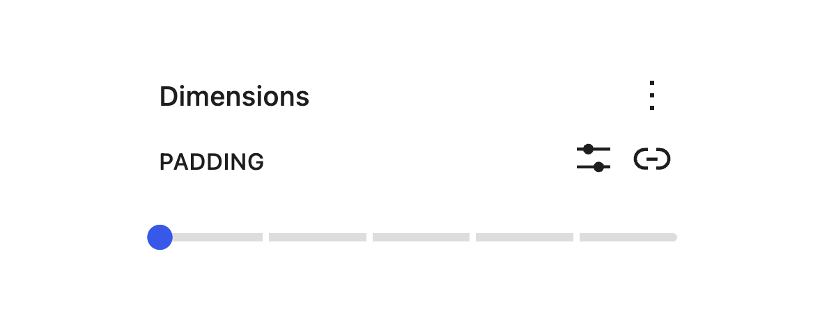
Code language: JSON / JSON with Comments (json)Below is what users see in the editor for blocks that support it. Each gray line represents a step set in the code above. The default value is 0; as you move the blue toggle to the right, an increase of 20px occurs.
By defining these spacing presets in theme.json, CSS variables are created, which are then used to style the blocks in which they are applied.
--wp--preset--spacing--x-small: 20px;
--wp--preset--spacing--small: clamp(30px, 4vw, 40px);
--wp--preset--spacing--medium: clamp(40px, 6vw, 60px);
--wp--preset--spacing--large: clamp(50px, 8vw, 80px);
--wp--preset--spacing--x-large: clamp(60px, 10vw, 100px);
Note: For blocks that support spacing presets, custom values can still be applied by clicking the Set custom size icon to the left of the Unlink sides icon.
Fluid Typography
Fluid typography is the dynamic adjustment of font sizes per variations in viewport width. This design approach facilitates a seamless transition of fonts between a set minimum and maximum size, fostering consistency and effective communication across various screen sizes.
The pivotal role of fluid typography in WordPress, as well as in the larger world of web design, has several compelling considerations:
Improved readability: Fluid typography can enhance readability by allowing the font to adapt to the screen size. Text will be more prominent on large screens, where there is more space, and smaller on smaller screens, where space is at a premium.
Better user experience: Fluid typography can provide a better user experience by making content more accessible. A website that’s easy to read on any device will be more user-friendly and inclusive, which could lead to longer visit durations and higher engagement rates.
Flexibility: Fluid typography provides a more flexible design than fixed-size typography. It enables the design to adapt more smoothly to various screen sizes, including future devices.
Less need for media queries: Traditional responsive design often requires numerous media queries to adjust font sizes at different breakpoints. Fluid typography allows you to use fewer media queries, leading to cleaner and more maintainable code.
To understand how fluid typography works, let’s explore the process of adding support for this dynamic feature within block-based themes.
How to Enable Fluid Typography
Adding support for fluid typography begins by enabling it in your theme configuration. In theme.json, you must specifically set “fluid” to true:
{
	"settings": {
		"typography": {
			"fluid": true
		}
	}
}
Code language: JSON / JSON with Comments (json)
Once fluid typography is activated, WordPress leverages a specific calculation to generate styles for all conventional font sizes automatically.
For smaller font sizes set in theme.json that may not require resizing, you can disable fluid typography by setting “fluid”: false, as shown below:
{
	"settings": {
		"typography": {
			"fontSizes": [
				{
					"fluid": false,
					"name": "Small",
					"size": "18px",
					"slug": "small"
				}
			]
		}
	}
}
Code language: JSON / JSON with Comments (json)
For larger sizes where a range of sizes that are fluid based on the viewport, a minimum "min" and maximum "max" value can be defined:
{
	"settings": {
		"typography": {
			"fontSizes": [
				{
					"fluid": {
						"min": "20px",
						"max": "24px"
					},
					"name": "Large",
					"size": "24px",
					"slug": "large"
				}
			]
		}
	}
}
Code language: JSON / JSON with Comments (json)
With fluid typography, WordPress employs a predetermined clamp() function calculation, which generates a comprehensive set of styles applied to all default font sizes, thus seamlessly automating the process of fluid typography implementation.
In the example above for Large font size, here is the CSS variable generated:
--wp--preset--font-size--large: clamp(20px, 1.25rem + ((1vw - 7.68px) * 0.481), 24px);
Code language: CSS (css)
As you incorporate fluid typography settings into your designs, there are several considerations to keep in mind:
'size': This is your preferred font size, also serving as the default minimum value. For now, it’s advisable to match this with a declared minimum value.'min': This represents the smallest font size in your design, which will commence scaling below 768px.'max': This is the largest font size that will begin scaling when the viewport exceeds 1600px.'scale factor‘: By default, this is set to 1.'units': The allowed units for fluid typography settings are pixels (px), ems (em), and rems (rem). Using rem units is encouraged as other units can hamper accessibility, especially when users zoom their browser text.
Anticipated future updates to Gutenberg, and consequently WordPress core, will give builders the flexibility to modify targeted media queries and even the scale factor. In addition, these updates will open up even greater adaptability and control over typography in your designs.
The Frost theme fully embraces fluid typography, facilitating custom font size adjustments from 16px to 72px. Explore how this dynamic feature operates in practice by visiting this link.
Conclusion
In conclusion, the dynamic landscape of the digital world, characterized by a myriad of devices, diverse user needs, and different interaction modes, necessitates the creation of adaptable, versatile, and responsive websites.
Fluid spacing and fluid typography offer integral tools for achieving this goal of adaptability. They embody the principles of intrinsic design, and when incorporated into the WordPress block editor, they ensure that content responds intuitively to the viewing environment.
Have you explored Intrinsic Web Design, Fluid Spacing, or Fluid Typography within your WordPress projects?
We’d love to see what you’ve built – share it with our Developer Relations team on Twitter @wpebuilders.