


Behind the Scenes of Our New Brand Refresh
How we paired artistic expression with research-based strategy
As WP Engine rolls out its refreshed brand identity, we’re thrilled to share this project with our customers and the world.
I wanted to share a closer look at the research and artistic detail that informed our deliberate choices for this refresh.
If you’re design-oriented or simply curious about the different elements that went into this project, read on for a recap of our brand evolution journey.
Building a solid foundation with a research-driven strategy
Before getting into the nitty gritty of our design work, our team began by mapping out a meticulously planned, research-intensive strategy.
We wanted a solid narrative foundation to inform our approach, so we started with an in-depth exploration of our brand’s mission, vision, emotional and functional benefits, and messaging hierarchy.
As part of this process, we conducted nearly 100 qualitative interviews with key stakeholders, including WP Engine’s leadership, members of acquired brands, and customers and partners of all sizes.
These interviews provided valuable insights into our brand’s unique strengths and opportunities to stand out in a busy marketplace.
Two major themes emerged through this initial round of research:
- WP Engine is widely viewed as a brand that “powers” websites, which fits perfectly with our core mission: “We power the freedom to create.”
- Our customers value and stay with WP Engine because of our friendly people and the reliable advice they receive from us.
These insights helped inform four signature pillars of the WP Engine experience for customers, which significantly influenced the development of our verbal and visual systems.
These pillars were refined and validated through a comprehensive quantitative survey involving close to 1,000 respondents across our various audiences to ensure we were speaking to what matters most to our customers.
Not another cog in the machine
One crucial element as we embarked on this journey was honoring WP Engine’s history and the story behind the iconic WP Engine cog.
Since 2013, the cog has symbolized the coming together of all the pieces that make us “us,” from our Core Values to our place in the broader WordPress community. WP Engine now has a portfolio of products and we wanted to take this concept of parts coming together to a new level.
Rather than starting from scratch, we chose to reinforce the spirit of the cog in a modern context—with a clean, rounded design and new typeface—all aimed at making our mark even more iconic.
We strategically utilized the shapes inside our new logo. The circular shape at the heart of our logo showcases our core offerings, namely Managed WordPress. The outer ring of square shapes describes the tools and plugins that we use to enhance WordPress for all members of the WordPress community—regardless of where their site is hosted.
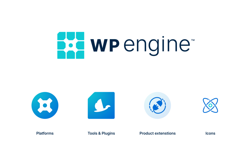
customer-centric approach by using the circular shape in the middle of the design to represent our customers. And those square shapes orbiting that customer—we use to showcase the faces of the friendly WordPress experts at WP Engine who are actively working with you on your site’s success.
The story of the WP Engine cog is about bringing pieces together to serve a greater goal. That combination of pieces is customized to each customer we serve.
Our new design embodies our commitment to continuously applying a customer-centric mindset across all of our efforts, whether it’s providing exceptional, award-winning support, fine-tuning our industry-leading WordPress platform, or empowering our customers with relentless innovation.
Usability-centric design
Accessibility and usability were significant drivers behind many of our choices. This was certainly the case when it came to colors, which, as a key part of our brand, played a pivotal role in shaping our new identity.

WP Engine has a catalog of products and tools, many of which have distinct color schemes. We wanted to bring things together in a way that allows products to maintain their identity while looking cohesive. We simplified our color palette from a dizzying array of shades to eight core colors used across all products, ensuring consistency and enhancing accessibility.
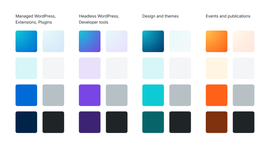
But color is just as much about function as it is about looking pretty, and our new palette was made with accessibility front of mind. Whether you’re on our marketing site or using our tools, we want all people to have the smoothest possible experience when navigating the things we build.
This focus on usability was also well-timed—coinciding with WordPress’ 21st birthday and the release of WordPress 6.5 (which includes more than 65 accessibility improvements!). Our brand refresh aligned with these updates and complements them wherever possible.
Typography and imagery
Work across our visual identity also extended to our textual representation, which we’ve updated with a new font family that includes Inter for body text and Lora for headings.
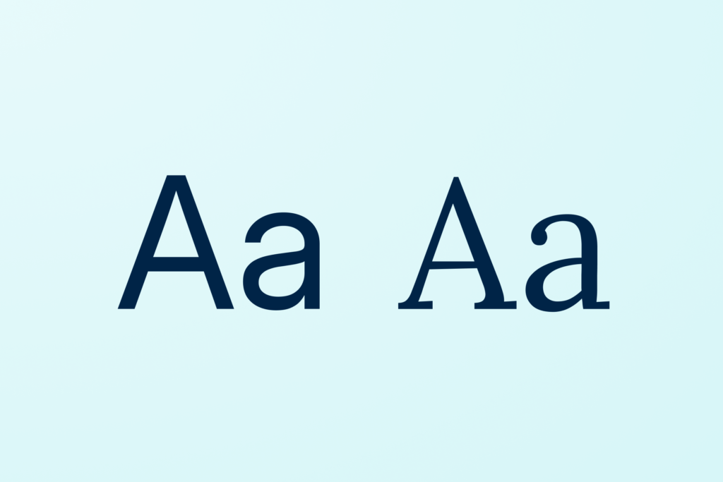
This choice, which will roll out across our channels over the coming weeks, enhances readability and gives our content a fresh, modern look.
Both fonts balance contemporary style with functional clarity. Lora and Inter are also both open source, reinforcing our love of open-source communities that make beautiful things.
An eye towards the future
Our brand refresh marks a pivotal moment for WP Engine, reflecting our growth and our commitment to innovation and excellence.
With an emphasis on accessibility and modern aesthetics, our new design system has provided a scalable framework for brand integration while ensuring a streamlined user experience for all—making it easier for you to build, power, manage, and optimize your WordPress sites and apps.
With this new chapter, we’re excited to continue our journey, empowering you with unmatched WordPress expertise and innovation along the way.
Visit WP Engine to see our new brand in action and learn more about our industry-leading Managed WordPress, Headless WordPress, and our Agency Partner Program, the largest network of WordPress agencies in the world!
Start the conversation.