Columns are everywhere in web design, from simple columns of text and images to multi-sidebar page layouts. Look at any website, and you are bound to see content areas laid out in columns. Therefore, the Columns block in WordPress is one of the foundational block types you will likely use in every project.
This article will explore two block layouts that rely on the Columns block. While both are relatively simple, they demonstrate how powerful and versatile this block can be. We will also add additional functionality using custom CSS classes. Let’s get started.
Feel free to watch the video version of this article or continue reading.
Table of Contents
Overview
Before diving in, it’s important to note that this article will not cover everything related to the Columns block.
If you have never used the Columns block before, the best way to explore this block type is to open up the Editor. Insert a Columns block and add a few additional columns. Manipulate the color, dimension, border, and alignment settings. Just start playing around. The companion video above does provide a brief walkthrough at the beginning.
Once you’re comfortable with how the block generally works, you will be ready for some of the more advanced implementations discussed in this article. And if you would like to follow along at home, all examples and screenshots were created using WordPress 6.1, the latest version of Gutenberg, and Frost.
Frost is an experimental block theme developed and maintained by the Developer Relations team here at WP Engine. I also recommend the Twenty Twenty-Three theme as a good starting point when exploring new features in WordPress.
When columns are the best tool for the job
There are countless applications where the Columns block is the obvious choice. Say you need three columns of content that showcase the features of a product or the services of a business.
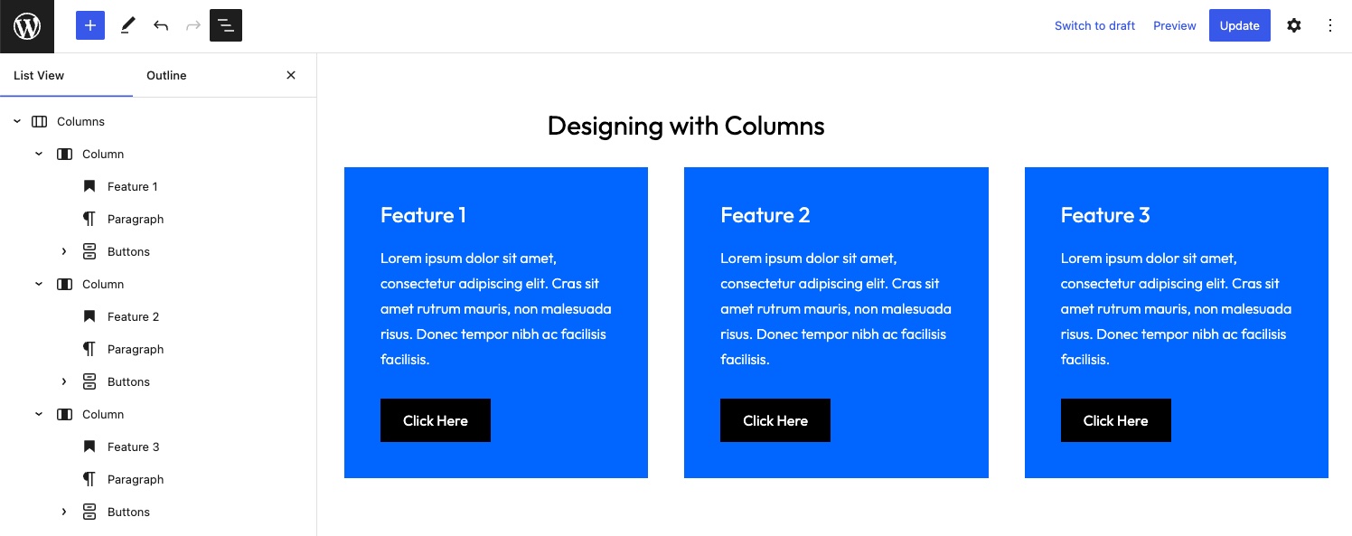
You will use this type of layout often, and it’s good to get comfortable building them quickly and efficiently while utilizing all of the design tools available to the Columns block.
Let’s set this design aside and look at a scenario where the Columns block might not be the obvious first choice. Consider this layout that uses the Media & Text block.
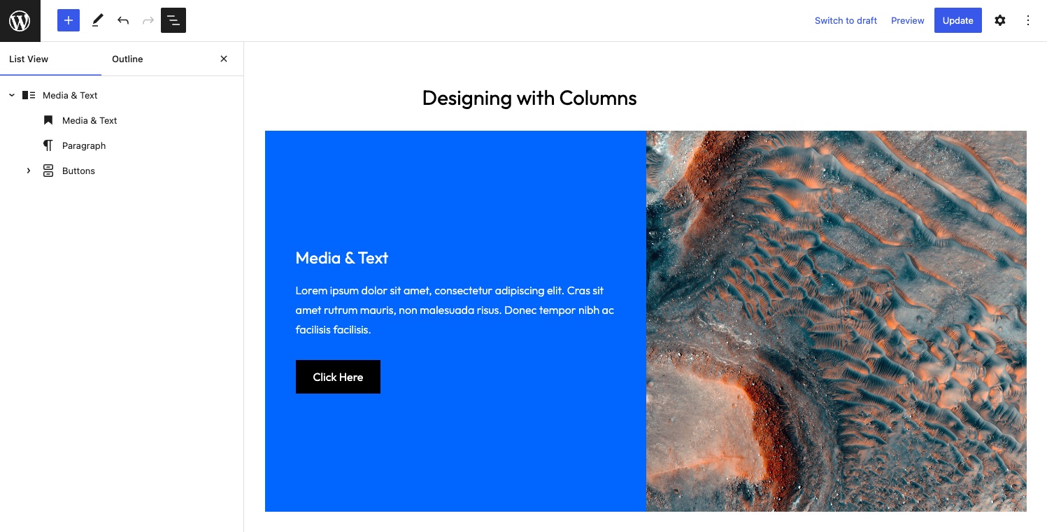
As the name implies, the Media & Text block allows you to display an image to the left or right of text content. The block has some useful features, such as the ability to stack the image and text on mobile, but there are design elements that you cannot configure in the Editor without custom CSS. A good example is the space between the image and the content. You also can only modify the size of the image. No duotone, no caption, the list goes on.
This block sacrifices control for a simplified user interface. This might be an acceptable trade-off in many situations, but these limitations can be frustrating from a design perspective. The correct tool for this type of layout, in my opinion, is the Columns block. The block layout becomes a bit more complicated, but you can build precisely what you want.
Step 1 – Setup
Start by adding a Columns block where each internal Column block is set to 50% wide. Add some content to the left Column and use a Cover block to add an image to the right Column. You can also use a simple Image block, but the Cover block provides additional features that this layout will need. Finally, configure a background color and modify the text and button colors as needed.
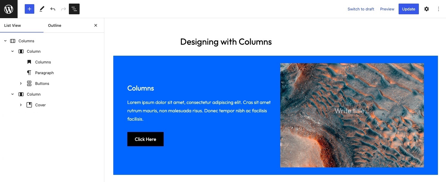
The design is already beginning to resemble the Media & Text block, but let’s keep going.
Step 2 – Dimensions
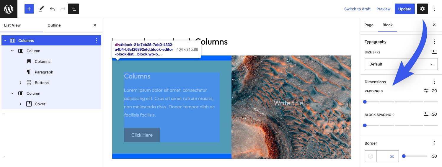
By default, padding is added to the Columns block when a background color is set. You can remove this while also setting the block spacing between the columns to zero in the Dimensions panel. We will control the visual space between the image and text by applying padding to the left internal Column block.
The screenshot below shows the padding around the text content, while padding and block spacing have been zeroed out on the Columns block.
The general layout is now complete so let’s move on to the image.
Step 3 – Image Adjustments
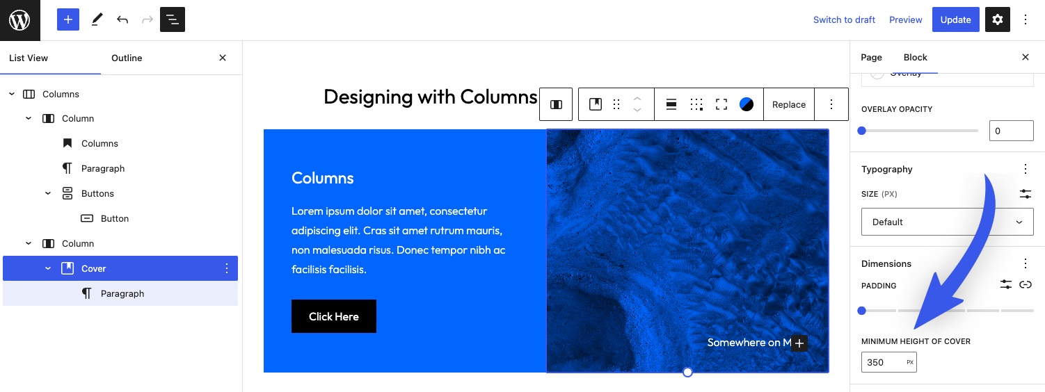
Since we are using a Cover block, there are lots of modifications that can be made. Let’s apply a duotone to the image and add a small caption. Finally, we can set the height of the image using the Min Height setting in the Dimensions panel.
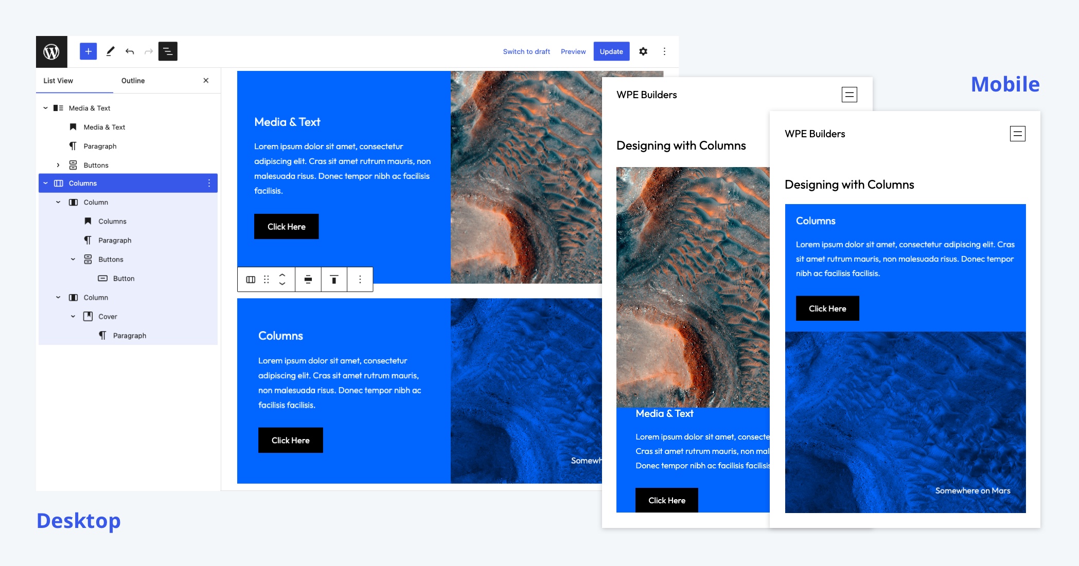
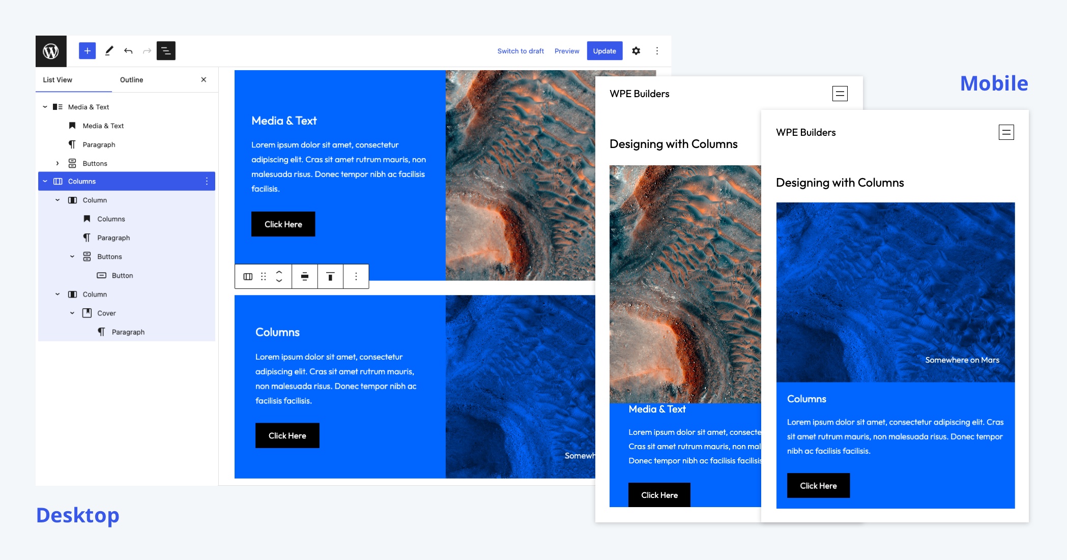
Here’s a comparison of the two completed designs. Note that the Media & Text does use fewer blocks and requires less configuration by the user. There’s always a tradeoff, but you can build far more robust designs using the Columns block, and you can always pre-package them as block patterns for end-users.
The one downside of this approach is that we cannot display the image above the text content on mobile if the image is placed in the right Column block. Let’s fix that.
Bonus – How to reverse column direction on mobile
The ability to change the order of stacked columns on mobile is not natively supported within WordPress (yet). Columns retain their order.
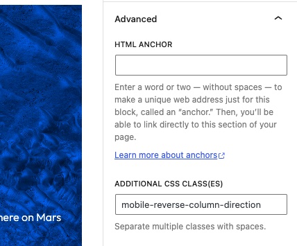
However, you can easily add this functionality with a custom class and some CSS. In the theme’s style.css file, let’s add the following.
frost/style.css
@media (max-width: 782px) {
    .mobile-reverse-column-direction {
        flex-direction: column-reverse;
    }
}
Code language: CSS (css)
The Columns block is a flexbox container, which means that you can reverse the direction of the items within it using flex-direction. To ensure this styling is only applied on mobile, wrap the class in a simple media query at the breakpoint you wish.
By default,782px is browser width when columns stack on mobile in WordPress, which is why I chose it for this example.
Finally, add mobile-reverse-column-direction to the Columns block. The image will now appear above the content on mobile.
You should always use as many native block settings as possible before writing CSS, but a little bit of custom CSS goes a long way, as seen below.
Using highly specific utility classes is generally the best approach if you need additional styling. If WordPress adds new functionality, like the ability to reverse the direction of columns on mobile, you can easily remove the utility class.
While the result is visually quite similar to the Media & Text block, you have far more control over each design element when using the Columns block. Now let’s explore the Columns block in the context of the Site Editor.
Using columns to create a page template with a sidebar
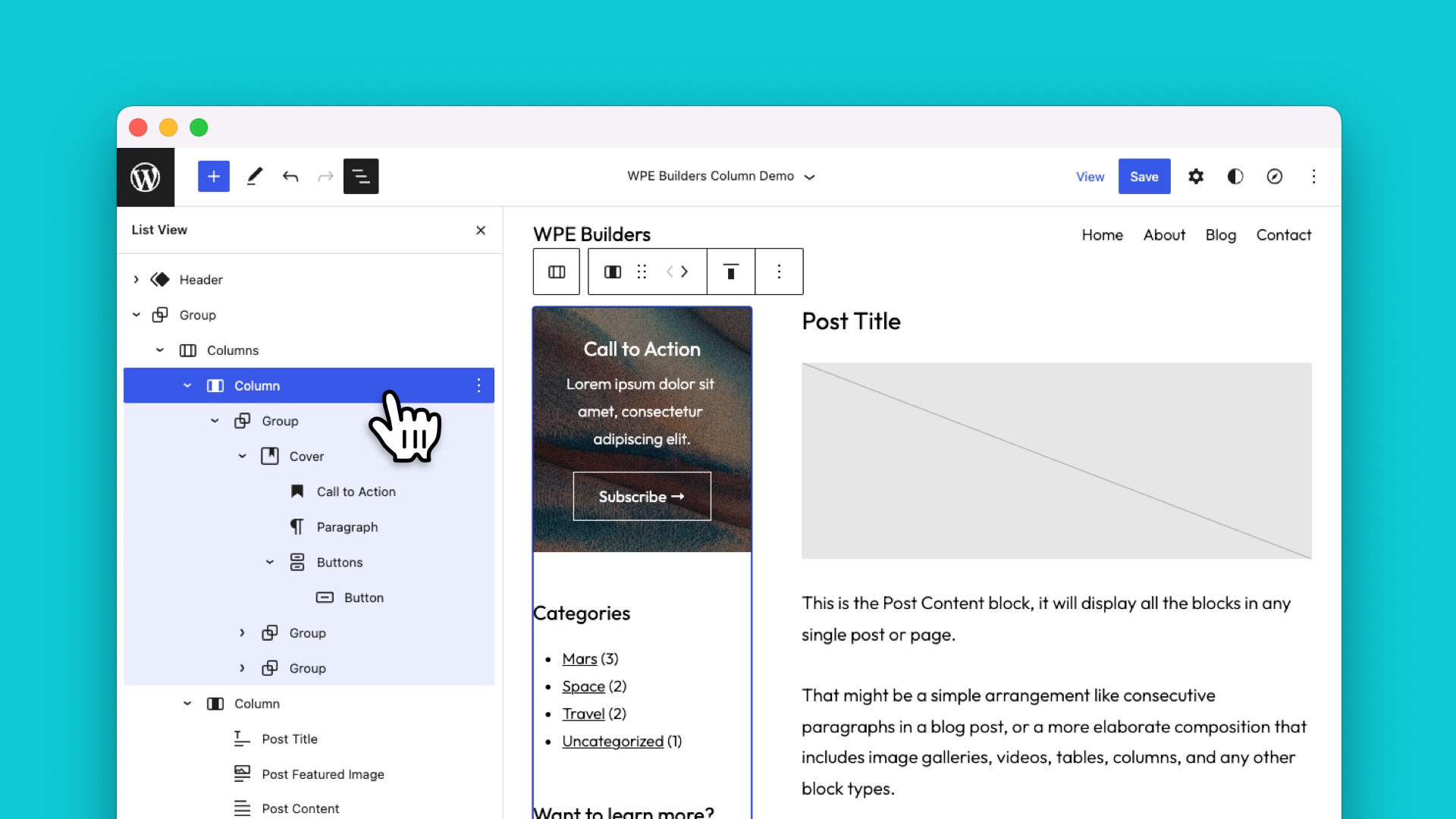
Sidebars are a standard fixture in web design. Unfortunately, the Frost theme does not include a page or post template with a sidebar. Luckily you can fix that with the help of the Columns block.
Begin by navigating to the Site Editor and then create a new custom template. Name it whatever you wish. This template will be available for both posts and pages.
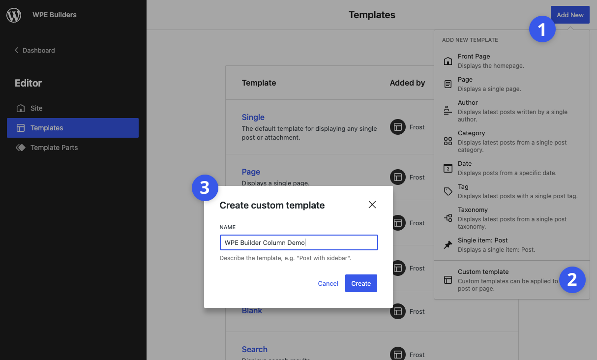
Once you click “Create,” WordPress will copy the default page template as a starting point for your custom design.
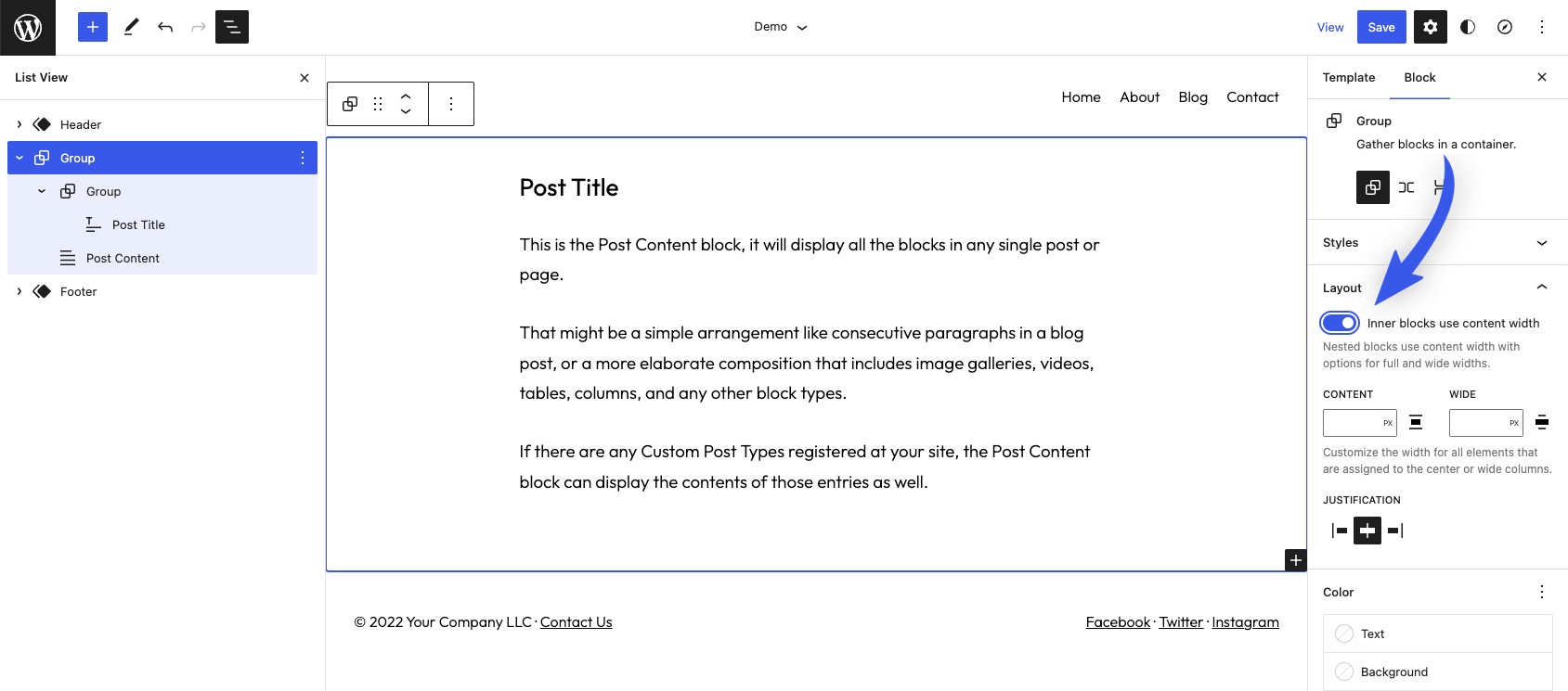
Every block theme is different, but the default page template for Frost is quite simple. It consists of Header and Footer template parts that sandwich a Group block containing the Post Title and Post Content blocks.
Before adding a Columns block and modifying the design, you will want to ensure the outer Group block has layout enabled. Enabling layout is not needed in Frost’s default template but will allow you to set the alignment of the Columns block, which will be placed inside the Group.
See the screenshot below for reference. You can learn more about alignment and layout controls in our recent article here on WP Engine Builders.
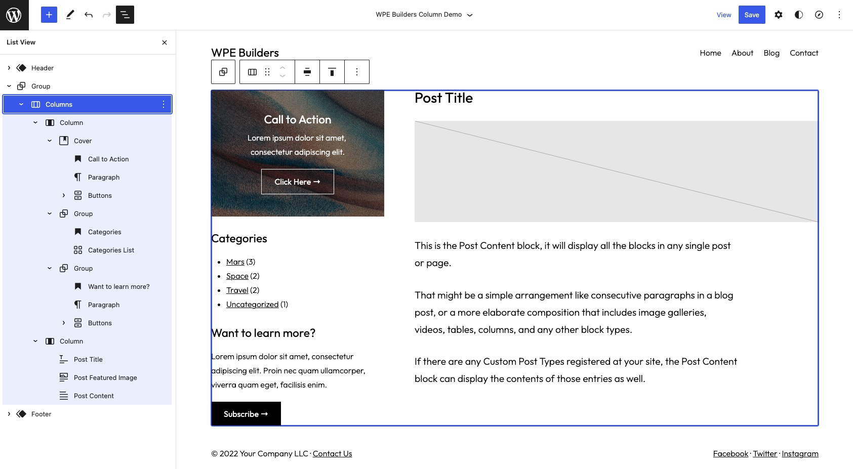
With layout enabled on the Group, you can remove the original content and add a Columns block. This is your opportunity to get creative and design a sidebar that suits the needs of your project. For the design below, here are a few of the specific tweaks that were made.
Design Features
- The Columns block alignment is set to Wide, so it lines up with the header and footer.
- A two-column layout was used, one with a width of 25% and the other with 75%.
- The block spacing between the two columns was set to Medium.
- The Post Content block was justified to the left.
- Three separate sidebar content items were created: two calls to action and a list of post categories.
The companion video at the beginning of this article contains a complete walkthrough of how this template was designed.
Before finishing the template, let’s apply the mobile-reverse-column-direction class to the Columns block. Otherwise, the sidebar will display above the post content on mobile devices. Not an ideal user experience.
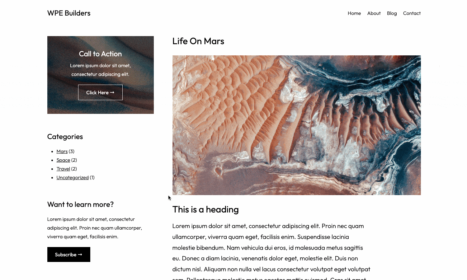
After saving the template in the Site Editor, it will become available when editing posts and pages. Choose a post and set the template to the new custom page template. The final result should look something like this.
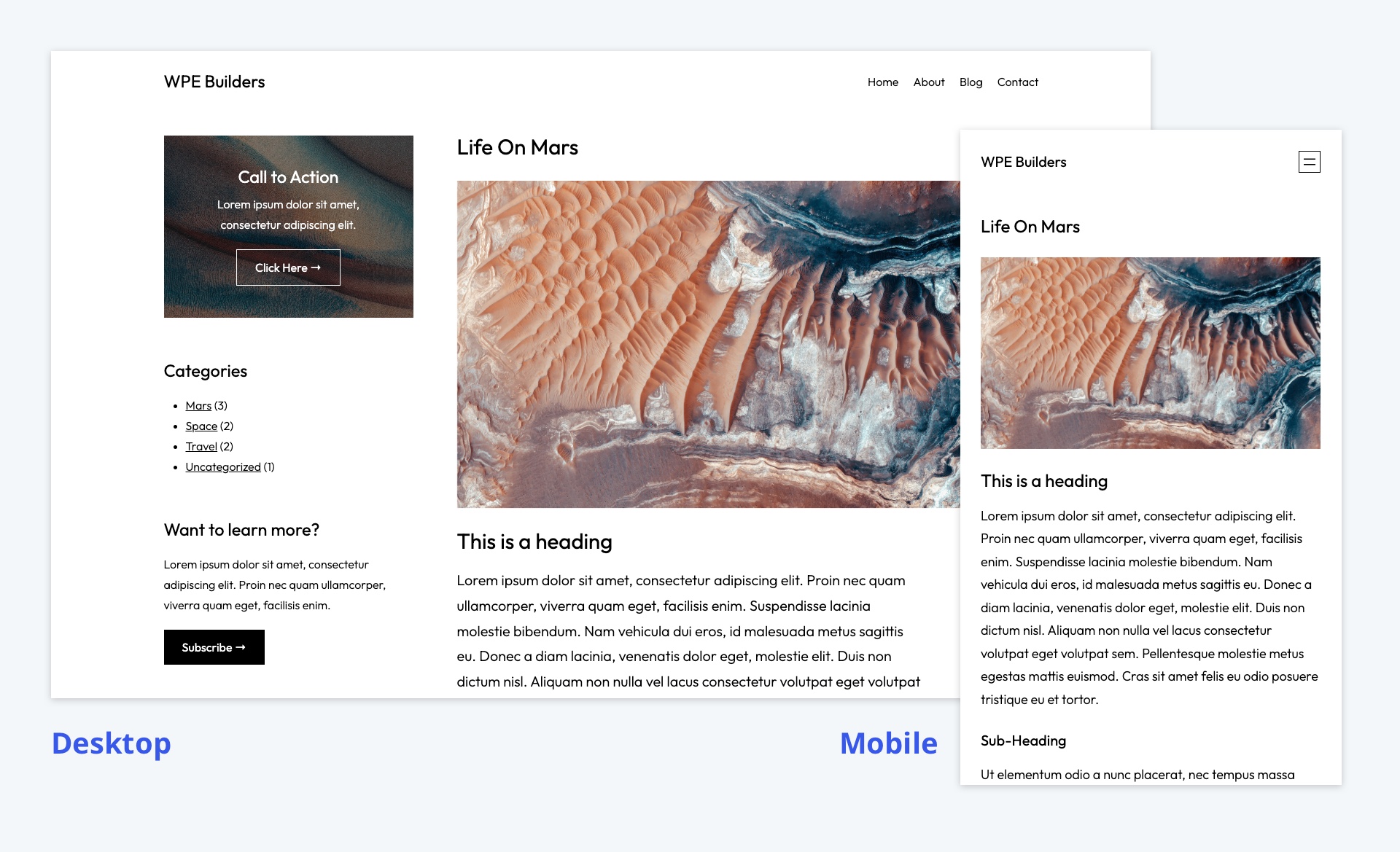
Bonus – How to make a sticky sidebar
The custom page template looks great, but we can take this design further with another minor CSS tweak. What if the sidebar content was “sticky,” so it stuck to the top of the browser window as the user scrolled down the post?
Sticky sidebars are relatively common on the web when you want to ensure specific content is always displayed to a visitor. Examples include calls to action, advertisements, or a post’s table of contents.
Unfortunately, making the sidebar Column block sticky is a bit challenging, given that the parent Columns block is a flexbox container. Applying custom CSS to the content within the Column is much easier.
To do so, we need to modify the block layout in the sidebar slightly by containing all of the content within a Group block. Then apply the CSS class sticky-column-content to the Group.
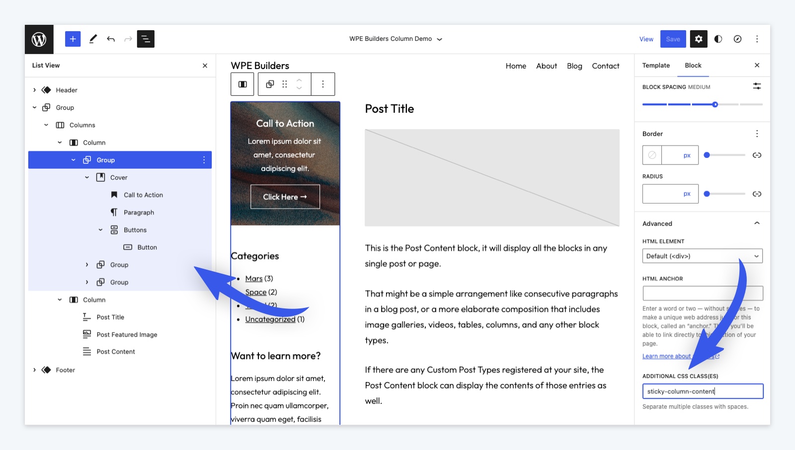
Next, add the CSS for the custom class to the theme’s stylesheet.
frost/style.css
.sticky-column-content {
    postion: sticky;
    top: 30px;
}
Code language: CSS (css)
The top spacing is relatively arbitrary but ensures a small buffer between the top of the browser window and the sidebar content. And here is the final result in action.
In conclusion
The Columns block is one of the most powerful tools at your disposal when building block layouts. Hopefully, the two relatively simple examples in this article demonstrated just how versatile it can be. Blocks continue to get more powerful with each WordPress release, and it’s incredible how much you can accomplish with very little extra CSS. By WordPress 6.2, you might not even need the custom CSS classes used in this article.
So have you experimented with this block type or used any of these techniques in your projects? Let me know on Twitter. I’d love to take a look.
And if you’re looking for more modern WordPress development techniques, check out our other posts here on WP Engine Builders. Until next time.