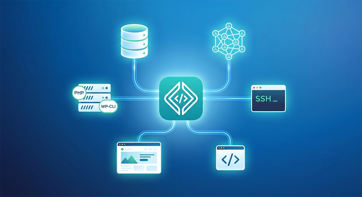
The Guide to Local Development for WordPress® Featured Tags:BlogDevelopmentWorkflows Featured Michael Bertram Developer Advocate Published date Jul 15, 2026 Read Time 19 min read
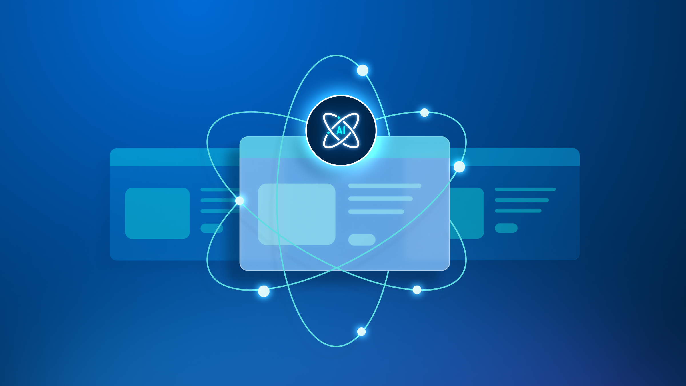
Future-Proofing Content: Plugging WordPress® Into the Agentic Web Tags:AIBlogDeveloper Published date Jun 24, 2026 Read Time 5 min read
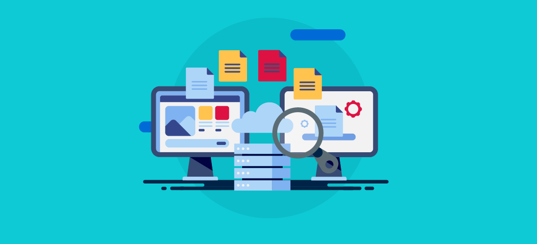
Using the Multimodal Feature with Smart Search AI MCP Tags:DeveloperSmart Search AITechnical Documentation Published date Jun 11, 2026 Read Time 8 min read
The Developer’s Guide to Zero-Downtime Website Migrations Tags:AgencyDeveloperWorkflows Published date May 18, 2026 Read Time 10 min read
Technical GEO: Ensuring Sites are Machine Readable Tags:AISEO & GEOSite Optimization Published date May 14, 2026 Read Time 8 min read
How AI Search Engines Rank Websites Tags:AgencyAIArticle Published date May 7, 2026 Read Time 9 min read
DE{CODE} 2026: Shaping the Intelligent Web, Together Tags:Advanced Custom FieldsAIDE{CODE} Published date May 6, 2026 Read Time 10 min read
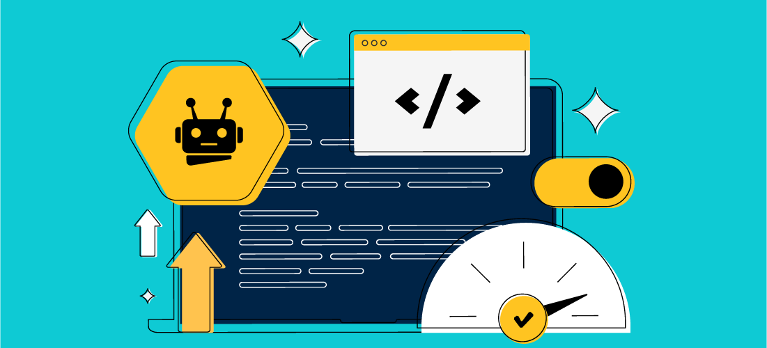
How To Fix a Slow Website (and Keep It Fast) Tags:ArticleDeveloperSite Optimization Published date Apr 27, 2026 Read Time 11 min read
Learn from Agency Leaders, Product Pros, and Marketing Masters at DE{CODE} 2026 Tags:AIDE{CODE}WP Engine News Published date Apr 22, 2026 Read Time 5 min read

 Get Started