For the last few years, fonts on the web have been a rather significant bottleneck for performance. This impacts our end users. Typography choices are imperative to providing a consumable experience, but at what cost?
Let’s explore some font techniques that can help us offer a faster experience in our WordPress themes.
The more you know!
A common misconception is that @font-face is what triggers a font to be downloaded. However, it is not until the font is used that it actually called, e.g. h1, h2, h3, h4, h5, h6 { font-family: "Open Sans"; }
Static & Variable fonts
Variable fonts have been around since the 90s but did not truly start gathering momentum until Apple, Adobe, Microsoft, Google, and some key type foundries collaborated to create OpenType Font Variations (aka variable fonts) for the OpenType specification (mid-2016).
Fast forward to 2022, and many independent designers and large foundries have created hundreds of variable fonts.
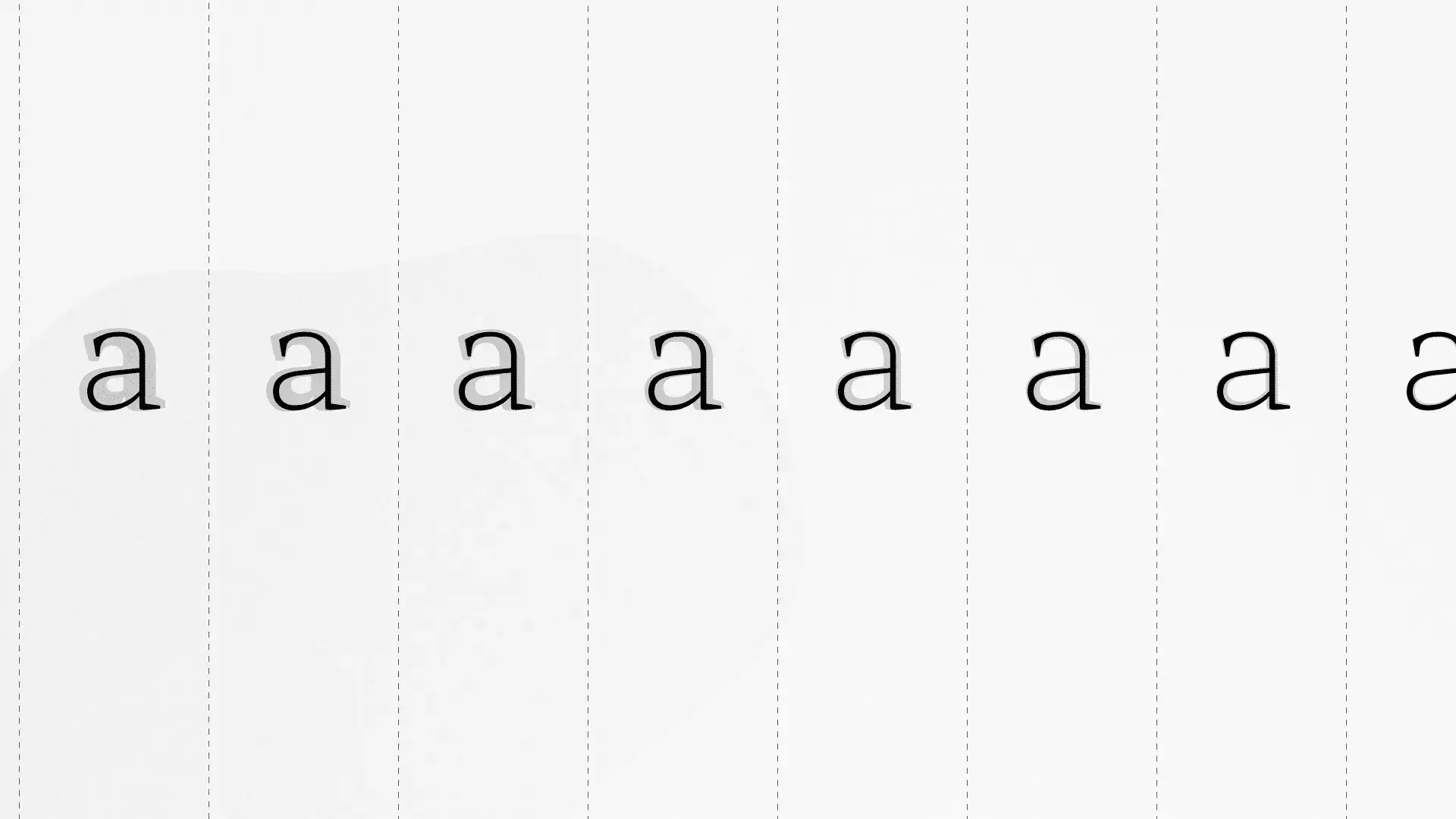
A single variable font can serve a variety of design axes, but in a single file. Whereas, a static font will serve a specific weight or style for each design variation.
Static font example with multiple weights.
/* Open Sans - Regular [static] */
@font-face {
	font-display: swap;
	font-family: 'Open Sans';
	font-style: normal;
	font-weight: 400;
	src: url('OpenSans-Regular-webfont.woff2') format('woff2');
}

/* Open Sans - Bold [static] */
@font-face {
	font-display: swap;
	font-family: 'Open Sans';
	font-style: normal;
	font-weight: 700;
	src: url('OpenSans-Bold-webfont.woff2') format('woff2');
}

/* Open Sans - Bold Italic [static] */
@font-face {
	font-display: swap;
	font-family: 'Open Sans';
	font-style: italic;
	font-weight: 700;
	src: url('OpenSans-BoldItalic-webfont.woff2') format('woff2');
}

/* Open Sans - more font weights ... */
Code language: CSS (css)
Variable font example with multiple weights.
/* Open Sans [variable] */
@font-face {
	font-display: swap;
	font-family: 'Open Sans';
	font-stretch: 100%;
	font-weight: 300 600;
	src: url('fonts/OpenSans-VariableFont_wdth,wght.woff2') format('woff2 supports variations'),
			url('fonts/OpenSans-VariableFont_wdth,wght.woff2') format('woff2-variations');
}
Code language: CSS (css)
It is easy to look at those code examples and think: I should definitely use variable fonts, because it is a single file and the syntax is more concise. However, there is a lot more to consider. So, sit back and grab a cup of coffee ☕️ (or your favorite drink). Let’s dive into some of the nuances.
Variable font axes
Say what? Variable fonts allow for multiple axes, including ital, wdth, and wght. This is arguably the best feature of variable fonts. Historically, different font weights and styles required unique, separate font files. However, variable fonts introduce axes for the user to manipulate slant, weight and width, and all within a single font file.
Since there is only one file to include on your site, then ideally there is a performance benefit. However, it greatly depends on which variable font you use, which features you choose to use, what format and subset you use, and how you package it all up for serving to your users.
Let’s focus on an example and compare how we might use a traditional static font versus a variable font.
Static vs. Variable font comparison
Let’s take a common font like Open Sans and compare how we might use it in a real-world theme with static and variable font differences. First, we’ll use these common rules for comparing the different formats:
- Only use the weights and styles that we need.
- Download the fonts and host them locally.
- Make sure they’re converted and served as
.woff2format. This is the most performant format and has rather good coverage from most browsers these days.- There are a few online services that allow you to upload and convert fonts to
.woff2. I’ll be using Google’s.woff2CLI compression tool for now.
- There are a few online services that allow you to upload and convert fonts to
The first step is always being mindful of choosing and using only the font weights and styles we need. This is key to optimizing our font’s overall size(s). We’ll imagine that our theme design requires only Open Sans Light for our large titles, Open Sans Regular for our main body copy, and Open Sans SemiBold for our other headings. This seems like a rather conservative and practical stack.
The more you know!
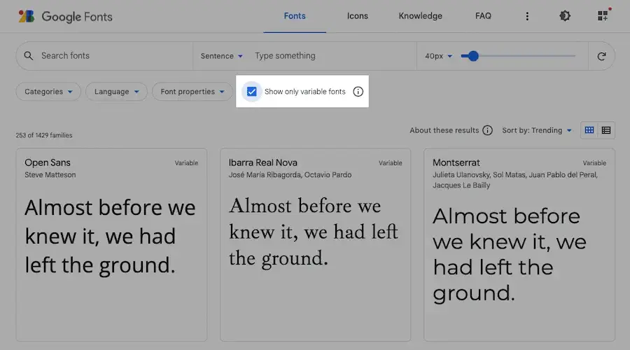
Did you know that Google Fonts offers a means to filter and “Show only variable fonts” when browsing? It most certainly does.

Open Sans Static Font example
Since our static font has separate files for weight and italic, then we’ll want to include the following variations:
- Open Sans Light
- Open Sans Regular
- Open Sans Regular Italic
- Open Sans SemiBold
- Open Sans SemiBold Italic
Note: we will not load in Open Sans Light Italic and will tell our editors to refrain from using italics in our large headings. They will likely forget about this restriction and still use italics once in a while, which is fine because most browsers will still render the font as a pseudo-italic or the closest browser interpretation.
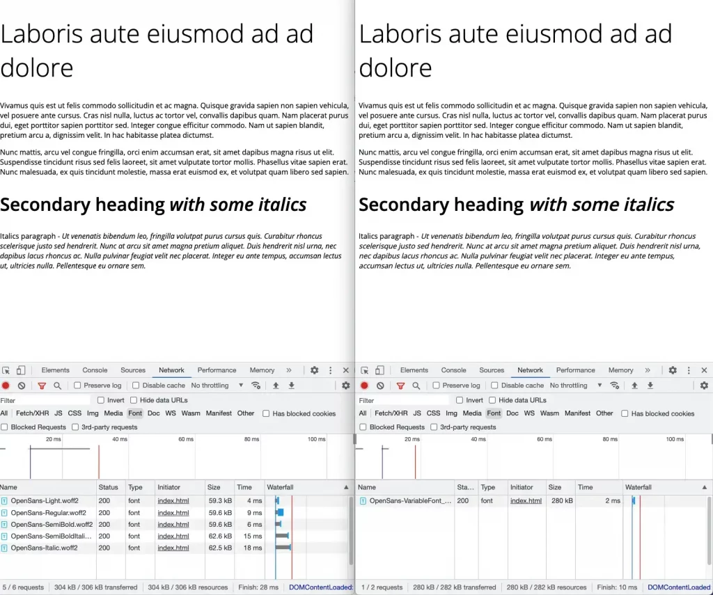
After we download the necessary fonts and convert them to .woff2 format, we end up with the five font files totaling 310 KB.

Open Sans Variable Font example
Now, let’s download our Open Sans variable font equivalent. Our single variable font file is 280 KB (30 KB less than the static version).

Exploring the nuances
Your conclusion of the above results may help you see the compelling reasons to consider using variable fonts in your next WordPress theme. However, there are some nuances and further details to consider.
How many weights and styles will you be using on each page?
We used all five styles and weights on the final page in our example. However, suppose you only need a single weight and corresponding style, e.g., Open Sans Regular and Open Sans Regular Italic. In that case, you’ll want to load the separate, static file versions of Open Sans Regular and Open Sans Regular Italic only. This would accrue a mere 123 KB if you used both on the page. Whereas with the variable file, it is still 280 KB loaded.
Do I need true italic for my variable font?
Different variable fonts handle italic differently. I’ve found that most fonts downloaded from Google Fonts include a separate italics file for variable fonts. So, there are usually two files to convert and include. However, I typically use the non-italic and allow the browser to render its interpretation of pseudo-italic. So, it is a matter of preference.
You can see in the screenshot below a side-by-side comparison of the rendered output for the corresponding tests with the fonts loaded in Chrome Developer Tools beneath each test. The pseudo-italics (on the right) are close to the true italic output (on the left).

Next Steps
As you can see, when to use variable or static fonts is not so cut and dry. It is important to experiment and consider what type of weights and styles you want to serve your users, and keep the performance impact in mind.

Curious whether to use a variable or static font for a project? Send me a DM on Twitter @dcook and let’s chat about it!

