Get Started


Key Takeaways
Client testimonials are powerful for boosting conversion rates. Having as few as five testimonials can improve conversion rates by nearly four times, providing potential clients with confidence.
Short, impactful testimonials are more effective. Posting very long testimonials can deter readers, so it’s best to pick out one sentence that highlights the key message.
Focus on client results, not on yourself. Highlight testimonials that showcase tangible business results achieved for clients, rather than just praising your work.
Feature testimonials prominently on your website. Leading with testimonials can significantly boost conversions by providing social proof for potential clients.
Featuring client testimonials on your website is a powerful way to give potential clients a boost of confidence when they’re considering hiring you.
In fact, one study suggests that having as few as five testimonials can improve your conversion rates by nearly four times.
Why are testimonials so powerful for your site?
Consider how you act when making a purchase. First, you search for the item and find a few options to consider. Then, you dive deeper on the details of each item. It’s very likely that part of your deeper dive focuses on reading reviews (or at least viewing the star-ratings that have become popular with most online sellers).
All things equal, you’ll pick the product with the better reviews.
It’s similar when a client is looking to hire you or your agency.
They search “web design agency in Tacoma” and click the top five results in Google.
From there, they investigate their options by reviewing pricing, style, former clients, portfolio samples, and—if you give them the chance—testimonials.
Testimonials are to service businesses as reviews are to e-commerce businesses.
But simply copying and pasting a few client testimonials onto your site may not bring quite the results you’re hoping for.
So today, I’ll share with you how (and how not) to feature client testimonials on your website.
My advice comes from years coaching creatives in their own small businesses, plus the chance I’ve had to review dozens of portfolios individually (watch some really good ones here).
With that in mind, here’s a list of dos and don’ts for featuring client testimonials:
Use Very Short Snippets (not Lengthy Text)
When including testimonials on your portfolio site, it can be very tempting to include all the text a client sent you. After all, you don’t want to offend them by editing or truncating their praise, right?
The truth is, posting very long testimonials is doing more damage than good on your portfolio site.
No one reads on the Internet anymore. They skim.
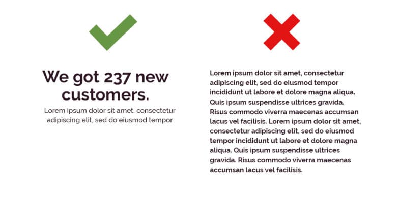
All you’re doing by posting full paragraphs is deterring anyone from actually reading the glowing review your last client gave you.
Do your best to pick out one sentence from the paragraph that really highlights what you’re trying to convey. Use ellipses between sentences to cut out words that don’t matter.
If you insist on including the full testimonial, opt to share the most powerful snippet and link to the full testimonial on a separate page or pull out the most impressive phrases in a headline above the paragraph.
If you can help it, keep it short.
Keep it Simple (and Don’t Make Them Interactive)
I see a lot of creatives who put their testimonials on sliders (with arrows to navigate) or on 3D CSS cards that flip when you hover on them.
Both are a mistake.
In fact, forcing the site user to take any action (hovering, clicking, etc) to see your testimonials may be a bad move.
Why? Not only are people skimmers when they’re online, they’re also lazy. If you ask them to click multiple buttons just to read more testimonials, not many people will take even that simple action.
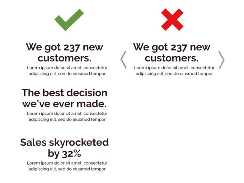
Even an “auto-advance” slider may be a bad decision since it forces the user to read quickly or miss out on what the testimonial says.
If you have too many testimonials and feel the need to put them in a carousel of some kind, instead try paring down your testimonials to the top three to five and then offering a link to a page full of them.
Above all, keep it simple. Static text, with an image is almost always the best way to go.
Focus on Client Results (Not on You)
While it may be tempting to highlight testimonials that talk about how great you are to work with and how efficiently you completed the project, there might be a better option out there.
Instead of focusing on testimonials that praise you and your work, try to collect and highlight testimonials that focus on the tangible business results you got for your client.
Instead of something like “Kara is great to work with and always delivers on time” you might aim for something like “Kara’s input led to a 15% increase in customer retention almost overnight.”
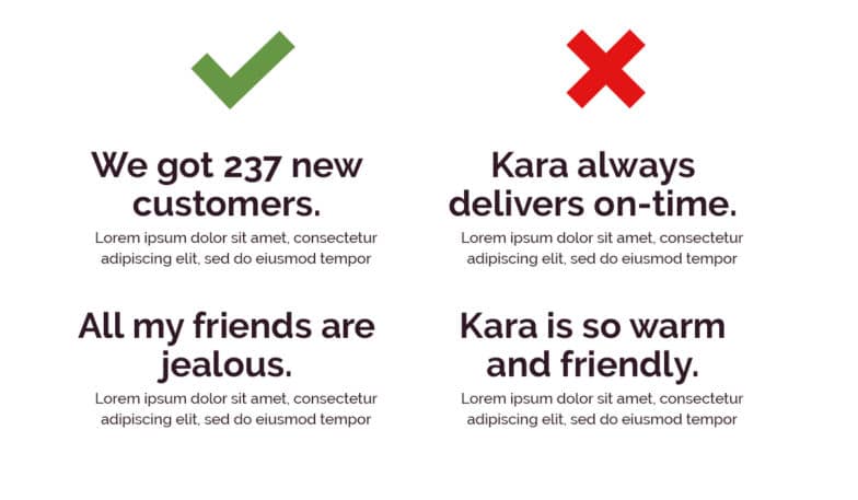
If you serve non-business customers, you can still take this approach.
Instead of “Lydia was patient and took the best photos!” you might try to get something like “My neighbors always comment on our family photo when they visit our home.”
Overall, you want to focus on the results you get your clients so that future clients can put themselves in the shoes of past clients. You want them to say “I want a 15% increase” or “I want all my neighbors to be jealous of my family photos.”
Feature Them Prominently (not as an Afterthought)
Social proof is one of the most important factors buyers consider when making a purchase.
They subconsciously ask questions like: did my peers like the results they got from this situation?
That’s why featuring reviews prominently on your portfolio site could boost conversions in a big way.
Instead of putting them at the bottom of the page, consider leading with them—even before highlighting projects or pricing.
I recommend having an entire section of your homepage dedicated to the best testimonials, a fancy landing page full of testimonials only, and even more testimonials scattered throughout your site in strategic places (like next to a checkout form or contact form).
While your portfolio design doesn’t have to be perfect, you should take the time to organize testimonials and other details in a meaningful way and give a little extra thought to the overall look and flow.
Do it Now! (Don’t Delay)
Adding testimonials to your online portfolio can be one of those to-do items that are easy to lose track of and endlessly put off.
Instead of skimming this article and thinking to yourself, “yeah, I should do that,” actually get out your calendar or planner right now and write down when you’re going to add or update testimonials on your site.
And to ensure those testimonials appear for your visitors quickly and clearly, make sure you’ve chosen a world-class WordPress hosting partner to keep your site at peak performance!