Get Started


Key Takeaways
Sticky headers enhance user experience. They provide constant navigation options, improving usability on websites with extensive content.
Responsive sticky headers adapt to different devices. Adjusting size based on scrolling behavior ensures optimal viewing experience across screens.
Combining CSS and JavaScript creates a squishy navigation. Shrinking the header when users scroll maximizes visible content, especially on smaller screens.
Leaders should assess their website’s need for a sticky header. Evaluating usability and responsiveness can drive better user engagement and navigation.
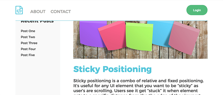
Screenshot of web page with source code revealed on the lower third
Website headers that stay in place when a user scrolls through a page have become an increasingly popular design element in recent years.
Known as “sticky headers,” these website headers allow users to easily access navigation without the need to scroll back up each time they want to choose a different page or option.
Sticky header functionality enhances the user experience by ensuring navigation remains readily available, helping users navigate your site more efficiently. Sticky headers are particularly beneficial for websites with extensive content, as they help users find what they’re looking for without losing their place on a page.
What makes a website header sticky?
Sticky headers are created using fixed positioning, which allows the header to remain in place as the user scrolls through the page. The main component of a sticky header is positioning the element relative to the viewport (the browser window). Unlike other elements that may move when the page is scrolled, an element with fixed positioning stays in a constant position on the screen.
Here’s how it works:
- Fixed positioning: This CSS property positions an element relative to the viewport, which means it remains fixed in one spot on the screen regardless of how much the user scrolls. The element does not move because its position is defined in relation to the browser window itself.
- Viewport relation: The viewport is the visible area of the browser window. Since this area remains consistent as the user scrolls, any element positioned relative to the viewport will also remain consistent in its position. This is why the fixed element, such as a sticky header, stays visible and accessible.
- CSS implementation: To implement fixed positioning, you use the
position: fixed;CSS property. This ensures that the element is taken out of the normal document flow and placed relative to the viewport. Additional properties liketop, right, bottom, andleftcan be used to define the exact position of the element within the viewport.
For example, consider the following CSS code snippet for a sticky header:
.navbar-fixed-top {
  position: fixed;
  top: 0;
  right: 0;
  left: 0;
  z-index: 999;
}
Here’s a breakdown of what each property does:
- Position: fixed;: This property ensures the header remains fixed relative to the viewport.
- Top: 0;: Positions the header at the very top of the viewport.
- Right: 0; and Left: 0;: Ensures the header spans the full width of the viewport.
- Z-index: 999;: Ensures the header stays on top of other elements, preventing it from being overlapped.
- Z-index consideration: The z-index property is crucial for sticky headers to ensure they remain on top of other elements on the page. By assigning a high z-index value, you make sure the header is not obscured by other content.
By combining these elements, you create a sticky header that remains accessible and enhances the user experience by providing constant navigation options. This approach is particularly useful for improving usability on websites with long pages or extensive content.
Note: Don’t try this on your live site!
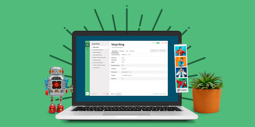
Remember: To prevent potential issues, avoid making changes directly on your live site. Instead, use a free local development app, such as Local, to set up a test environment where you can safely follow this tutorial.
Creating a sticky header with CSS
Now that you understand the basics and benefits of using a sticky header, here’s how to create one for your WordPress site(s).
To get started, you’ll first need to define a CSS class that sets the header’s position to fixed. This class will ensure the navigation bar stays at the top of the page, no matter how much you scroll. Here’s an example:
.navbar-fixed-top {
  position: fixed;
  top: 0;
  right: 0;
  left: 0;
  z-index: 999;
}
The .navbar-fixed-top class is added to the navigation element, setting its position to fixed and ensuring it occupies the full width of the page. Here’s a breakdown of what each property does:
- Position: fixed; This property ensures the header remains fixed relative to the viewport.
- Top: 0; Positions the header at the very top of the viewport.
- Right: 0; and Left: 0; Ensures the header spans the full width of the viewport.
- Z-index: 999; ensures the header stays on top of other elements, preventing it from being overlapped. The
z-indexproperty is crucial for sticky headers, as it ensures they remain on top of other elements on the page. By assigning a highz-indexvalue, you ensure the header is not obscured by other content.
Adjusting the page body
Since a fixed header will cover part of the content at the top of a page, you may want to add the following padding to the top of the body that pushes the content down:
body {
  padding-top: 75px;
}
Using this code snippet, you can adjust the padding based on the height of your fixed header.
While the above provides the essential CSS for adding a sticky header to your site, the next sections will explore additional enhancements, such as making your sticky header responsive and squishy, and exploring alternative methods like CSS position: sticky; for creating sticky headers.
Making your sticky header responsive
In today’s multi-device world, it’s crucial that your website adapts to different screen sizes and devices, ensuring an optimal viewing experience for everyone. For a sticky header, being responsive means adjusting the header’s size and appearance based on a user’s device and scrolling behavior.
A responsive sticky header often becomes thinner as the user scrolls, a feature sometimes referred to as a “squishy” header. This provides more space to view the main content and is particularly useful on smaller screens, where maximizing visible content is essential.
Achieving a responsive sticky header requires a combination of CSS and JavaScript. By setting initial styles with CSS and using JavaScript to adjust these styles based on scroll events, you can create a header that works seamlessly across all devices. Below, we’ll walk through the different steps and code snippets needed to implement these features.
CSS for a squishy navigation
To make the navigation bar shrink when the user scrolls, you can start by defining the initial and shrunken states in your CSS:
.navbar-fixed-top {
  position: fixed;
  top: 0;
  left: 0;
  width: 100%;
  background: #f6f6f6;
  z-index: 999;
  height: 90px;
  overflow: hidden;
  transition: height 0.3s;
}

.navbar-fixed-top.cbp-af-header-shrink {
  height: 75px;
}
The .navbar-fixed-top class sets the initial fixed position and dimensions of the header. The .cbp-af-header-shrink class specifies the reduced height for the header when the user scrolls, making the header “squishy.”
JavaScript for dynamic class addition
Next, use JavaScript to dynamically add the .cbp-af-header-shrink class based on the user’s scroll position:
function scrollPage() {
  var sy = window.scrollY;
  if (sy >= changeHeaderOn) {
    header.classList.add('cbp-af-header-shrink');
  } else {
    header.classList.remove('cbp-af-header-shrink');
  }
  didScroll = false;
}
This script checks the scroll position and adds or removes the .cbp-af-header-shrink class accordingly. As a result, the header’s size adjusts dynamically based on the user’s scrolling behavior.
By combining these CSS and JavaScript techniques, you can create a responsive sticky header that enhances user experience and adapts to various screen sizes and devices. Implementing these features ensures your website remains user-friendly and accessible, regardless of how it is accessed.
Using CSS sticky positioning
While making your sticky header responsive is essential for a seamless user experience across different devices, it’s also beneficial to explore using CSS sticky positioning.
The position: sticky; property combines the characteristics of relative and fixed positioning, allowing an element to be treated as relative until it hits a specified point, at which it becomes fixed. This approach can simplify the implementation of a sticky header and offer better performance in some scenarios.
Example of sticky positioning
To use position: sticky;, you can apply the following CSS to your navigation element:
.navbar-fixed-top {
  position: -webkit-sticky; /* For Safari */
  position: sticky;
  top: 0;
}
This code ensures that the header sticks to the top of the viewport when scrolling. The element remains relative until the top of the viewport reaches the top of the header, at which point it becomes fixed.
Handling overflow and browser support
While position: sticky; is useful, it has some limitations regarding overflow and browser support. Here are a few things to keep in mind:
- Overflow: Avoid certain types of overflow on a parent element with a sticky-positioned element, such as
overflow: auto;, overflow: scroll;, oroverflow: hidden;, as these can interfere with the sticky behavior. - Browser Support: Not all browsers fully support
position: sticky;. To ensure your design works across different browsers, you can use the@supportsrule to detect if the current browser supports sticky positioning:
@supports (position: sticky) {
  .header {
    position: -webkit-sticky; /* For Safari */
    position: sticky;
    top: 0;
  }
}
If browser support is a concern, consider using fixed positioning as an alternative. Fixed positioning is widely supported across all modern browsers, making it a reliable fallback option.
Using position: sticky; can simplify the implementation of a sticky header by combining relative and fixed positioning.
However, it’s essential to consider its limitations with overflow and browser support. By using the @supports rule and providing fallbacks like fixed positioning, you can ensure your sticky header works effectively across all devices and browsers. Exploring both responsive design and CSS sticky positioning will help you create a robust and user-friendly navigation experience on your website.
Create a sticky header for your WordPress sites!
Creating a sticky header for your WordPress site is relatively simple with CSS and JavaScript. By following the steps outlined above, you can ensure your navigation remains accessible and user-friendly. And remember—test your changes in a local environment before applying them to your live site!
Create a sticky website header for your WP Engine-hosted sites on Local! Learn more and download it for free here!