Get Started


Key Takeaways
Color selection is crucial for branding and user communication. Understanding color theory and target market preferences is key to creating effective website color schemes.
Established brands should align website colors with existing brand guidelines. Consistency in color usage helps maintain brand recognition and identity.
New brands need to establish color guidelines early in the web design process. Testing and reviewing mockups can ensure the chosen color scheme resonates with the brand’s message.
Consider color psychology to evoke specific emotions in site visitors. Different colors convey different feelings and can impact user engagement and perception.
Creating a website color scheme is an important and exciting aspect to web design! Color is a key component of your business’s branding, and also helps communicate important messaging to users as they interact with your site. Because of this, color selection is something that should always be carefully planned and tested.
There are lots of best practices and elements of website color schemes you should consider before implementing something new on your site (or your client’s). In this article, we’ll dive into:

How to think about color palettes for your website
Before choosing any color palettes or schemes, you need to have a deep understanding of your brand and the users interacting with your website.
As designers, we love color. Having an infinite color palette and the ability to choose options that best represent a brand makes this an exciting part of the web design process. The brand you’re designing for should always be the main focus when creating a color theme for your website.
It may seem obvious, but it’s important to know what you’re starting with in regards to the brand. Before getting too far, make sure you know if you’re working with an established brand color scheme or if you’re starting from scratch. You’d be surprised how often this can be overlooked in the discovery phase, so it’s definitely something to confirm with your client.
A major goal of branding is to be easily recognizable, and color plays a huge role in that. Whether you’re working with an established brand or starting from the beginning, the colors you choose have an impact when distinguishing yourself from competitors. The brand represents the business, and how it’s perceived in the market.
Color choices should always align with the values the brand stands for.
Advice for established brands
When starting a web design project, you may be working with an established brand. No matter what stage the client is in, try to be mindful of what’s already recognized in the market (and therefore shouldn’t change) and what opportunities there are for change.
For example, take Coca-Cola, one of the world’s most popular brands. What color comes to mind?
Most people would say red. Consumers are used to seeing this brand in stores, restaurants, and other places. To stay on brand, the Coca-Cola website incorporates red to tie in with the overall brand. A solid red website would not be easy to use, however, so there are other accent colors included (such as black and white). The red comes through as the dominant color, and the accent colors make for a seamless experience.
It’s very likely that established brands have documented brand guidelines, where any web color palette guidelines live. If this is the case with your client, choosing a color theme for their website will be somewhat predetermined. But as a designer, there’s still a good chance you’ll need to select secondary colors or test the visual impact in your design to find the perfect combination.
Advice for new brands
For new brands (or an existing one going through a full redesign), there may not be existing color guidelines yet, especially if the website is being created for the first time. If you’re in this situation and brand guidelines need to be established, it’s important to consider the website color scheme before fully launching the website. You can always test and change things later, but it’ll help to review mockups of the color scheme first before actually building it out.
What is color theory and how does it relate to web design?
Color theory is a set of guidelines that artists and designers use to confer different ideas and feelings to audiences. Color theory is complex and incorporates elements of design, psychology, and visual art, but how does color theory relate to web design? Well, when choosing a web design color scheme, you may need to utilize color theory in making your selection. Your website’s color scheme can really see improvement if you’ve got a solid understanding of color theory and design principles.
Identifying your target market (and how they’ll respond to your website’s color schemes)
This is the most important research to do before developing your color scheme. Color is very subjective, and you (or your client) might find yourself geared toward colors that you like or that are trendy right now. But it’s important to consider the site visitors first and not focus on personal color preferences.
Consider who your target audience is and what needs they have. For example, are you targeting an older demographic? If so, making sure that they can easily view the content is absolutely key. Color contrast, larger text (maybe even bolder as well), and clear indications of actionable items should be planned out in the design process.
What if your audience is younger? A visually interesting web color palette that is bright and playful will help them stay engaged. The content of the site will also need to be engaging, but color will play a big role.
Remember to keep an open mind and let the research inform your final color decisions.
Color psychology
When deciding a website color scheme, remember to be mindful of color psychology and the effect color can have on the emotions of your site visitors. While it’s not a requirement to follow the “rules” of color psychology, it can help you focus on the message and feeling you want your site to convey.
For example, it’s common to hear clients say something like “I really like purple and want to use it on my website.” Lilac purple is a beautiful color, but if you’re designing a website for a masculine tool company, it may not be the best fit.
Here’s an overview of color psychology, and what different colors mean:
- Red: A bold color that evokes a strong emotion. With its intensity, it creates a sense of urgency.
- Orange: Cheerful and confident, orange conveys the idea of enthusiasm. However, it can come off as the color of caution as well.
- Yellow: Like orange, yellow provides a cheerful feeling. It represents optimism and is usually attention grabbing. One thing to consider, however, is that some shades can strain the eye.
- Green: Represents growth and nature. It signifies health, serenity, and tranquility. It is associated with wealth.
- Blue: This color is associated with water, and provides a feeling of calmness and serenity. Blue creates a sense of security and trust, and is often used for corporations.
- Turquoise: Sophisticated and also associated with healing.
- Purple: The color of wealth and success. It’s a powerful color, but also represents creativity.
- Brown: Friendly, earthy, and commonly represents the outdoors.
- Black: A color with a sophisticated feeling. It’s often what we think of with “sleek” brands because of its exclusivity and mystery.
- Gray: Provides a feeling of security, reliability, and intelligence.
- White: Provides a clean or neutral feeling. It’s a key color because it adds breathing room and what is referred to as “white space.”
Note: This is written from a US perspective. When designing globally, be sure to do your research because colors will have different meanings in different parts of the world. Read more on the psychology behind color choice here.
How to choose your website’s color scheme
Now that you’ve thought about all the context of colors, the next step is to start with the key brand color; the “primary.” Once that’s defined, you can start thinking about the secondary colors.
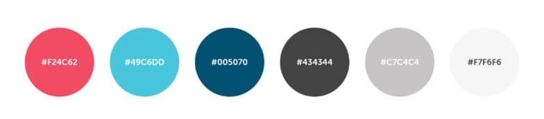
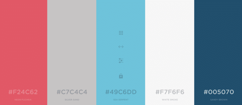
The final number of colors in your scheme will vary from brand to brand, but choosing three is a good place to start. You want to ensure the colors don’t fight each other so your visuals don’t get too chaotic.

Keep in mind that you’ll have those additional colors, like neutrals for text, background, and other secondary elements. These should also coordinate with your main and accent colors. As you look at your favorite websites, you might notice whites, grays, or variations of the primary colors (like lighter or darker options).
Tools for choosing color schemes
If you need help settling on a final color scheme, there are lots of tools out there to help you plan.
These website color scheme generators are free and easy to use:
Paletton
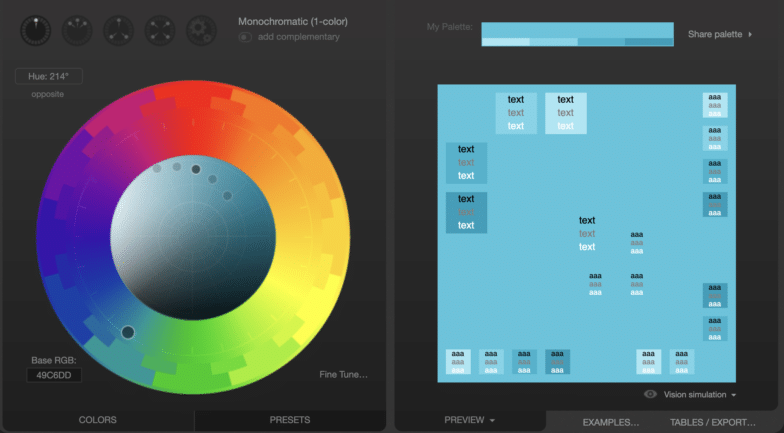
This color palette generator is great because it has several different modes, including a color blind simulation. It’s useful for seeing how different visitors will view your color scheme, which is especially helpful if you don’t have the ability to do a lot of in-person user testing on the site.
Coolors
This handy tool is great for testing different colors next to each other. Featuring a drag-and-drop interface, it allows you to not only customize your color palette, but move things around to see what looks best or clashes next to another color.
Canva’s color wheel
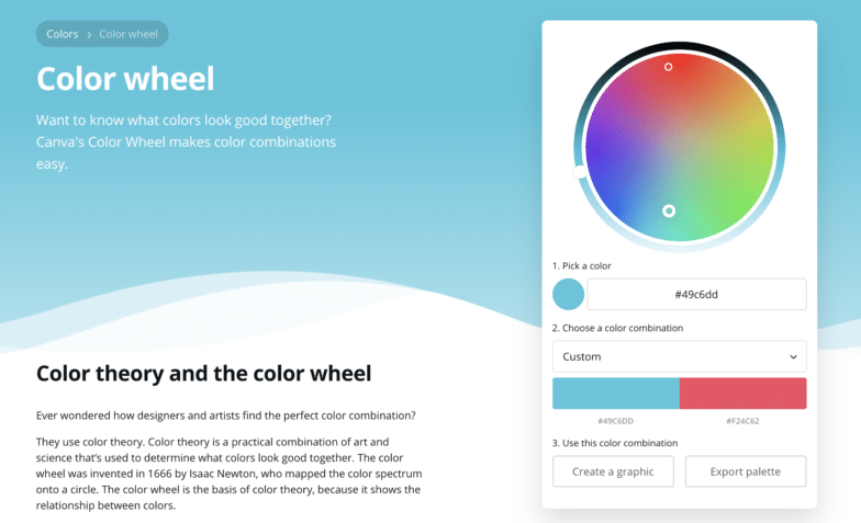
This colorful tool by the Canva team is a great resource for picking out a new palette and for learning even more about color theory! It’ll help you discover different combinations based on those theories, so you know your decision is backed by art and science.
How to apply your colors to your website
Now comes the fun part: Actually starting to implement your website’s color scheme! Before you get too far, however, it’s important to review a few things to make sure you’re covered on all bases.
Contrast and accessibility
If you’re trying out a few ideas or have a final scheme in mind, it’s important to make sure that the color scheme will work for all users on your site. For example, make sure there’s enough contrast between site elements and the background, so that it’s easy for color blind users to distinguish different pieces.
There are a few tools out there that help with this kind of testing, but Contrast Checker is one that is pretty straightforward to use.
Where to use certain colors
After you’ve created your color scheme and tested for accessibility, how do you actually bring it to life? There’s not one set way that works for every project, but there are some helpful things to think about.
A good starting point is to break things down into your primary color, secondary colors, and neutral colors.
- Primary color: This is where the user’s attention goes. Calls-to-action, buttons, and any other important information should utilize the primary color.
- Secondary color: The secondary colors are used to highlight less important elements. Secondary action buttons, less important text, and anything else that doesn’t need immediate attention should be presented in a secondary color.
- Neutral/Additional colors: Neutrals are typically used for text, backgrounds, or anything else that does not need to compete for attention.
Putting all of these colors together will help you create a harmonious website. Then once your colors become established, it’s important that they are used consistently across all marketing channels.
Want additional resources for building and designing incredible sites with WordPress? Visit WP Engine’s Resource Center for our vast library of educational, how-to content—created for WordPress users of all technical skill levels!
Find out more about hosting your WordPress sites with WP Engine, or speak to a representative today.