
How To Show Different Sidebars for Posts and Pages in WordPress
By default, WordPress shows the same sidebar on all posts and pages. But sometimes, you may want to display a completely different sidebar for your most important post or sidebar items related to an entire post category. If you’ve ever wondered how to do that, you’re in luck!
In this article, we’ll show you how to create unique sidebars for different posts or pages, both manually and with WordPress plugins. But first, let’s talk more about why you might want to do this.
Why you might want different sidebars
As stated earlier, if you have lots of categories in your blog, you may be tempted to have a sidebar with similar offers, ads, or products to that topic. Or maybe you want to talk about your business in an “About Us” sidebar, tailored to the audience of each page.
In these types of situations, you’ll want to have a unique sidebar. There are two ways you can create one: manually by developing your own or with a WordPress plugin.
Let’s cover the manual way first.
How to manually create a new WordPress sidebar
To manually create a new sidebar, ideally you should use a child theme in a local environment. We’ve already created one for the twentyseventeen theme, but you can follow the same process for any theme.
First, find the file where the sidebar is registered in your theme. Typically it’s the functions.php file, but it may vary depending on your theme.
Open the file and locate the function for the sidebar code. It will generally consist of register_sidebar and the full function might look something like this:
[php]
function twentyseventeen_widgets_init() {
register_sidebar(
array(
‘name’ => __( ‘Blog Sidebar’, ‘twentyseventeen’ ),
‘id’ => ‘sidebar-1’,
‘description’ => __( ‘Add widgets here to appear in your sidebar on blog posts and archive pages.’, ‘twentyseventeen’ ),
‘before_widget’ => ‘<section id=”%1$s” class=”widget %2$s”>’,
‘after_widget’ => ‘</section>’,
‘before_title’ => ‘<h2 class=”widget-title”>’,
‘after_title’ => ‘</h2>’,
)
);
register_sidebar(
array(
‘name’ => __( ‘Footer 1’, ‘twentyseventeen’ ),
‘id’ => ‘sidebar-2’,
‘description’ => __( ‘Add widgets here to appear in your footer.’, ‘twentyseventeen’ ),
‘before_widget’ => ‘<section id=”%1$s” class=”widget %2$s”>’,
‘after_widget’ => ‘</section>’,
‘before_title’ => ‘<h2 class=”widget-title”>’,
‘after_title’ => ‘</h2>’,
)
);
register_sidebar(
array(
‘name’ => __( ‘Footer 2’, ‘twentyseventeen’ ),
‘id’ => ‘sidebar-3’,
‘description’ => __( ‘Add widgets here to appear in your footer.’, ‘twentyseventeen’ ),
‘before_widget’ => ‘<section id=”%1$s” class=”widget %2$s”>’,
‘after_widget’ => ‘</section>’,
‘before_title’ => ‘<h2 class=”widget-title”>’,
‘after_title’ => ‘</h2>’,
)
);
}
add_action( ‘widgets_init’, ‘twentyseventeen_widgets_init’ );
[/php]
Now copy the entire function and create a functions.php file in your child theme (if you don’t have it already) and paste the code. Make sure to change the function name.
Depending on how many additional sidebars you need to create, you can simply replicate the same code and assign a unique id to each sidebar. You should also change the name and description to make each one unique. Here we’ve created two new sidebars:
[php]
function twentyseventeen_new_widgets_init() {
register_sidebar(
array(
‘name’ => __( ‘WordPress Sidebar’, ‘twentyseventeen’ ),
‘id’ => ‘sidebar-4’,
‘description’ => __( ‘Add widgets here to appear in your sidebar on wordpress related blog posts.’, ‘twentyseventeen’ ),
‘before_widget’ => ‘<section id=”%1$s” class=”widget %2$s”>’,
‘after_widget’ => ‘</section>’,
‘before_title’ => ‘<h2 class=”widget-title”>’,
‘after_title’ => ‘</h2>’,
)
);
register_sidebar(
array(
‘name’ => __( ‘Web Design Sidebar’, ‘twentyseventeen’ ),
‘id’ => ‘sidebar-5’,
‘description’ => __( ‘Add widgets here to appear in your sidebar on web design related blog posts.’, ‘twentyseventeen’ ),
‘before_widget’ => ‘<section id=”%1$s” class=”widget %2$s”>’,
‘after_widget’ => ‘</section>’,
‘before_title’ => ‘<h2 class=”widget-title”>’,
‘after_title’ => ‘</h2>’,
)
);
}
add_action( ‘widgets_init’, ‘twentyseventeen_new_widgets_init’ );
[/php]
The new sidebars are ready now; If you check the widgets section, it will show two new widget areas. We’ve added a simple text widget to each sidebar to make them recognizable.
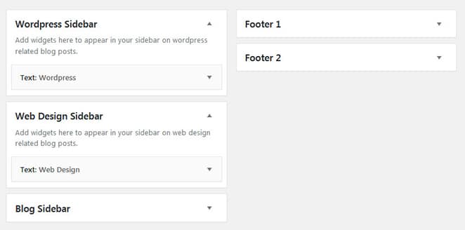
Once you have your sidebars created, it’s time to assign the location. We’re looking to replace the existing right sidebar, so you need to find the file where it’s located.
For this instance, it’s in sidebar.php. Copy the file from the parent theme and paste it into your child theme.
If you check the file, it’s calling sidebar-1, which is the id of the main right sidebar.
[php]
<aside id=”secondary” class=”widget-area” role=”complementary” aria-label=”<?php esc_attr_e( ‘Blog Sidebar’, ‘twentyseventeen’ ); ?>”>
<?php dynamic_sidebar( ‘sidebar-1’ ); ?>
</aside>
[/php]
Now, we’ll create one sidebar for my web design category and another for my WordPress category. This can be achieved in two different ways: one is a template-driven approach and the other is a category-driven approach.
Template-driven approach
In this approach, you have to create different templates depending on your requirements. For this example, single.php is responsible for single posts, so you can copy and paste the file in your child theme. Rename the file accordingly, like wordpress-post.php, and add a template name as well.
[php]
/* Template Name: WordPress Sidebar
* Template Post Type: post*/
[/php]
Likewise, we have created another template named webdesign-post.php.
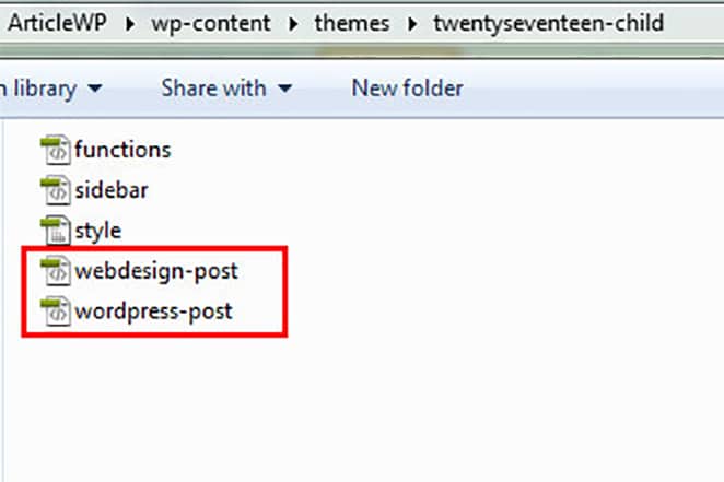
Now, go back to the child theme’s sidebar.php file and add a simple condition to check which template is in use. For this, we’ll use theis_page_template() function.
The code is self-explanatory. It checks which template is in use and sets the sidebar accordingly. If none of the conditions are fulfilled, it will use the default sidebar.
[php]
<?php
if ( is_page_template(‘wordpress-post.php’) ) {
dynamic_sidebar( ‘sidebar-4’ );
}elseif ( is_page_template(‘webdesign-post.php’) ){
dynamic_sidebar( ‘sidebar-5’ );
}else{
dynamic_sidebar( ‘sidebar-1’ );
}
?>
[/php]
Now let’s create a new post and assign one of the templates we just created.
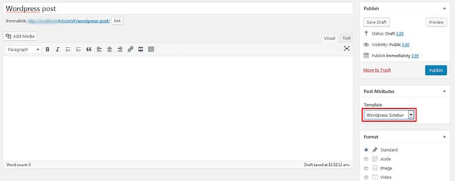
You will see I’ve selected the WordPress sidebar for this particular post.
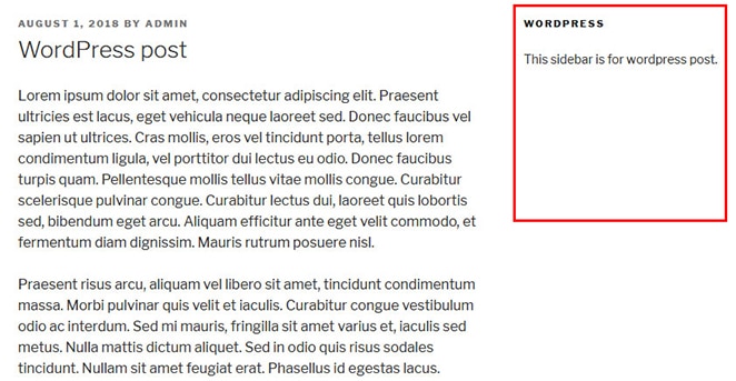
Category-driven approach
For this example (changing the sidebar based on post categories), a category-driven approach will work better than the template-driven approach. To do this, you’ll need to adjust the condition in sidebar.php based on the category instead of template usingin_category() function.
[php]
<?php
if ( in_category(‘wordpress’) ) {
dynamic_sidebar( ‘sidebar-4’ );
}elseif ( in_category(‘web-design’) ){
dynamic_sidebar( ‘sidebar-5’ );
}else{
dynamic_sidebar( ‘sidebar-1’ );
}
?>
[/php]
Now if you edit or create a new post, just add your desired category. It’ll display the sidebar accordingly, so there’s no need to choose any template! Here we’ve chosen web design as my post category, so the web design sidebar will appear.
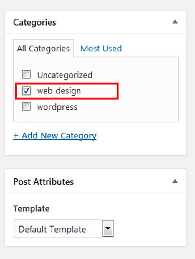
Basically, you just need to adjust the sidebar.php condition according to your specific requirements.
How to create custom sidebars with WordPress plugins
If you’re having trouble creating sidebars manually, you can try some handy WordPress plugins that allow you to easily create them!
One such plugin is Content Aware Sidebars. It’s a simple plugin that lets you dynamically create sidebars on individual pages, posts, categories, etc.
Once installed, you will see a Sidebars menu in the admin panel.
Sidebars > Add New
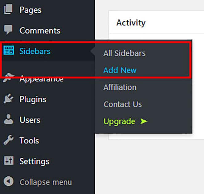
First, add a name to your sidebar. You can then set display conditions from the Sidebar Conditions dropdown. A sidebar can have multiple conditions like pages, posts, categories, author, etc.
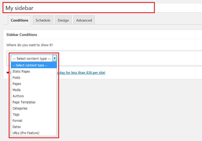
You can schedule your sidebar from the schedule tab, and alter HTML tags in the design tab.
You will see an Options box on the right side. From there, you can set the location and rules of your new sidebar. You can also perform actions, such as creating a shortcode of your sidebar.
Once your sidebar is published, you can access it from the Appearance > Widgets section.

This new sidebar will appear on pages and posts automatically, as per your settings.
The plugin also allows you to select sidebars when editing each post or page, regardless of your initial settings.
Within a post or page, you’ll see a Sidebars – Quick Select panel on the right side that will show you all the existing sidebars. From there you can select your sidebar in the target location set previously in the initial settings.
For instance, we had previously created My sidebar and the target location was Blog Sidebar, so in the Quick Select panel, My sidebar will be available for Blog Sidebar only.
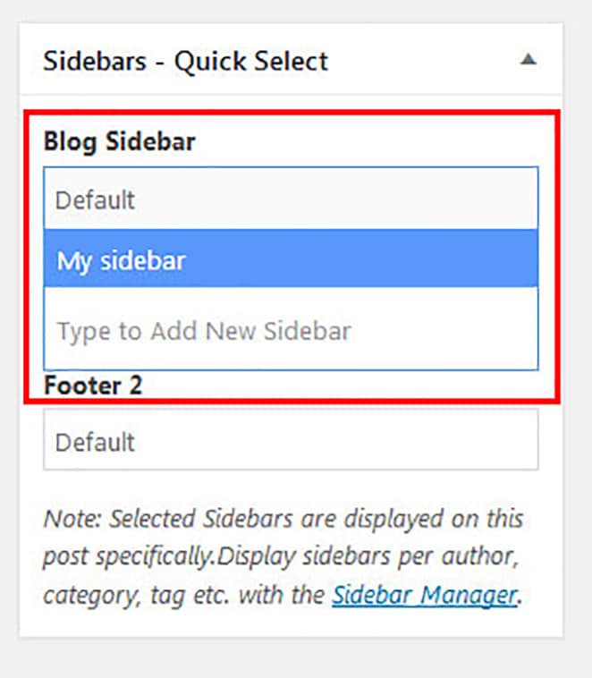
You can also create new sidebars, however, from the edit page section. Just type the name of your new sidebar and publish or update the page.
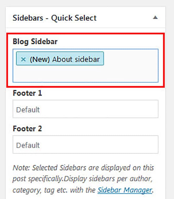
If you create a new sidebar, you’ll just need to activate it in the Appearance > Widgets section.

Note: You can also assign sidebars to your pages, but make sure your page template includes a sidebar. Without that, the sidebar will not be displayed, even if you set it in the edit page section.
Conclusion

You’ve now seen two options for creating sidebars: manual development as well as with plugins. If you’re not comfortable with codes, then using a plugin might be the best option for you, but if you have a specific requirement and don’t want to add an extra plugin to your site, then you should go for the manual way. The important thing is to understand your requirements and then choose your best option!
You’ll also want to choose the best possible option when it comes to your WordPress hosting, and for that, you’ll need look no further than WP Engine! Our platform provides a solid foundation for any WordPress site. Check out our plans to learn more!
