Get Started


Key Takeaways
CTAs are crucial for converting visitors into customers. Designing effective CTAs involves choosing vibrant colors that contrast with the site, using action-oriented text, and creating a sense of urgency to drive conversions.
Action-oriented language boosts click-through rates. Using compelling words like ‘download,’ ‘try,’ or ‘start’ can significantly improve user engagement with CTAs.
Placing CTAs strategically enhances conversion rates. Neil Patel’s research shows that placing CTAs below the fold can lead to higher conversions, especially for complex products.
Supporting CTAs with convincing messages can increase conversions. Including guarantees like ‘no risk’ or testimonials around CTAs can help hesitant prospects take the desired action.
You know the main goal for your website, but do your visitors? You might have the best product on the web, a gorgeous website with a user-friendly interface, and loads of traffic generation from your effective SEO techniques. But if it isn’t crystal-clear what you want your visitors to do when they land on your…
You know the main goal for your website, but do your visitors?
You might have the best product on the web, a gorgeous website with a user-friendly interface, and loads of traffic generation from your effective SEO techniques. But if it isn’t crystal-clear what you want your visitors to do when they land on your site, you’ve lost them.
Read on for some tips for getting your users to interact with your site in all the right ways.
What is a CTA?
A call to action, or CTA, is a rallying cry that appears on your website and invites readers to take a specific action. Its primary job is to grab people’s attention and nudge them into doing something that leads them down your conversion funnel.
Common CTAs include:
- Download an ebook, guide, or coupon code
- Sign up for an email newsletter
- Start a free trial
- Learn more
- Add to cart
- Get a free consultation
CTAs can take several different forms, including underlined text, icons, and images, though buttons are generally the most common.

The Importance of Your CTA
Your CTA is the fundamental step that turns visitors into customers; it’s the gatekeeper to the success of your brand. As such, they demand their own design rules. With minor changes having the potential to make a huge impact on conversions, it’s essential that your CTA is well-designed.
Here are ten best practices for designing wildly effective CTAs.
1. Choose your colors
The color of your CTA button is one of the most important design choices you’ll make. It needs to be visually striking so it stands out from other elements on the page.
There’s a lot of debate over which color performs best for CTAs. The fact is no single color is a magic converting wand—it depends on several things, including your audience and the color scheme of your site.
Visual hierarchy, however, does matter, so the color you choose should stand out from everything else on the page. For this reason, contrasting colors are the way to go.
Choose a vibrant color that contrasts with the rest of your site, yet fits in with the overall design.

2. Give it room to breathe
Do you work best on a nice, clear desk with lots of space around you or surrounded by mess and clutter? For most people, a clean desk equates to a clear mind and the ability to maintain focus.
The same applies to your CTA. Including a healthy chunk of negative space around it creates essential breathing room, separating it from other elements on your interface. The fewer distractions you include around the all-important button, the greater your chances of making a conversion.
3. Use action-oriented text
Forget dull, boring copy, like “enter for more info,” and whatever you do, don’t expect people to “submit.” If you want to encourage your readers to take a specific action, use compelling, action-oriented language, like “download,” “try,” “join,” or “start,” so people are clear about what they need to do next.
Your text should be brief—ideally between two and seven words—but it should communicate exactly what the visitor will receive when they follow the action. This is not the place to experiment with clever or confusing words.
Research has shown that the more personal the message, the more successful it will be. Simply changing “Create your account” to “Create my account,” or “Start your free 30-day trial” to “Start my free 30-day trial” can improve your click-through rates significantly.
4. Add a value proposition
In addition to compelling your readers into a certain action, your text should convey the benefits they’ll receive when they click through. If your on’t make it clear what exactly they’re getting, they have little reason to follow your instructions.
You can see a great example of this on Copyblogger:
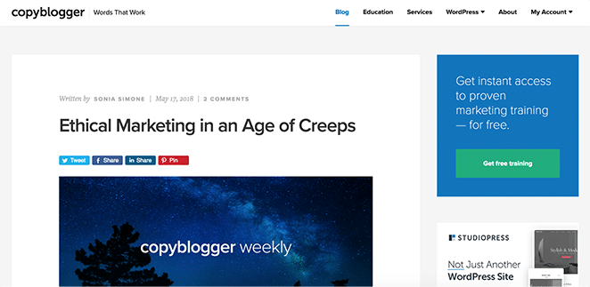
Copyblogger incorporated the word “free” in its text, which is a great persuasive word. Words like “bonus” or “instantly” will have a similar effect.
5. Create a sense of urgency
Emotion is a great driver when making a purchase. One emotion that’s great for lead generation is curiosity, and a great way to pique somebody’s curiosity is by stoking a feeling of urgency or scarcity.
By making a time-limited offer and combining it with a benefit, such as a free ebook or a discount if you sign up within a specific timeframe, you’ll motivate people to claim the offer while its available. FOMO (fear of missing out) can be a powerful motivator to taking action. Even using the word “now” can convey a subtle sense of urgency.
6. Consider your placement
The placement of your CTA is a hot topic. Traditionally, above the fold was seen as the ideal spot, so it’s unmissable when people land on the page.
But this isn’t always the case. If you’re in a shop and the salesman jumps in with his “buy now” spiel before describing the benefits of the product—before you’ve even fully walked in the door—you’re likely to back away from the purchase.
Neil Patel discovered that people generally wanted to know more about an offer before signing up – his research saw a 17% decrease in conversions when the CTA was placed above the fold. This is especially true if your product is complex and people need to know more before making the commitment.
At the end of the day, if your offer is compelling enough, people will find the CTA; don’t force it on them before they might be ready. If you have a long-form sales page, sprinkling a few CTAs down the page is good practice, as it gives people the opportunity to make the conversion as soon as they’re ready.

7. Special effects
Don’t reinvent the wheel when it comes to the design of your CTA button. The button should look like a button, so people know it’s clickable.
The button should be a good size—large enough so that it stands out at a glance, but not so big that it dominates the rest of the content. The shape of the button can affect its success, with rounded corners being easier on the eyes, and you can play around with special effects such as shading, 3D effects, subtle gradients, and arrows, or include PayPal or card logos for added peace of mind.
Finding the right balance between being big and bold without being overbearing is the key to an effective CTA. Essentially, the more noticeable the button, the more likely that people will click through.
8. Reduce options
Offering too many options can lead to decision paralysis for your visitors, which could result in them clicking away from your site. Where possible, it’s best to stick with one option.
If you do need to include additional CTAs, always give more visual weight to the most important option. To do this, give the less-important option a lower contrast color or even make it transparent, as Starbucks did here.

Sometimes, including two options can help people feel as though they have more control over the process, which makes them more likely to convert. You can include a second option that simply reinforces the first, for example, “Yes please, send me the free ebook” and “No thanks, maybe later.”
You may have seen examples online of secondary buttons being used to shame visitors into making a certain decision. In these cases, the secondary button to “Yes please, send me the free ebook” might say “No thanks, I don’t like learning.” While this might entice some people into taking action, you’re likely to ostracize the very audience you’re trying to attract, so use this technique with caution.
9. Support with convincing messages
Adding supplementary text around the CTA button can help convince hesitant prospects to take the plunge. This is particularly useful if your CTA is encouraging people to sign up for a free trial.
Convincing messages can include guarantees such as “no risk,” “no commitment,” “no credit card required,” or “money-back guarantee.” You could also include testimonials from satisfied customers or privacy promises.
Netflix addresses the customer’s ability to “Cancel at any time” before its “Join free for a month” CTA.

10. Test, test, test
Once you’ve created your CTA and implemented these helpful tips, your job is not over! You need to check that your CTA is having the desired effect.
Carry out A/B testing to see how changes in color, message, offer, design, and placement affect your conversion rates. Play around until you’ve found the right combination—sometimes tiny, easy-to-make changes can make a huge difference. And don’t forget to periodically check in to see that the CTA continues to be effective.
To ensure your audience is getting the best possible user experience, from your headline to your final CTA and everything in between, make sure you choose a fast, performant hosting provider for your WordPress site!