
8 Best Fonts for Your Website
The font you use on your website says a lot about your brand. Each web font has its own unique set of traits and helps to relay the message of your business. However, given the wide array of choices, it can be difficult to decide which option would be the right one for your site.
Fortunately, there are many factors that can help you choose a typeface for your brand. By looking at some examples and their uses, you’ll be able to select a font that communicates your brand’s story and personality.
In this post, we’ll look at the different types of fonts and their characteristics. We’ll then review some of the best web fonts for business websites. Finally, we’ll share some tips to help you choose a style for your site.
Let’s get started!
An introduction to fonts
Fonts are an important feature that helps round out the visual identity of your website. You might be able to recognize some common fonts, like Times New Roman in a heading and Arial in the body of a post, but there is more to fonts than meets the eye.
According to a Senior User Experience Researcher at YouTube UX Research your visitors will judge your business within 50 milliseconds, and your site design—including the font you choose—plays a big role in that initial judgment.
There are more than 550,000 fonts available online, and most of them can be classified into one of four categories: serif, sans serif, script, and display/decorative. Let’s take a look at the distinguishing features of each of these groups.
Serif
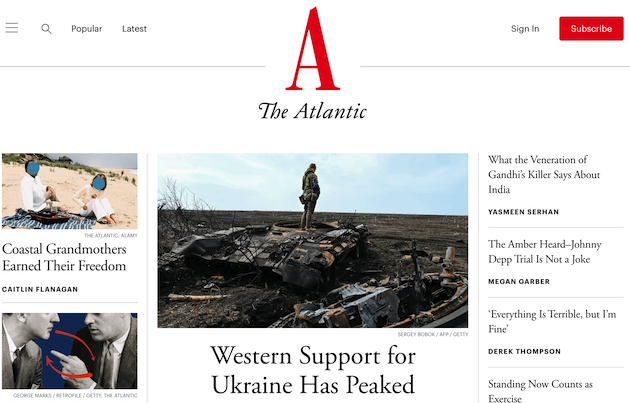
Serif fonts are categorized by the small lines at the ends of each letter which are called “serifs.” This style is usually found in traditional print cases, like newspapers and textbooks. Additionally, many news websites like The Atlantic use serif fonts:
Popular examples of serif fonts include Times New Roman and Verona. This font family communicates a sense of tradition and formality.
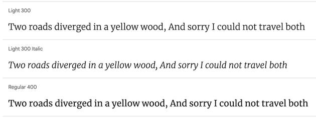
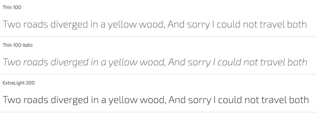
Sans serif
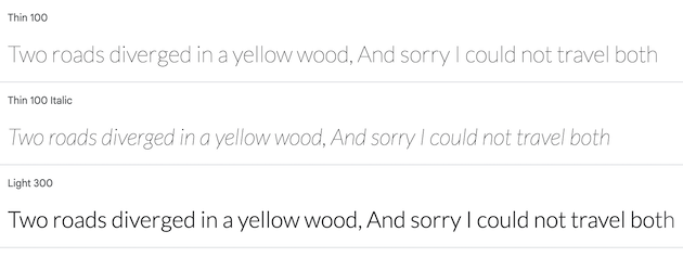
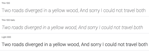
Sans serifs are the most ubiquitous font style on the internet. They are clean and simple, and come without any bells or whistles. Sans is the French word for “without,” so sans serif literally means, “without serif.”
Sans serifs tend to convey a sense of authority, trust, and modernity, which is why they are widely used on corporate sites:

Popular sans serif styles include Open Sans and Arial, and they lend a contemporary look to a project.
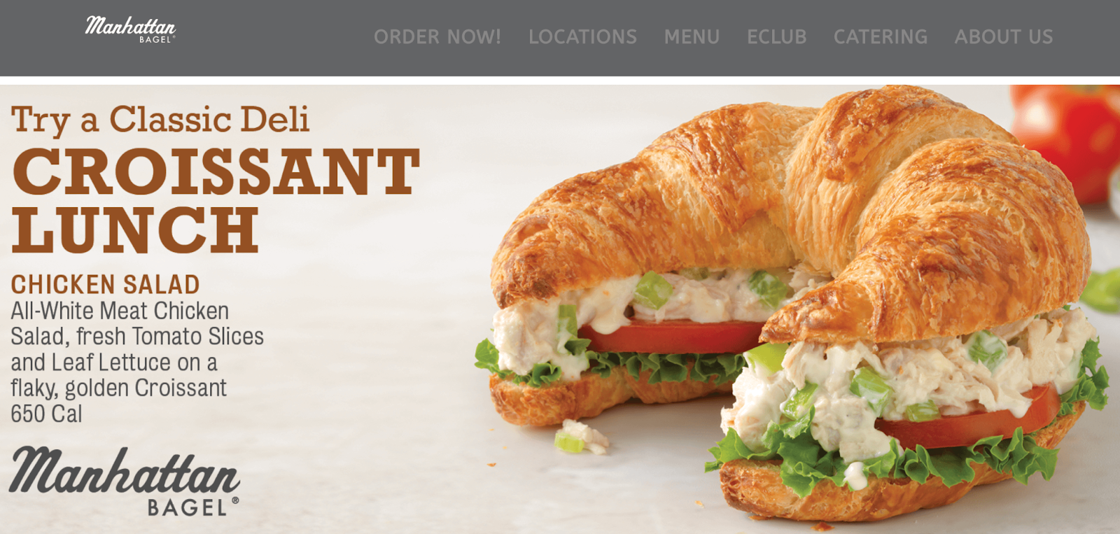
Script
As the name suggests, script fonts (or cursive fonts) resemble handwriting. They are lively and fun, and can therefore be used to relay creativity and playfulness:

Lobster and Pacifico are two examples of script fonts. Since these fonts tend to be more artful they are usually found in ads that promote festivals and events.
Display
Display (also called decorative) is the most distinctive font group. These fonts tend to be quirky and far from the traditional serif and sans serif fonts. They are often used in headings or logos:
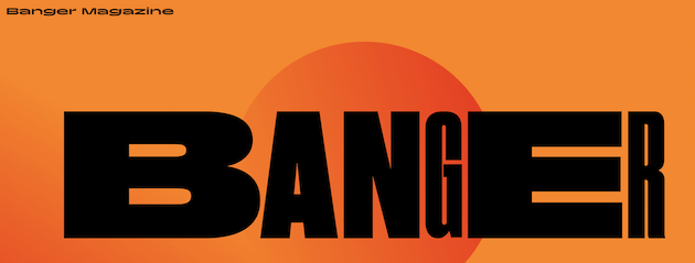
This typeface is bold and creative. You can find decorative fonts on a variety of sites, including cultural blogs and artisan boutiques.
What to keep in mind when choosing a font
There are many things to consider when it comes to choosing a font for your website. First, you’ll want to think about the values that you want to communicate.
For example, if you’re a professional corporation with high-profile clients, you wouldn’t want to choose a font that conveys informality or playfulness. On the other hand, if you’re a small business that sells artisanal pottery and other crafts, a plain and serious typeface might not reflect the artistic values of your brand.
Your font gives your site a certain vibe. Therefore, it’s important to choose a typeface that helps you elicit the response from your visitors, whether that be a sense of dependability and trust, playfulness and joy, openness and transparency, or something else entirely. .
Readability is another important aspect to consider. When your font is clean and simple, it makes your text easier to read. While an elaborate header can help catch a user’s attention, a simpler typeface is better for the body copy of your posts and pages.
Additionally, you’ll want to make sure that your fonts are user-friendly. Choosing the a typeface that helps people with dyslexia and visual impairments navigate easily can say a lot about your brand. It shows that you are an inclusive business and makes your website accessible to a wider audience.
8 best fonts for your website
Now that you know a bit more about fonts and how they’re used (for more on that, check out our deep dive into the psychology behind great design!), let’s take a look at eight styles that can be found on Google Fonts.
These fonts differ in characteristics, which will make certain choices better suited to different types of websites, but all of them are free to use and look great on WordPress.
1. Merriweather
Merriweather is an excellent choice if you want something readable and modern. Although it is a simple font, its subtle strokes give it a more playful side. It’s a good option for those who want to come off as professional but not too serious or stuffy.
2. Exo
Exo is a quirky option that has a futuristic style. It’s also clean and very readable. Its geometric features and versatile weights make it a great choice for IT and tech companies.
3. Corinthia
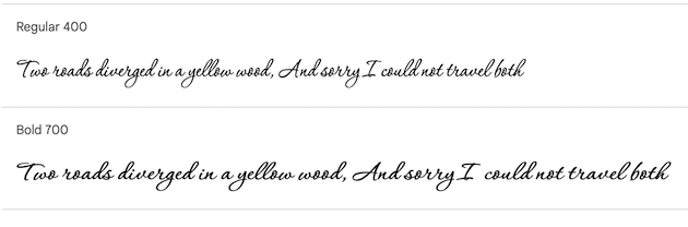
Corinthia falls under the script category and communicates a sense of creativity. It resembles cursive handwriting and could be ideal for a boutique shop or an artisan’s website. It would be best to use this font for page titles or headings (and not for longer texts), as its loops and curves can make it slightly difficult to read.
4. Alegreya
Alegreya is another serif typeface that you can use on your website. It was originally created for literature, so it is ideal for long texts. It would also work well for literary blogs or virtual bookshops.
5. Open Sans
Open Sans is a basic sans serif font. It can be used for a professional website with a minimalist design. It could also be ideal for longer texts due to its legibility and user-friendliness.
6. Playfair Display
Playfair Display is a serif font that is often used in fashion magazines and editorial content due to its elegant style. It could also be a good option for professional portfolios or luxury brands. It is versatile and has numerous weights to choose from, and you can pair it with a more decorative font for your headings.
7. Lato
Lato is a bare-bones font that has a clean and modern feel. It is a member of the sans serif family, and it would be a good fit for a corporate website or a business looking to build credibility. You can pair it with a font that is slightly more lively, depending on the vibe you’re going for.
8. Roboto
One of the most popular fonts on the internet, Roboto is used as the default tyepeface for Chrome OS, and it is a readable and accessible option. It is therefore a good font for websites and businesses that want to communicate reliability and familiarity.
How to choose the right font for your website
Now that we’ve gone over some recommendations, let’s take a look at how to choose the right font for your website. Here are some things to consider before making a decision.
Step 1: Think about your brand voice and values
When deciding what typeface to choose, it’s important to think about the characteristics of each option to see if it aligns with your brand voice and values. Ideally, you’ll want to help tell your story through your font choice.
For example, do you want your website to relay professionalism, or playfulness? Try to come up with a list of adjectives and look for fonts that communicate your desired traits.
Step 2: Test the font on different devices
Once you’ve narrowed down your options, try viewing each typeface on different devices. This way, you can make sure that they are readable and responsive. Readability is important for both your visitors and your site’s Search Engine Optimization (SEO).
Just because your page looks amazing on a laptop, it doesn’t mean it will render well on a mobile device. If a font looks off on any given preview, you might want to eliminate that choice and move on to your next one.
Step 3: Rank each font by significance
As a general guideline, you’ll want to use a maximum of three fonts on your site. Any more than that can make your site less accessible and look a bit messy.
Once you’ve chosen your top three options, decide which one will be your primary font. This will be at the front and center of your website, used for important elements like your banners or headers.
Your secondary will serve as the bulk of your written content, including the body copy of your pages and posts as well as secondary text on images.
You can use a third option for calls to action (CTAs) and logos. Feel free to tinker with different fonts to see which ones look best together before making your final decision.
Conclusion
Fonts can help you tell the story of your brand. Choosing the right typeface will enable visitors to better understand your message and values. Additionally, it can help you build brand recognition.
If you want to communicate reliability and professionalism, you can use a serif font like Playfair Display and Merriweather. Alternatively, you might want to go for a fun cursive style, such as Corinthia. Meanwhile, a clean sans serif typeface like Open Sans can make your content more readable.
At WP Engine, our powerful hosting service ensures your site always loads to pixel perfection, helping you grow your online business. Check out our hosting for WordPress plans today!