Get Started

Key Takeaways
Pixels are the foundation of consistent design. Understanding CSS units like em and rem can enhance layout adaptability and ease of scaling.
Viewport-relative units offer responsive design solutions. vh and vw provide dynamic sizing based on screen dimensions, ideal for full-height elements and typography.
Font-relative units simplify design scalability. Em and rem units streamline font-size adjustments across elements, reducing manual tweaking.
Consider absolute CSS units for print CSS. Units like in, cm, and mm are more suited for print design rather than screen layouts.
CSS units are one of the most fundamental aspects to consider while creating a site layout. These units will define how your design will interact on various devices.
But when it comes to CSS units, there are many options to choose from and all options are not equal. CSS units are not limited to fonts only, so as a front-end developer, you should understand how these units affect layouts, also.
In this article, we’ll show you how different CSS units work, so you can use them to create better layouts and site designs. Here’s what we’ll cover:
Types of CSS units
CSS units can be separated in the following categories:
- Absolute CSS units
- Font relative CSS units
- Viewport relative CSS units
Absolute CSS units
Some CSS units depend on certain absolute values and are not affected by any screen size or fonts. These units display may vary depending on different screen resolutions, as they depend on DPI (dots per inch) of screens.
These units are:
- px (pixels)
- in (inches)
- cm (centimeter)
- mm (millimeter)
- pc (picas)
- pt (points)
Pixels
Pixels are the most commonly used and accepted CSS unit. And it’s considered the base of measurement for many other units. It provides the most consistent result among various devices.
The box element in the following example has a height of 150px and width of 150px, and it will remain the same on all screen sizes.
.box {
    height: 150px;
    width: 150px;
}
All other absolute units like in (inches), cm (centimeter) and mm (millimeter) are real-world measurement units with very little real-world CSS use cases.
It’s still good to understand their relationship to pixels, however, so this is how they compare:
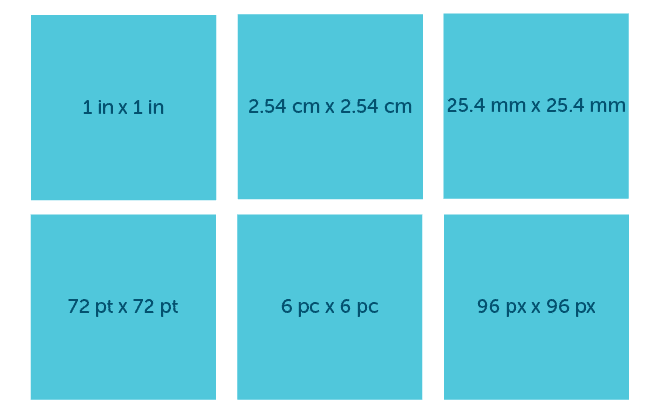
- 1in = 96px
- 1cm = 37.8px
- 1mm = 3.78px
While pc (picas) and pt (points) are directly related to inches.
- 1in = 72pt
- 1in = 6pc
The relation between all absolute units can be demonstrated like this:
Rem
Apart from pixels, all other absolute units have very little to no use cases for screen CSS, but since they are real-world measurement units, they can be effectively used in print CSS. (In case you are wondering about pixels, they work fine in print CSS as well!)
Font-relative CSS units
There are some CSS units which depend on the font size or font family of the document or its parent level elements. This includes units like:
- em
- rem
- ex
- ch
Em
Em is a relative length unit; it depends on the font size of the parent element or the document. By default, 1em is equal to 16px if is no font-size is defined.
Em inherits size from its immediate parent’s font size. So, if a parent element has font-size:18px, then 1em will be measured as 18px for all its child’s.
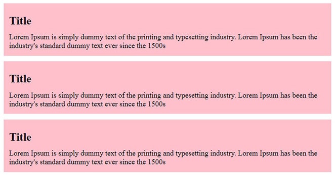
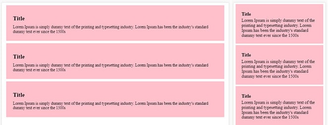
Here we have a div .post with three childs, .post-item, with a title and some text.
<div class="post">
    <div class="post-item">
        <h2>Title</h2>
        Lorem Ipsum is simply dummy text of the printing and typesetting industry. Lorem Ipsum has been the industry's standard dummy text ever since the 1500s
    </div>
    <div class="post-item">
        <h2>Title</h2>
        Lorem Ipsum is simply dummy text of the printing and typesetting industry. Lorem Ipsum has been the industry's standard dummy text ever since the 1500s
    </div>
    <div class="post-item">
        <h2>Title</h2>
        Lorem Ipsum is simply dummy text of the printing and typesetting industry. Lorem Ipsum has been the industry's standard dummy text ever since the 1500s
    </div>
</div>
Now the parent .post has a font-size:20px and the child element .post div has its own font-size:1.2em with padding:0.75em and margin:0.75em, so the computed padding and margin will be 18px (20px*1.2em*0.75em).
html {
    font-size: 20px;
}

.post {
    font-size: 20px;
}

.post div {
    font-size: 1.2em;
}

.post-item {
    background: pink;
    margin: 0.75em;
    padding: 0.75em;
}

.post-item h2 {
    font-size: 1.5em;
    margin: 0.5em 0;
}

.post-item p {
    font-size: 1em;
    margin: 0;
}
As you can see, the child elements are inheriting values from the parent.
The advantage of using em is, if you decide to change the font-size, padding, and margin of each element proportionately, then you just have to change the parent element font size and all other elements will adjust accordingly.
That won’t be the case with absolute units like px, where you have to adjust each element individually.
This inheritance nature can be a bit tricky to manage, however, if nested elements have their own font-size in em, too.
Like in the previous demo, if you wrap the title and paragraph inside another div in one of the child items, you’ll will see strange results.
<div class="post-item">
    <div>
        <h2>Title</h2>
        Lorem Ipsum is simply dummy text of the printing and typesetting industry. Lorem Ipsum has been the industry's standard dummy text ever since the 1500s
    </div>
</div>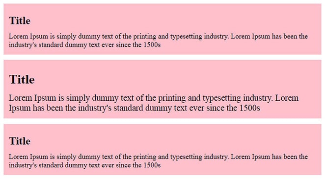
Because post-item has a nested div, the base size will change from 24px to 28.8px (20px*1.2em*1.2em), and font-size and margin for h2 will change to 43.2px (20px*1.2em*1.2em*1.5em) and 14.4px (20px*1.2em*1.2em*0.5em), respectively.
Rem
Rem can be really helpful in these types of situations because they always refer to the root element font size, not the parent element.
If you take the previous example and change the units from em to rem for .post div, you’ll see all child elements fix themselves.
.post div {
    font-size: 1.2rem;
}
Once the unit is changed from em to rem, its base changes from parent div to root element, which has a front-size:20px.
So, the calculation will be 20px*1.2rem*value and h2 and p both will have consistent font-size and margin, regardless of their parent.
Ex
Ex is relative to the x-height of the current font and it’s very rarely used. The x-height measurement is not consistent; sometimes it comes from the font itself and sometimes the browser calculates itself.
Like em and rem, it depends on font but the major difference is that ex will change when you change the font-family too, which is not the case with the other two.
.box {
    width:150ex;
    height:150ex;
}
Ch
Ch is similar to ex but it doesn’t depend on the x-height; rather on the width of the zero (0) character. It also changes with font-family.
.box {
    width:150ch;
    height:150ch;
}
Viewport-relative CSS units
There are a few units that depend on the viewport height and width size, such as:
- vh (viewport height)
- vw (viewport width)
- vmin (viewport minimum)
- vmax (viewport maximum)
Vh
Vh (viewport height) is measured as 1vh equal to 1% of the viewport’s height. This unit is very useful for creating full height elements. Vh reacts similarly to percentage, but doesn’t depend on the parent element height.
You can use vh anywhere but the most common use case of vh is for making full height elements. In this example, the full-height class will create a blue container which will be 100% height of the viewport.
.full-height {
    height:100vh;
    background:blue;
}
Vw
Vw (viewport width) is similar to vh but it considers the width, rather than height of the viewport. 1vw is equal to 1% of the viewport width. These units can be really helpful if you want to create a responsive viewport based on typography.
In this example, font-siz of h1 is 6% of the viewport width, so if viewport width is 1000px, the font size will be 60px, and if the viewport is 500px, the font size will be 30px.
h1 {
    font-size:6vw;
}
Vmin
Vmin is calculated on the basis of the minimum value of the viewport’s width or height, whichever is smaller. Say you have a viewport size of 1000px tall by 800px wide. 1vmin will be equal to 8px.
Vmax
Vmax is calculated exactly the opposite of vmin, where the maximum value is considered of the viewport.
Like the previous viewport example with 1000px tall by 800px wide, 1vmax will be equal to 10px.
Now let’s explore how you can use vmin and vmax effectively. Using our previous example, let’s say we want to have a fluid padding and margin based on the viewport size now, rather than a fixed value.
In this code snippet, I’ve set the padding to 3vmax and margin to 1.5vmin.
.post-item {
    background pink;
    padding:3vmax;
    margin:1.5vmin;
}
The padding and margin will change according to the viewport size.
Percentage(%) unit
Percentage(%) unit doesn’t belong to any particular category mentioned above, but can be categorized as a relative unit. It is relative to its parent element.
Percentage is primarily associated with height and width of an element, but can be used anywhere where CSS length units are allowed.
Percentage is one of the most useful CSS units for creating a responsive or fluid layout. Popular frameworks like Bootstrap, foundation, and Bulma use percentage for their base layout.
Here the full-width class will be of 100% width of its parent element.
.full-width {
    width: 100%;
}
Keep best practices in mind with WP Engine
This article has discussed nearly every CSS unit that is ready for application. Your goals will undoubtedly dictate which CSS units are the most appropriate. As a front-end developer, familiarizing yourself with the best practices for CSS units is pivotal, since you never know when they might come in handy in your upcoming project.
When you’re ready to focus more on site design elements like your CSS and less on the ins and outs of hosting for WordPress sites, talk with an expert at WP Engine to discuss your options!