Get Started


Key Takeaways
Exceptional WordPress web design requires expertise and effort. Understanding design principles and exploring successful examples are crucial for visually stunning and functional sites.
WordPress is a powerful platform for eCommerce web design. Top-tier strategies can elevate user experience and branding, as seen in examples like Joco Cups and Mowellens.
WordPress blogs can be both engaging and beautifully designed. Sites like 99U and The Sartorialist showcase how WordPress can enhance content delivery and aesthetics.
WordPress offers user-friendly web design for businesses. Platforms like Time and Proske demonstrate the adaptability and simplicity of WordPress for impactful online presence.
Looking for web design inspiration? When you’re creating or overhauling a website, inspiration is key. No matter the type of website you are developing, there are exceptional and prosperous instances of WordPress web design out there that can guide you on how to make your WordPress site visually stunning and highly functional!
Unlocking exceptional web design with WordPress: Key factors for inspiration
Creating an impressive WordPress web design doesn’t just happen spontaneously. It requires expertise, patience, and consistent effort. To achieve a successful WordPress website design, having an understanding of design principles, color theory, and fundamental visual art concepts is crucial. Also, exploring exemplary instances of well-crafted WordPress web designs can offer a wealth of inspiration and guidance. Achieving high-quality WordPress web design isn’t a quick process, but the end results are worth the effort!
Below, we’ll take a look at some of the best examples of inspiring WordPress website designs, including:
- WordPress website designs for eCommerce
- Inspiring WordPress blog designs
- WordPress business website designs
- High-traffic WordPress website designs
- WordPress website designs for agencies
- Interactive WordPress website designs
WordPress website designs for eCommerce
Implementing top-tier strategies for WordPress web design can notably elevate your eCommerce site. The given examples demonstrate how to achieve a visually stunning and user-friendly design that significantly enhances the overall user experience on your WordPress platform.
1. Joco Cups

JOCO Cups Demonstrates that WordPress web design for eCommerce sites can be far from old-fashioned or clunky. This elegant and contemporary design mirrors the trendy appeal of their products— an excellent illustration of harmonious branding!
Related Articles:
- Save Time and Money: Change Your WordPress Theme
- 4 Ways Web Designers Can Use Digital Marketing
- 10 Top WordPress Themes for Designers
- A Guide to Web Content Strategy
- Finding the Right Partner for Your Web Design Business
2. Solasie
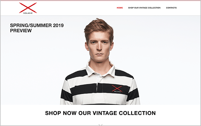
This European fashion eCommerce site incorporates distinctive features and an upbeat design aesthetic, perfectly harmonizing with their selection of vintage items. Their seamless utilization of the WordPress web design showcases an intuitive interface, enhanced by the strategic use of WooCommerce and other exceptional WordPress plugins. This encapsulates how spectacular WordPress web design can revolutionize your eCommerce business.
3. Mowellens
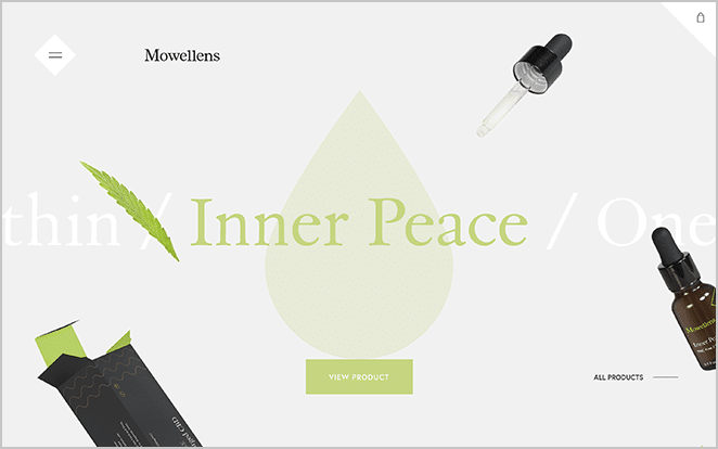
This exceptional WordPress web design demonstrates the engaging and clean-cut aesthetics of an eCommerce site. The unique scrolling style and product-centric layout reflect the creative potential of incorporating WordPress into your web design strategy for an eCommerce platform. Mowellens’ site is an excellent example of the innovation and user-friendly interface achievable through WordPress web design.
4. Over Clothing
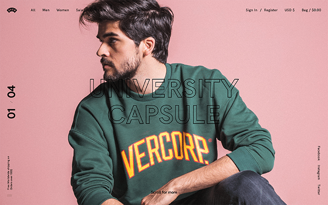
With a dynamic home page and minimalist design on their product pages, you’d almost think this Over Clothing is an agency or portfolio site with just a passing look. Plus, you might want to grab some swag from their clothing created by designers, for designers.
Inspiring WordPress blog designs
WordPress is widely recognized as an excellent CMS platform, not just for bloggers, but also for state-of-the-art WordPress web design. These impressive sites showcase both engaging content and striking WordPress web designs, offering an inspirational resource for those seeking design ideas or considering adopting WordPress for their own site design. Explore these sites and you could discover your new go-to source for WordPress web design inspiration and insights!
5. 99U
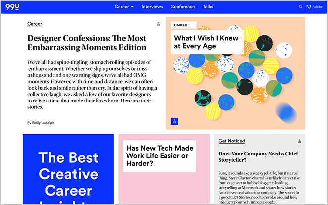
If you love Adobe, you definitely need to check out their blog! They produce great content on trends, tutorials, and other fun inspiration. They also have a beautiful design, which is a no-brainer considering many people look to them as a thought leader in the field. But did you know their blog is on WordPress?
6. 99% Invisible
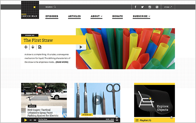
Though 99% Invisible is well known for its podcasts, they also offer a compelling blog and diverse web content, much adored by developers and creatives alike. Adding the cherry on top, it’s all curated and maintained using an excellent WordPress web design!
7. The Small Things Blog
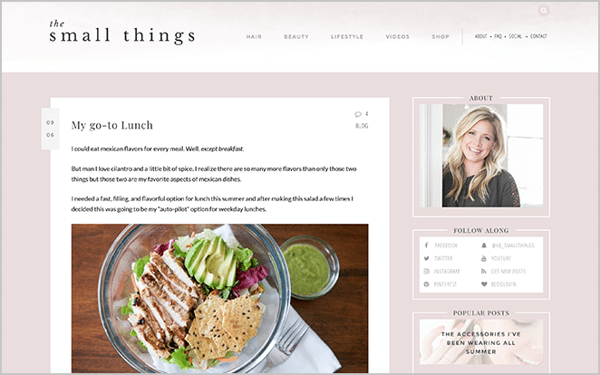
The Small Things Blog beautifully showcases the power of WordPress web design. As a self-starter, she manages all the content using WordPress, demonstrating its user-friendly aspects. While Kate, the owner, collaborated with a website designer and developer for the site creation, WordPress gave her effortless control over her blog’s technical elements.
8. The Sartorialist
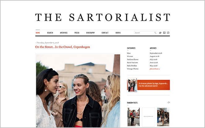
The Sartorialist effectively demonstrates how minimalist aesthetics can significantly enhance your blog concept. This blog ignites global fashion dialogues, and with WordPress web design, it flawlessly simplifies the execution of its mission. WordPress web design tools enable it to maintain its clear-cut structure, giving the blog its unique charm and making it a great model of successful web design practices.
9. The TED Blog
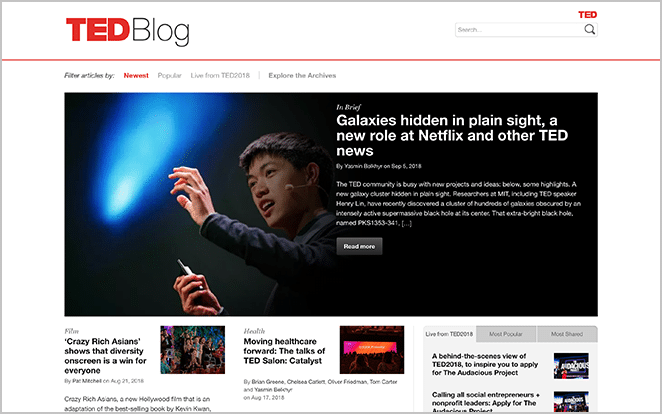
If you’ve ever been inspired by a TEDTalk, you’re bound to find some insight from their blog as well! They cover content from internal company content to pop culture to motivational interviews.
WordPress business website designs
Businesses often choose WordPress for web design due to its comprehensive content management system, allowing for effortless website management. This user-friendly platform empowers all team members, even those without technical expertise, to make alterations and complete tasks. The popularity of WordPress web design lies in its simplicity and adaptability, making it an ideal choice for businesses aiming to maintain an impactful online presence.
10. Time
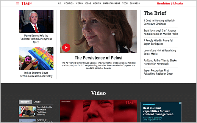
Time is one of the biggest news and entertainment companies in the world, and they run their business largely online (as well as in print) to keep up with the digital age. With so much content each and every day, it only makes sense to have a content management system. Plus, their site looks great—they’re the perfect place to start looking for your web design inspiration.
11. Eginstill

Experience the stylish elegance of this one-page WordPress web design, artfully showcasing the outstanding portfolio of this interior design boutique. Their website, constructed on WordPress, incorporates a seamless scroll through past projects on the sidebar, perfectly aligning with their refined aesthetic. Explore their WordPress web design for a captivating blend of style and functionality!
12. Offset
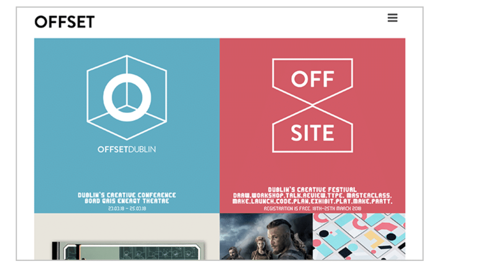
The Offset team masterfully demonstrates that they’re anything but traditional with their highly impressive WordPress web design. Their innovative use of vibrant color schemes and unique card styling ensures an engaging user experience that keeps visitors scrolling. This extraordinary WordPress website is a testament to their exceptional creativity and their impressive prowess in web design.
13. Proske
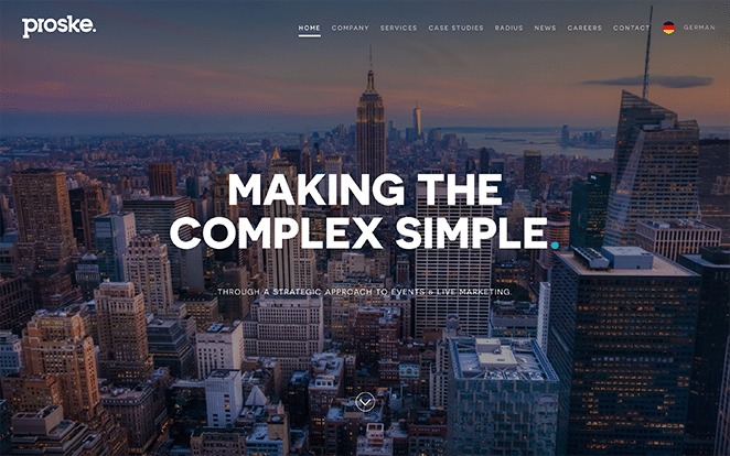
This German marketing firm excels in WordPress web design, transforming conventional layouts into visually dynamic platforms. Their proficient use of creative assets and projects serves as a compelling testament to the potential impact of WordPress web design. Their striking design strategies not only enhance the aesthetic appeal of websites but also significantly contribute to their marketability and uniqueness.
High-traffic WordPress website designs
Have you ever wondered what powers some of the most frequently visited websites? Surprisingly, it’s WordPress web design. For any significant site that requires unwavering performance in handling high-traffic volumes, WordPress proves itself to be a solid, dependable platform and hosting solution. WordPress web design is well-regarded and trusted among the internet’s most popular sites for its reliability and robustness.
14. The Guggenheim
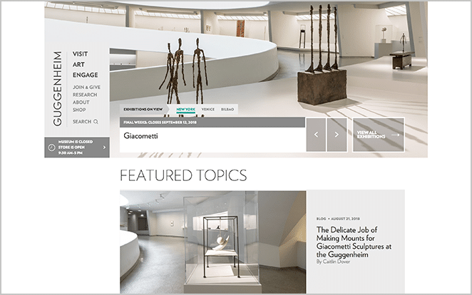
The Guggenheim museum’s website certainly meets the high calibre necessities of a contemporary art museum, offering a clean, up-to-date online experience. This exceptional digital representation is achieved through the proficient application of WordPress web design. The platform’s capabilities are perfectly harnessed to mirror the sleek and modern aesthetic of the museum itself, demonstrating how effective WordPress web design can elevate a brand’s online presence.
15. The Walt Disney Company
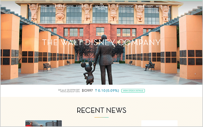
Everyone knows and loves Disney, so with such a dynamic and famous brand, they built a reliable yet whimsical website. This WordPress web design is robust, yet retains an element of charm, making it a preferred choice for both corporate and playful brands alike.
16. The New York Times

Renowned as a premier global news platform, The New York Times showcases its supremacy through its high-performing WordPress web design. The website is not only speedy and reliable despite its frequently updated content, but it also exudes aesthetic appeal. This underscores the effectiveness of WordPress web design in maintaining excellent performance while ensuring visually captivating interfaces. Hence, The New York Times serves as a model example of a thoroughly well-executed WordPress web design.
17. The Rolling Stones
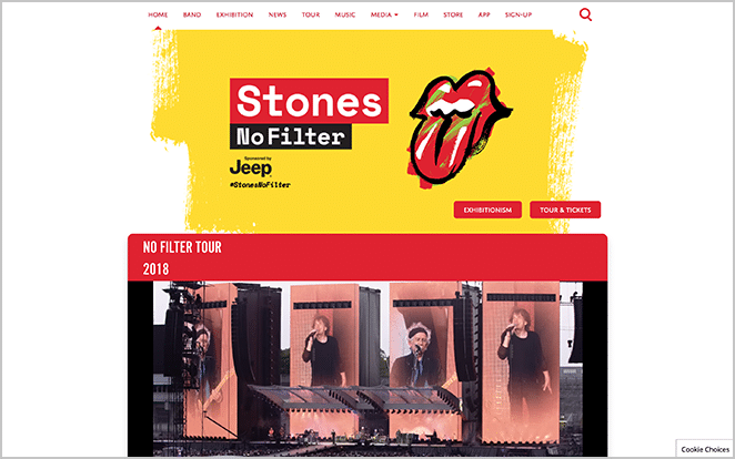
As an iconic b(r)and, The Rolling Stones has an infamous repertoire with a website to match. Their website is a home-base for fans that’s filled to the brim with tour dates, music, merchandise, band insights, and so much more.
18. Mercedes-Benz
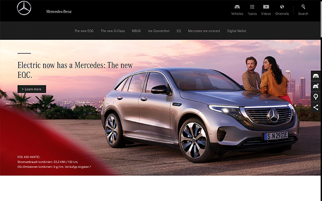
Another great business website is Mercedes-Benz. As a popular, worldwide vehicle brand, their site is versatile in order to service the wide range of customers looking for vehicles anywhere from small two-doors to tour buses.
WordPress website designs for agencies
If your digital agency is in the business of creating WordPress web designs, showcasing your own website crafted in WordPress is an ideal portfolio addition. Ranging from web design to event planning, these agencies have inventive, engaging WordPress web design examples that are sure to attract clients!
19. Iron to Iron

As a top-tier digital agency, this skilled WordPress web design team showcases the power and effectiveness of a sleek, straightforward website in enhancing a robust brand image without any compromise.
20. Pink Gorilla Events
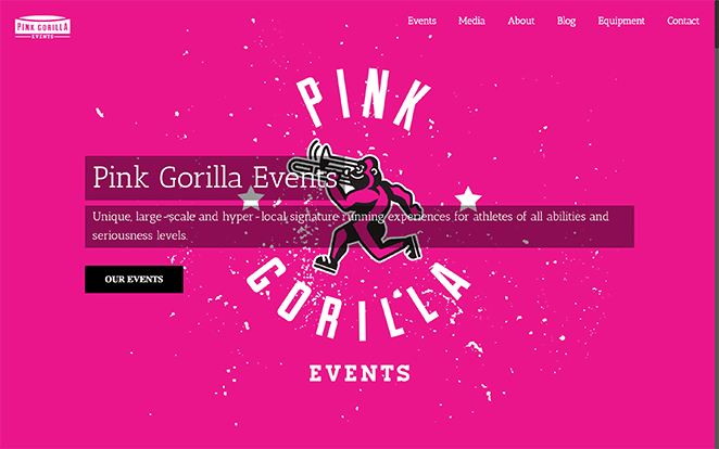
Don’t let the name of this Nebraska-based agency fool you. You can’t rent a pink gorilla for your event, but you can find an awesome event agency with a stellar WordPress website.
21. Wedge and Lever
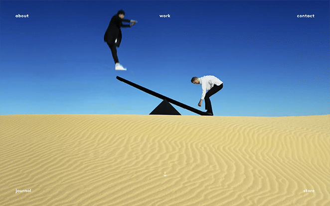
Even with the most literal interpretation of their brand, Wedge and Lever creates an engaging experience for their site visitors. If you’re looking for a new take on an agency site or a refreshing menu design, check them out!
Interactive WordPress website designs
Boost your conversion rates and minimize the bounce rate with an interactive and engaging WordPress web design. Ready to navigate through these compelling WordPress sites?
22. Cultivated Wit
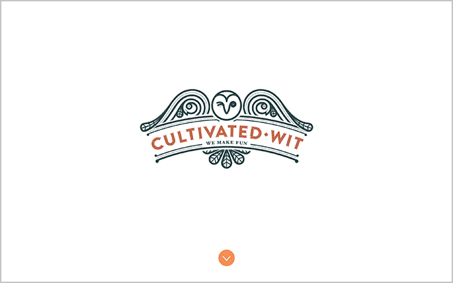
While this site seems like another stunning agency site, you’ll be pleasantly surprised at the whimsical details thrown into the interactive elements like the “Care to enter?” section or “Whiskey Friday” callout.
23. Velvet Hammer
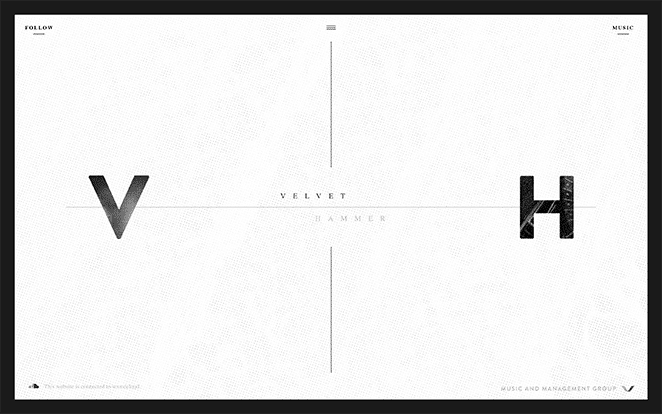
Velvet Hammer is a music and management business with a simple one-page WordPress site that comes to life as you click around and hover over content. You might also find your next favorite band while you’re there.
24. We Virtually Are

We Virtually Are, designed by Herdl, takes intentionality to a new level. If you really want to engage with their fluid site, be sure to scroll in the right directions and take in all their moving content.
25. Plane
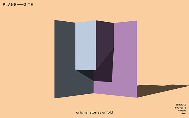
The captivating WordPress web design showcased on this site brilliantly encapsulates their narrative and purpose. Its engaging and visually appealing layout urges visitors to continuously explore its pages. This compelling demonstration of WordPress web design effectively heightens user experience and engagement.
Having explored the diverse ways that individuals and businesses are utilizing WordPress web design for creative expression, now is the perfect time to either revamp or build your own website. Have you come across any outstanding WordPress web design themes that have inspired you?
Want to find more inspiration for your WordPress website projects? Visit WP Engine to find out more about our industry-leading hosting for WordPress sites, or speak to a representative now!