Psychology of Design: Characteristics of Color
Whether you’re putting together a series of brand guidelines for a startup or refreshing an established brand, there’s a lot to consider about the overall feeling a design should impart on an audience. From the colors you choose and the open space you leave in a design to the fonts you use and where you place your clickables, every decision you make will affect the overall success of your branding efforts.
All these minor elements work together to build your brand’s impression in the minds of your audience, and with a little research, you can ensure you’re making the best impression possible. In this article, we’ll start part one of a deep dive into the psychology behind design.
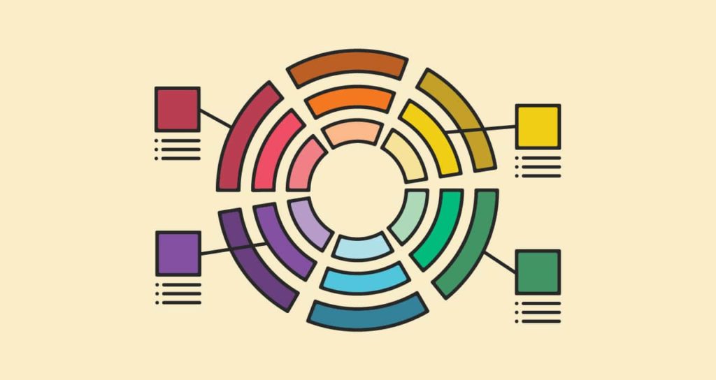
While colors often have different significance in different cultures, there are many commonalities that exist in consumers’ minds. This week, we break down color and how, when used correctly, different shades can imprint subconscious messages into the minds of your consumers to position your brand in the best light.
Read on to see what different colors tell audiences about your brand, both positively and negatively. We’ll also break down some different shades within a color and ways you can use them to reinforce your brand personality, as well as some successful real-world branding efforts. Then, you can decide for yourself what colors best illustrate your message!
Pink
It’s unsurprising that pink is often used for companies and products with predominantly female audiences, but there’s so much more you can accomplish when you think pink! In Western culture, the color conveys feminine, youthful, innocent, and loving or romantic energy very well.
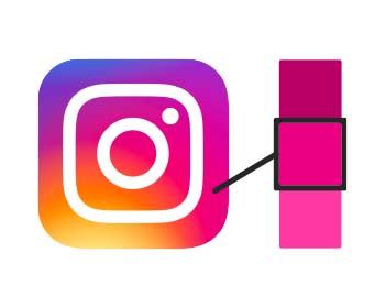
However, pink can also seem vulnerable, weak, unserious, or silly when used for certain brands, so you have to be careful when you choose to use it. One brand that has made the transition to pink very successfully is Instagram.
With a slightly higher proportion of women using the app, they were able to implement the pink logo without alienating too much of their audience. Now, the photo-sharing app stands apart from other social sites (which tend to lean toward blue tones), and the bold color choice is instantly recognizable among users.
Pink shades & branding interpretations
Pastel/dusty rose: elegance, innocence, old-fashioned, softness, infants. The color dusty rose has been used in prisons as it’s linked to a reduction in aggression.
Magenta/fuschia/hot pink: boldness, youth, optimism, caring, rebellion. Hot pink has a wide cultural significance, and has been associated with revolutionary changes from feminism to punk rock.
Salmon/orange-pink: self-expression, community, sociable, free-spirited. Salmon is one of the most androgynous shades of pink, and menswear has recently seen a spike in salmon-colored options.
Red
Red is powerful, passionate, and adventurous. It connotes love, desire, courageousness, assertiveness, confidence, and determination. It’s an intense color that demands attention, which is why it’s often used for important driving and warning signage.
It can also convey violence, danger, or aggression. Use too much, and your brand can be hard on the eyes. Pair it with the wrong color, and you might give off the wrong impression. It may be difficult to get it right, but when you do, red really packs a punch from a branding perspective.
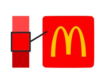
Shades of red have been shown to increase feelings of impulsivity and hunger—which is why they’re so often used for fast food companies. McDonalds, for example, capitalizes on what some marketers have deemed the “ketchup and mustard theory.” Using red and yellow together subtly triggers our brains to think of both the common condomant pairing as well as the satisfaction we feel after a good meal.
Red Shades & Branding Interpretations
Scarlet/bright red: love, excitement, fun, stimulating, attention-getting. Coca-cola’s red branding is iconic, but it was originally just used as an indication to tax agents that the beverages were non-alcoholic.
Garnet/mid-to-dark red: sensuality, sophisticated, commanding, luxurious, powerful. There’s no denying the luxury of Louboutin heels, and the shoes’ red bottoms make them instantly recognizable.
Burgundy/maroon: professional, determined, strong, controlled, serious. The BBC’s darker red branding helps convey an air of professionalism and seriousness that’s to be expected from a global news source while presenting a “warmer and more approachable feel than the more prevalent blue.”
Orange
Orange emanates positivity, rejuvenation, and free-spiritedness. It combines the power and assertiveness of red with the cheery disposition of yellow for a color that feels both stimulating and comforting to your audience. And, with autumn around the corner, orange is obviously used in a wide variety of fall campaigns and strategies.
But used incorrectly, and orange can come across as insincere or superficial. It can also be contradictory at times, connoting both safety (e.g. high-visibility safety gear) and danger (e.g. biohazard signs). While often used as an accent color, it has successfully been used as a primary brand color across a variety of industries.
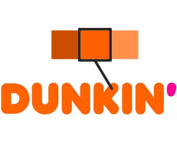
Dunkin’ Donuts bright orange and hot pink logo is great for a morning pick-me-up! Their website is a stellar example of leaving plenty of white space and relying heavily on your brand colors to convey your personality to your audience. In this case, they’re conveying the smiling faces who help you start your morning right. (This is not a sponsored post, but I do love their breakfast croissant.)
Orange Shades & Branding Interpretations
Bright orange: energizing, motivating, healthy, strong, attention-getting. Home Depot makes great use of a bright orange logo, and the brand color makes it easy to spot their associates in stores.
Burnt orange: familiar, warm, assertive, stoic, aggressive. One of the most recognizable examples of burnt orange branding is the University of Texas at Austin, and they’re currently the fourth Google search result when you enter, “burnt orange branding.”

Yellow
The impact of yellow is obvious. Even without hours of research into the meaning behind color use, you can probably guess what yellow tends to signify. Happiness, positivity, optimism, summertime, joy, and our dreams for the future. Its association with the sun and the light bulb makes it commonly associated with intellect, mindfulness, bright ideas, and creative or analytical strength. If your brand’s personality is creative with a sunny disposition, yellow is a great choice for your branding.
Yellow can also evoke feelings of impulsivity, foreboding or warning; often, it’s the color of crime scene warning tape. It can also come across as deceitful or weak, as evidenced by the terms “yellow journalism” or “yellow-bellied.” Poor use of yellow can cause your branding to come across judgemental, egotistical, or temperamental.
Snapchat is a superb example of effective yellow branding. Their mission is to be “an app that empowers people to express themselves, live in the moment, learn about the world, and have fun together.” Expression, living in the moment, learning, and having fun all certainly sound like yellow-worthy attributes.
Yellow Shades & Branding Interpretations
Bright yellow: Joy, excitement, activity, hope, spontaneity. Ikea uses bright yellow, which makes sense when you think about it. While furniture itself isn’t necessarily a “happy” topic, their customers are usually people who have just purchased a new house or apartment they want to furnish, which is typically a happy time!
Mustard/dark yellow: learning, imagination, confidence, casual, classic. National Geographic’s yellow logo tones down the brightness of the color and provides a square frame through which their readers can see the world.
Gold: luxury, success, authoritative, stable. Gold is most commonly used for luxury branding, and famous gold logos include Rolex and Versace among others.
Green
There are lots of great ways to use green in branding as it’s an extremely versatile color, both in the variety of shades and the meanings your audience can glean from them. Nature-based brands, financial institutions, and health companies are the most common users of green branding because it tends to connote nature, tranquility, wealth, prosperity, endurance, and physical and mental wellness. Green is also used to convey modesty, generosity, and rationality.
Most of the negative attributes of green are natural extensions of its more positive meanings. While green often makes us think of plants and growth, it can also bring to mind stagnation or staleness. While green evokes thoughts of money, it’s also the color of greed and jealousy. With health on one end of the spectrum, green can simultaneously connote filth or nastiness.
Whole Foods is a perfect brand to take advantage of green in their branding, and they’ve done so since the company opened their doors. As a retailer of natural and organic foods and housewares, green represents both their food focus and their eco-minded products.
Green Shades & Branding Interpretations
Neon/lime green: vibrancy, energy, freshness, creativity. Android’s lime green robot logo was inspired by an Atari video game and embodies how the brand brings fresh energy to the tech industry.
Seafoam/mint green: peace, security, growth, fertility. Mint—the alternate meaning being “a place where money is coined”—is too great a pun to pass up, and by using mint-green colored branding, they’re able to stand out from other financial institutions.
Dark/viridian green: ambition, wealth, nature, self-reliance. Land Rover’s emerald/forest green logo makes consumers want to jump behind the wheel and head off on an adventure—exactly what the brand intended.
Blue
Blue is easily one of the most common colors in branding, and that’s probably because it’s by far the world’s most common favorite color. It’s used in almost every industry and in about every shade possible. So what makes blue so unanimously appealing?
Blue conjures images of sky and sea, tranquility and peace. It’s trustworthy, stable, and so soothing it can even lower your blood pressure. Blue is a non-confrontational color and, depending on the shade, it can make you feel cared for, encouraged, and supported.
On the other hand, blue can come across cold or uncaring when used incorrectly. Depressed, aloof, predictable, and ordinary are other negative characteristics that your customers might pick up on if your brand’s not meant to be blue.
Dell, Facebook, Boeing, and Oral-B all use shades of blue to carry their brands, and each has seen success despite their vastly different industries. This is possible because of the versatility you gain when choosing this soothing hue.
Blue Shades & Branding Interpretations
Pastel/light blue: serenity, empathy, communication, nurturing. Goldman Sachs uses a light blue logo to soften the feel of the financial services company while still portraying a trusted, reliable partner.
Teal/turquoise: balance, clarity, dignity, introspection, uniqueness. Easily the most recognizable brand color on this list, “Tiffany Blue,” is a trademarked color adjacent to turquoise, and it’s been a powerful tool for the Tiffany brand throughout the years.
Royal/navy blue: loyalty, reliability, support, stability, authority. You want your home appliances to be reliable, and Carrier’s logo carries the message of their reliability through the use of a dark blue logo design.
Purple
Often associated with royalty, purple was once a very expensive color to produce, which is why purple cloth was so often reserved for the rich and powerful. Now that choosing your brand colors takes only a few clicks, it’s important to remember the gravity that this color holds in the minds of consumers.
Purple can be high-class, graceful, and yet whimsical. A popular choice for weddings, it easily complements a wide range of colors. It’s also sometimes associated with spirituality, magic, mystery, and religion. In branding, purple is commonly used as both as a standalone color and as part of a robust palette.
However, a little goes a long way. Use too much purple for the wrong brand, and you can come across as immature, impractical, arrogant, or ostentatious. Like pink, it can lean toward the feminine, which can also affect your brand’s impact. FedEx tows the line by pairing their primary purple with a bright, vibrant orange.
Purple Shades & Branding Interpretations
Mauve/lilac: relaxing, peaceful, gentle, intimate. Because purple is relatively rare in the natural world, it can be bold to behold. These shades help soften the overall effect.
Violet/true purple: innovative, transformative, generous, romantic. Roku has done a great job forging their own path and helped to transform the streaming industry, both from a business and a branding perspective.
Indigo/dark purple: exclusive, lavish, indulgent, valuable. Cadbury’s unique purple shade allows their branding to feel indulgent—as chocolate should—without becoming inaccessible.
Brown
The color of chocolate, warm coffee, or a fall forest walk, brown is often associated with feelings of comfort and coziness. Because of this and its neutral tone, shades of brown are common in interior design.
Brown makes consumers imagine the natural world. It speaks to minimalism and meeting basic needs. Unassuming, comforting, and reliable, brown can make your consumers feel safe when choosing your products or services. Brown is also popular for food, coffee, and candy brands like Hershey.
However, brown can come across as dull, isolating, numb, or unsurprising. It can also be difficult to match at times, so be extra careful with brown when you’re looking to create a multi-colored brand palette.
Brown Shades & Branding Interpretations
Beige/Nude: minimalist, natural, approachable, classic. The Swarovski website uses a beige shade that allows the vibrant colors of their crystals to take center stage.
True Brown: strong, sincere, wholesome, trustworthy. The M&M’s logo has been a mid-tone brown color since the 70s, which has helped the brand achieve its wholesome family aesthetic.
Dark brown: down to earth, reliable, comforting, modest. The UPS brand relies on dark brown so heavily that their slogan used to be “What can brown do for you?”

Black/Gray
Aside from blue, black and gray round out some of the most popular colors used in branding. Professional, serious, independent, mysterious, rational, and unbiased, black and gray are useful for a variety of industries.
However, there’s a difference between serious and boring. Black and gray can sometimes come across as plain, uncreative, negative, conforming, conventional, or blunt, so it’s important to use them in the right places and for the right brands.
Apple’s gray logo makes perfect sense for their current brand. They pride themselves on producing items that lead to creative innovation, but since they’re now a household name, they were able to scrap their original rainbow logo. Apple users already understand the company’s creative spirit, so their logo speaks for itself now.
Black/Gray Shades & Branding Interpretations
Black: controlled, serious, qualified, mature. The Auschwitz digital exhibition site is a perfect place to use lots of black on a website. It should be a solemn scrolling experience, and the black background keeps viewers focused on the important learning on the screen.
Gray: mild, adaptive, neutral, ambiguous. The Cristo Balenciaga Fashion Museum uses an almost entirely gray and black web design to remain as timeless as the pieces they feature.

White
Like black and gray, white is more the absence of color than an actual color. That being said, it’s still a powerful part of your “color” palette. White can symbolize purity, goodness, innocence, adaptability, cleanliness, simplicity, honesty, and hope.
White can also come across as cold or unfriendly. In the wrong spaces, too much white can make a design look empty. Lack of color can also make a design feel indecisive.
Sneak In Peace, the world’s largest premium sneaker platform, uses impeccable design with lots of open white space that feels as sleek as the sneakers sold there.
Branding Using White & Open Space
White: pure, adaptable, hygienic, uncomplicated, effortless, refreshing, idealistic. The White Album by the Beatles was released with a plain white package, starkly contrasting their previous, more colorful album covers. The album was written as the band sought enlightenment at a Transcendental Meditation course in India, which could be the reason for the refreshingly bare and uncomplicated cover art.
Open/unused space: The Quip website uses lots of blank space to help move their audience’s gaze through the site and let the text and images capture their attention.
Remember:
All of these inferences will depend on the brand you’re creating or refreshing. It’s important to get lots of feedback throughout your creative process, because everyone’s going to react a little bit differently to your color palette. Your goal is to make sure your color choices describe your brand well to the widest possible audience.
