Get Started
WP Engine Newsroom Technical Documentation
Tags:
Key Takeaways
WP Engine Newsroom is a suite of tools for media teams, enhancing organization and productivity.
Included tools like MediaPress, ACF Pro, SPM, Smart Search AI, and WP Engine Analytics offer advanced features for content creation and site management.
MediaPress Meta panel provides editable metadata fields for articles, including SEO, author byline, and DAM integration.
Advanced Featured Image in MediaPress allows for multiple variations and customization within posts.
Media management features in MediaPress streamline assigning and using approved images for articles.
MediaPress Authors integration enhances author management and seamless block integration.
WP Engine Newsroom is a valuable suite of tools for any team that frequently publishes articles. Read about all the tools and features included that can help make your media team more organized and productive.
Included With Newsroom
The tools in the Newsroom package include:
- MediaPress: MediaPress is an editorial plugin that supercharges your content creation and publishing workflow. All of the features of MediaPress are outlined below in this article.
- ACF Pro: The Advanced Custom Fields Pro plugin is a favorite among developers for making plugin and theme customizations that are easy for users to edit.
- SPM: WP Engine’s Smart Plugin Manager helps to keep your plugins and themes up to date and includes an auto rollback feature when a layout error is detected.
- Smart Search AI + Recommendations: WP Engine’s Smart Search is an AI assisted search tool with an intuitive, typo-tolerant, customizable search function that surfaces more relevant results. Smart Search’s Recommendations block improves the browsing experience by showing related or trending posts.
- WP Engine Analytics powered by TWIPLA: WP Engine Analytics is a suite of analytics tools that gives you advanced insights into your website’s traffic.
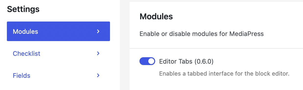
Editor Tabs
The MediaPress editor tabs feature adds 3 tabs to the top of the post editor that let you easily switch from the Editor to the MediaPress Meta and Media panels.
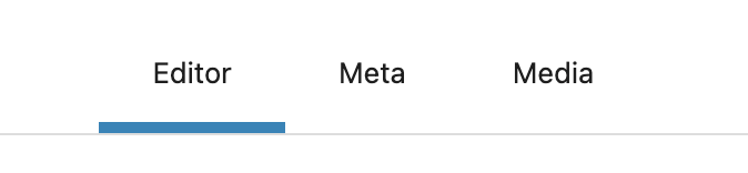
To enable or disable the MediaPress editor tabs, go to the MediaPress menu in the WordPress sidebar and use the toggle button labeled Editor Tabs.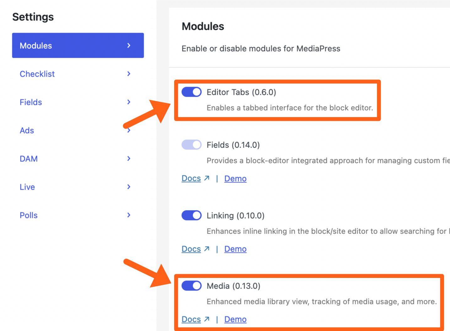
The Media tab is optional and can be toggled on or off from the same settings menu with the toggle button labeled Media. Read more about the Meta and Media panels below.
Fields
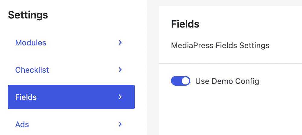
Fields live under the MediaPress Meta panel. The Meta panel can be seen by clicking the Meta tab at the top of the post editor. If you do not see the tabs in the post editor, then enable the Editor Tabs as shown in the previous section.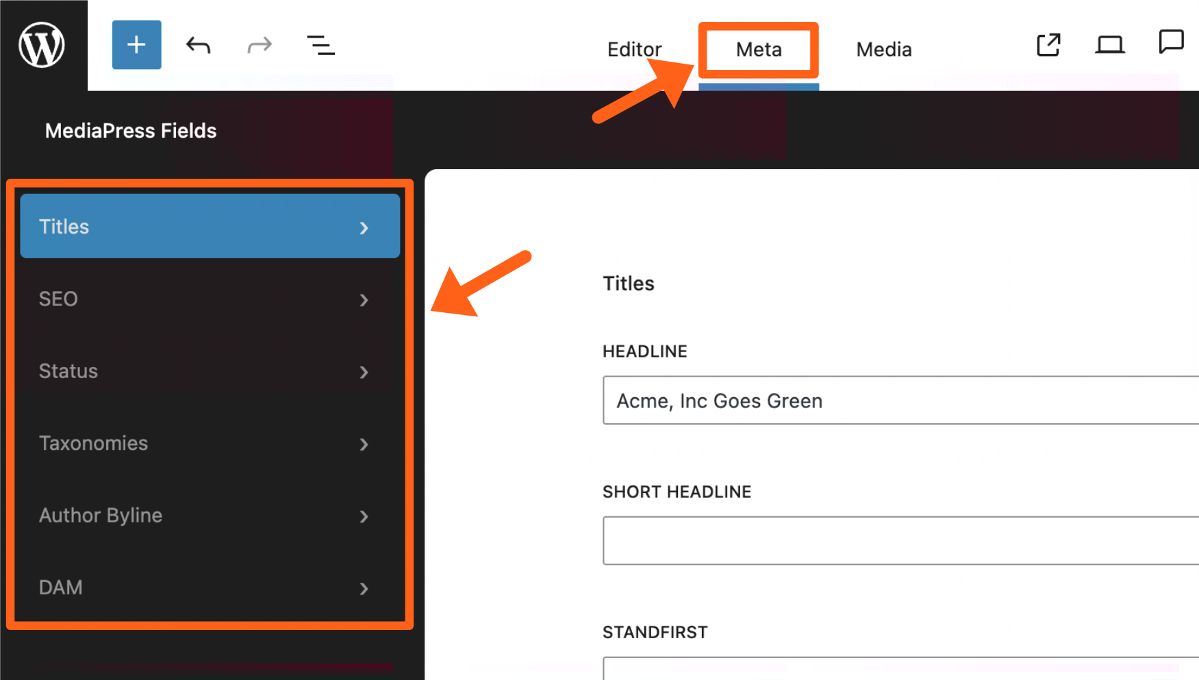
The Meta panel shows multiple tabs in the sidebar which include editable metadata fields for your article. If you don’t see the default fields here, make sure you have the Use Demo Config option enabled by going to the MediaPress menu in the WordPress sidebar and selecting the Fields tab.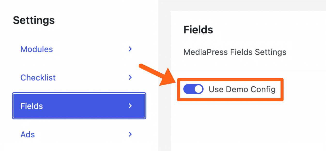
The available tabs and fields include:
- Titles
- Headline
- Short headline
- Standfirst
- Excerpt
- SEO
- SEO headline
- SEO description
- Social share image
- Social headline
- Social description
- Status: The status labels currently include:
- New
- Breaking
- Updated
- Feature
- Exclusive
- Sponsored
- Taxonomies
- Category
- Tags
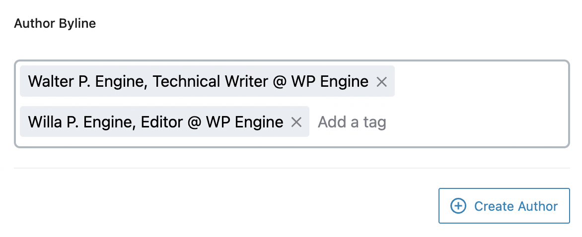
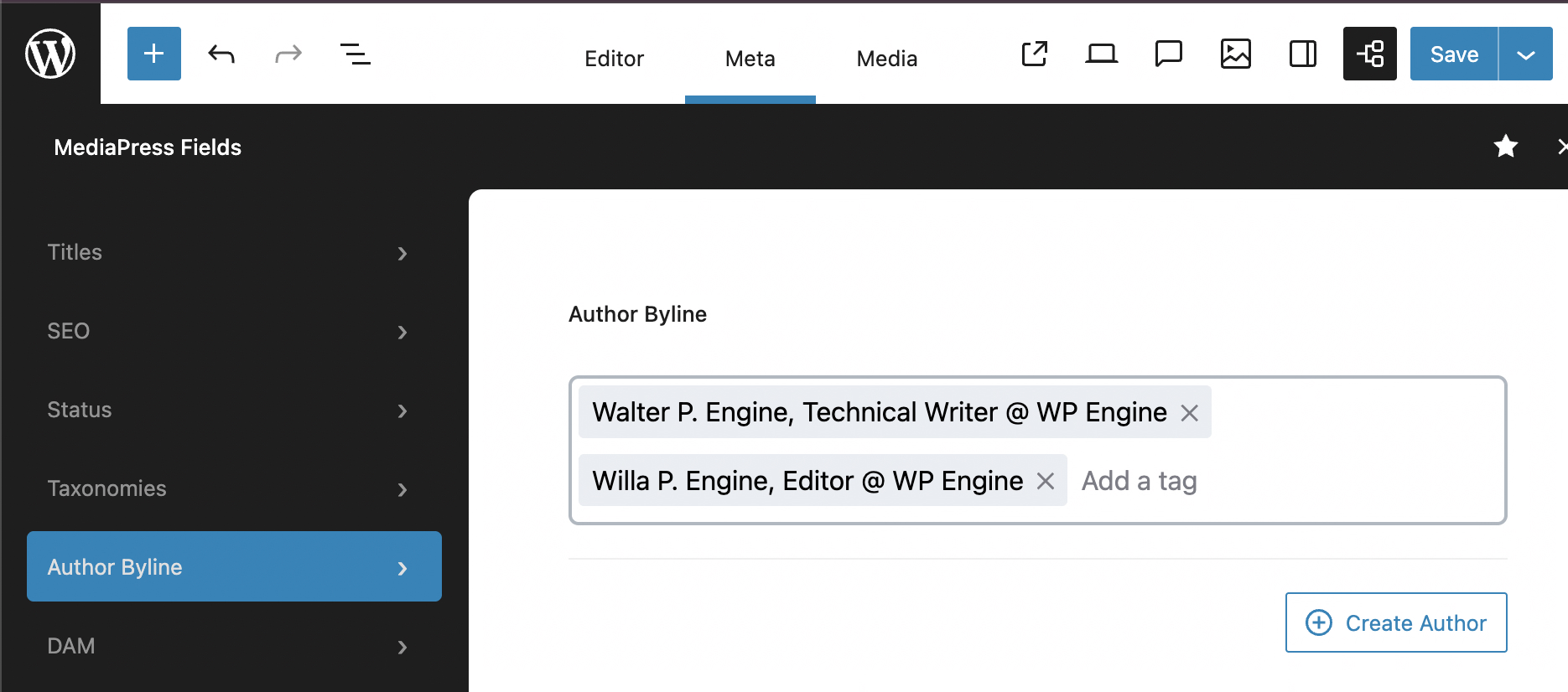
- Author Byline: The author byline has a search bar to let you search and select one or more MediaPress Authors. The byline for each author is shown along with the author name. There is also a Create Author button to allow you to add a new MediaPress author.
Note: If you add an author with the Create Author button, you can add a byline for that author by going to Posts > MediaPress Authors in the WordPress sidebar and filling in the Title field for the selected author. - DAM: The DAM (Digital Asset Manager) tab has a field labeled DAM Tags. Here you can add a tag from your 3rd-party DAM and sync the media assets to the Media panel of the current article. Read more DAMs below.
Media
The MediaPress Media management features allow you to assign images that are approved for use on the website or in an article, and also to use variations for your featured images.
To enable or disable MediaPress Media, go to the MediaPress menu in the WordPress sidebar and toggle the checkbox next to Media.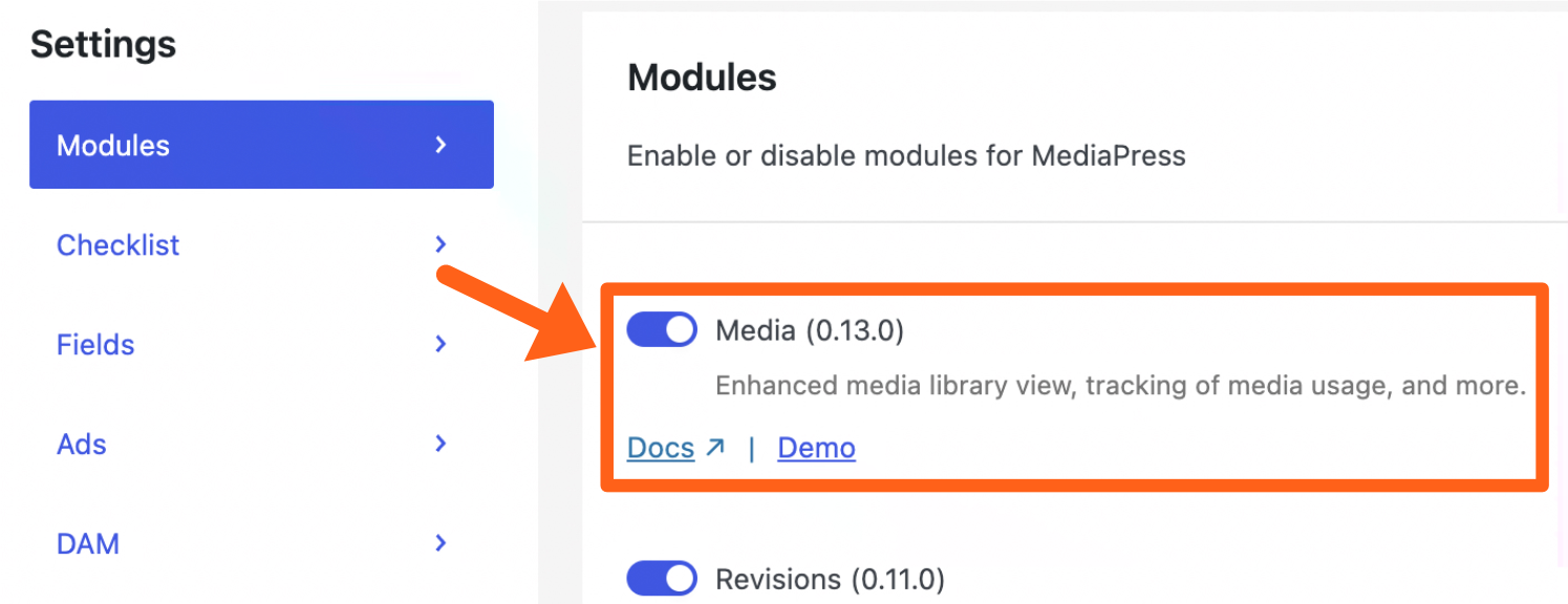
Attach Media Items to a Post
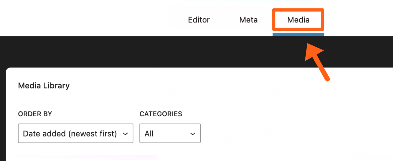
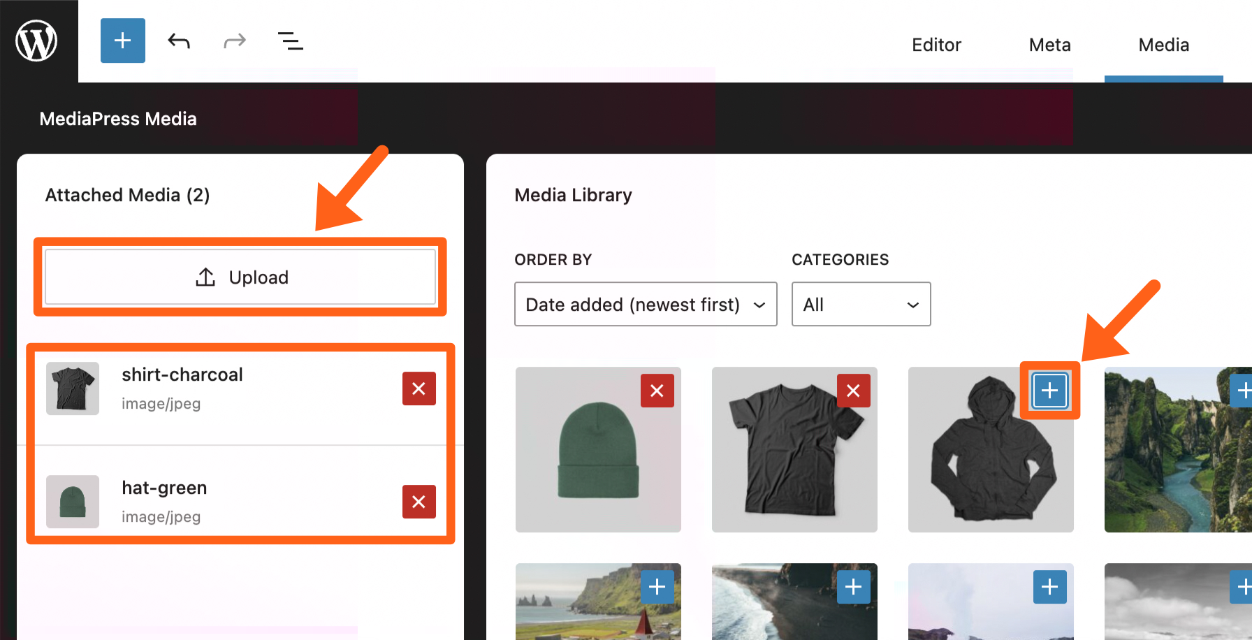
- Click on the Media tab at the top of a post.
- Click on the plus icon in the top right of any existing items in the media library or use the Upload button in the Attached Media sidebar to attach new media. All items that you select or upload will show in the attached media sidebar. You’ll see an X button next to each of the attached images allowing you to remove them from the list of available media for the post.
Add Attached Media Within a Post
After you’ve attached media to a post, you can add images as you usually would in blocks. When you select the Media Library option in a block, only your assigned images will show as an option for your team to use. 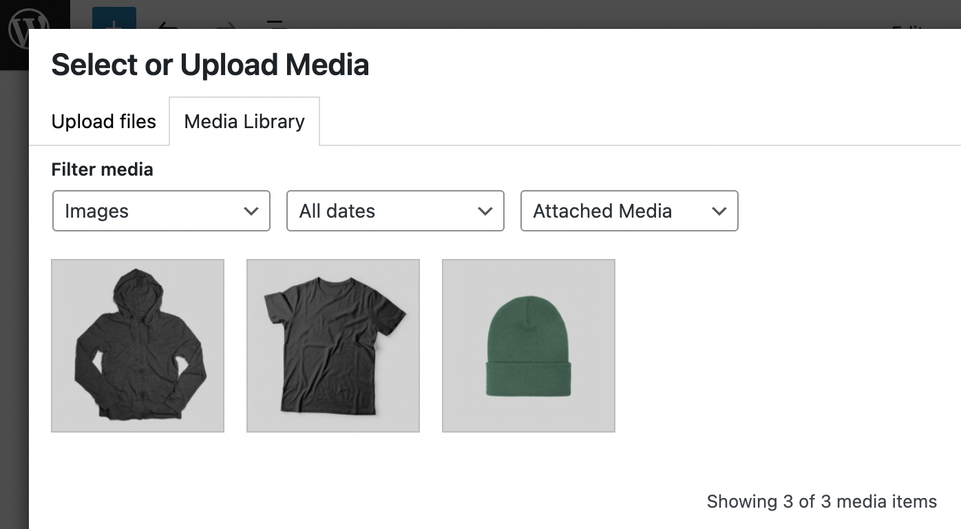
If you need to add images that your team has not yet assigned to the attached media panel, then you can change the media library filter to Full Library, as shown below.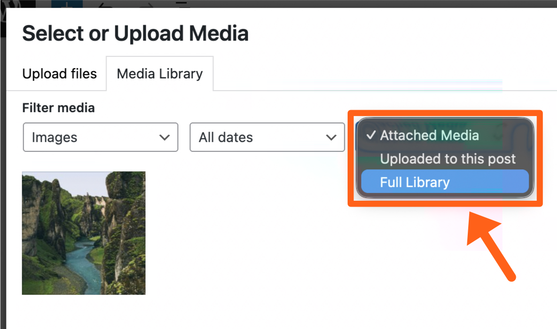
You’ll also see an In Use note in the attached media sidebar under each item that has already been used in a post. To remove an item that’s marked as “In Use”, remove it from the post and then you’ll be able to remove it from the attached media sidebar.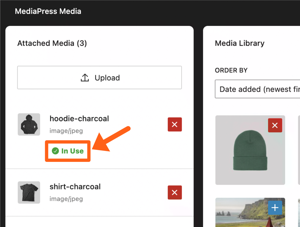
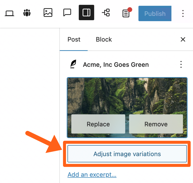
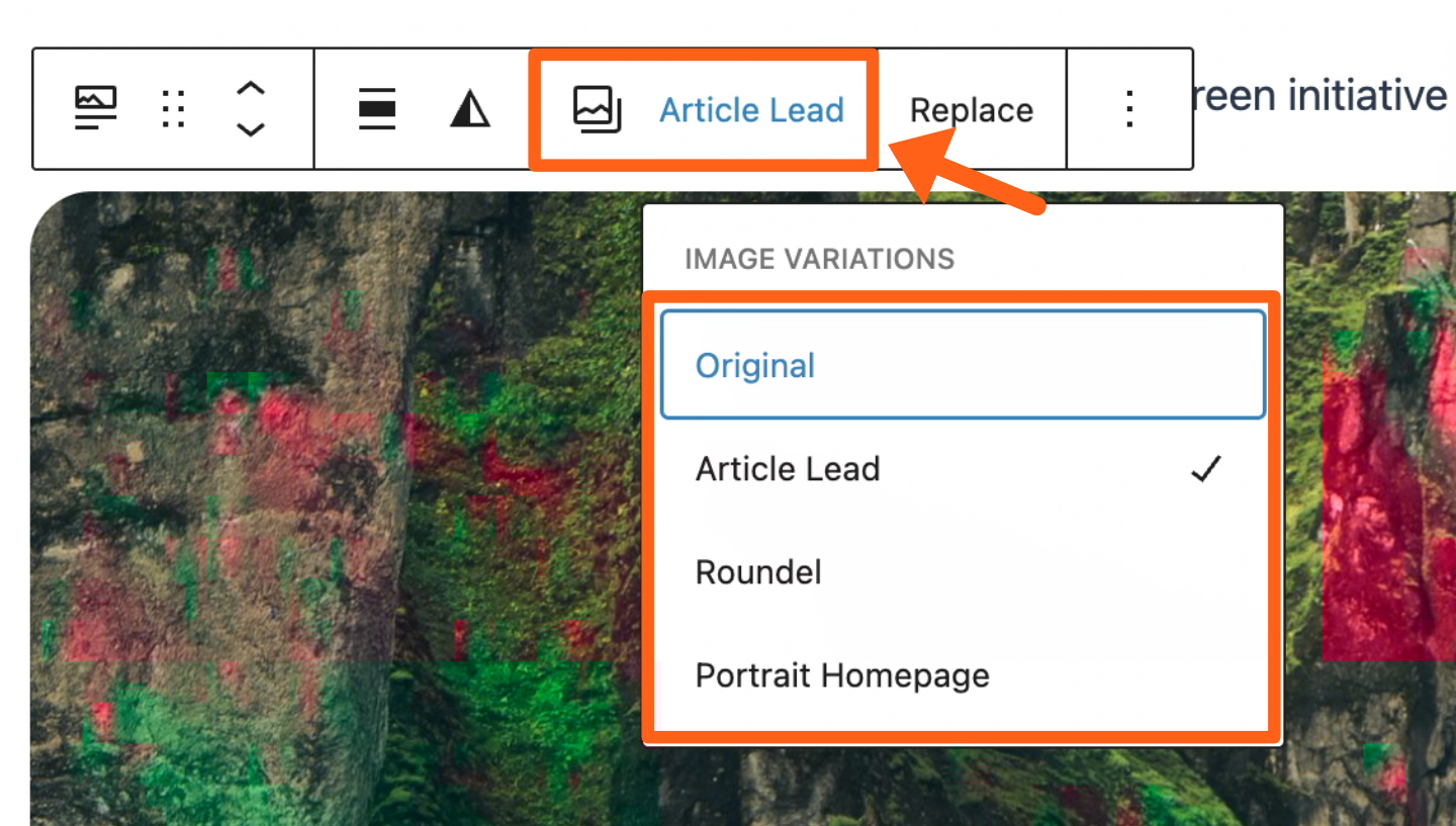
Advanced Featured Image
MediaPress gives you the option to add multiple variations for your featured image. These variations can be added in your post content with the Featured Image block.
To add variations:
- Click the Adjust Image Variations button under your featured image.
- Adjust each variation. In the edit window, you’ll see the option to Replace image or Crop when you hover over each variation. You can crop the image or upload a different image for each version. The available variations are Article Lead, Roundel, and Portrait Homepage.
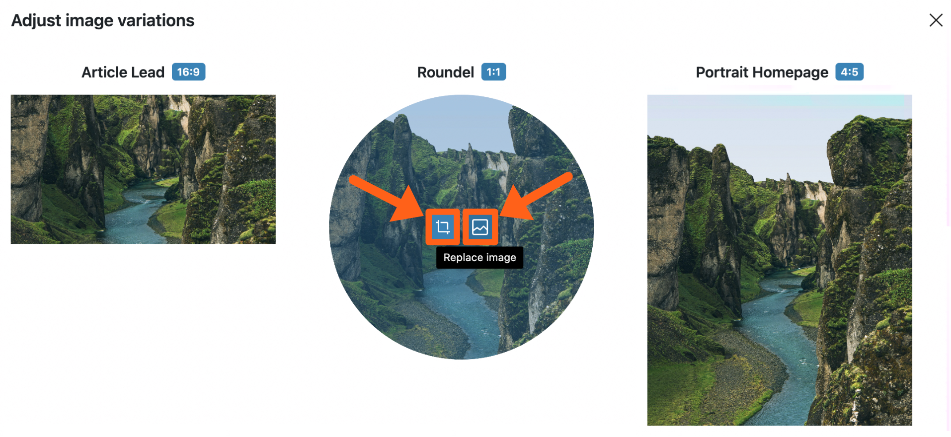
- Add a featured image variation within your post with a Featured Image block. In the block you’ll see an option in the block toolbar to select which variation type you want to use.
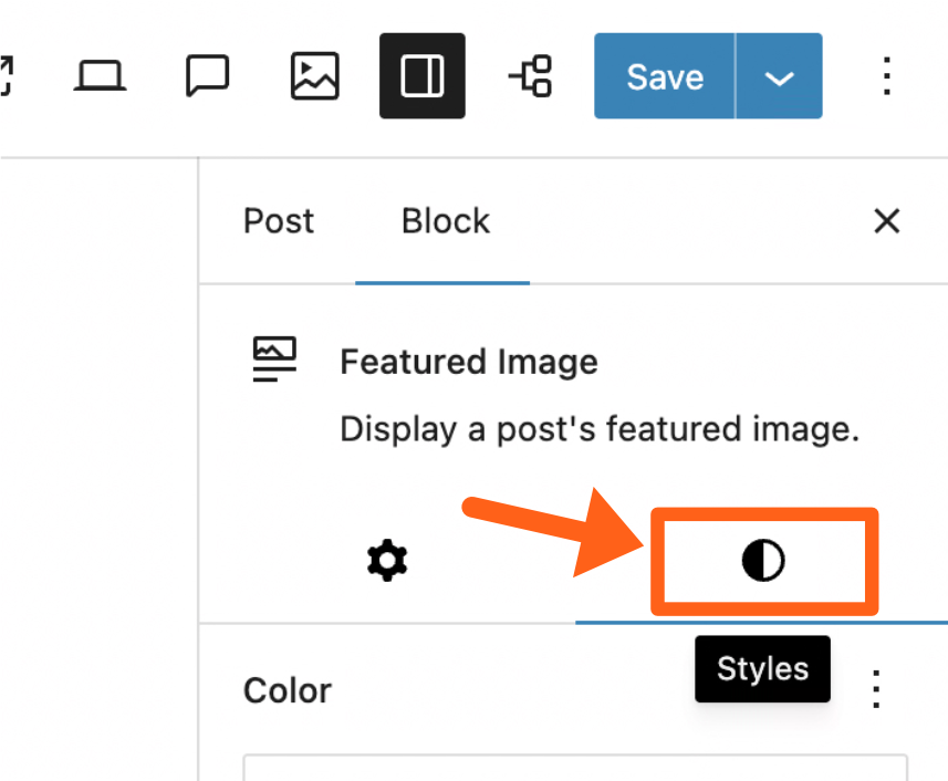
- Customize the featured image. For example, if you want to customize the Roundel variation to make it round, you can either upload an image for that variation that is already cropped to be round, or you can click on the Styles tab for the block and adjust the border-radius settings.
In the styles tab you can adjust the radius to 100 and the radius unit type to percent (%).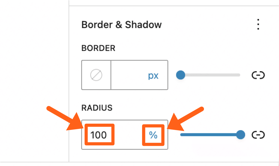
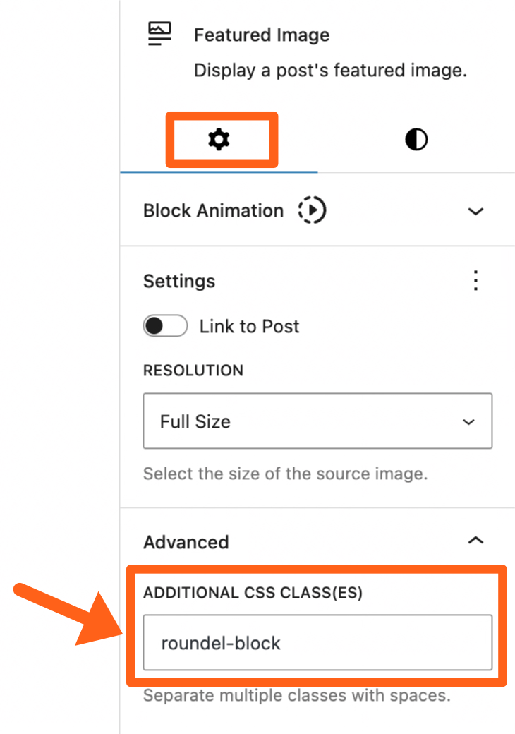
- An alternative styling option for developers would be to add a custom CSS class to the block and style the image relative to its block parent element.
- An alternative styling option for developers would be to add a custom CSS class to the block and style the image relative to its block parent element.
Authors
A MediaPress author is different than the built-in WordPress author. Using the MediaPress author will allow it to integrate seamlessly with MediaPress blocks.
To enable or disable MediaPress authors, go to the MediaPress menu in the WordPress sidebar and toggle the checkbox next to MediaPress Authors.
Add a MediaPress Author
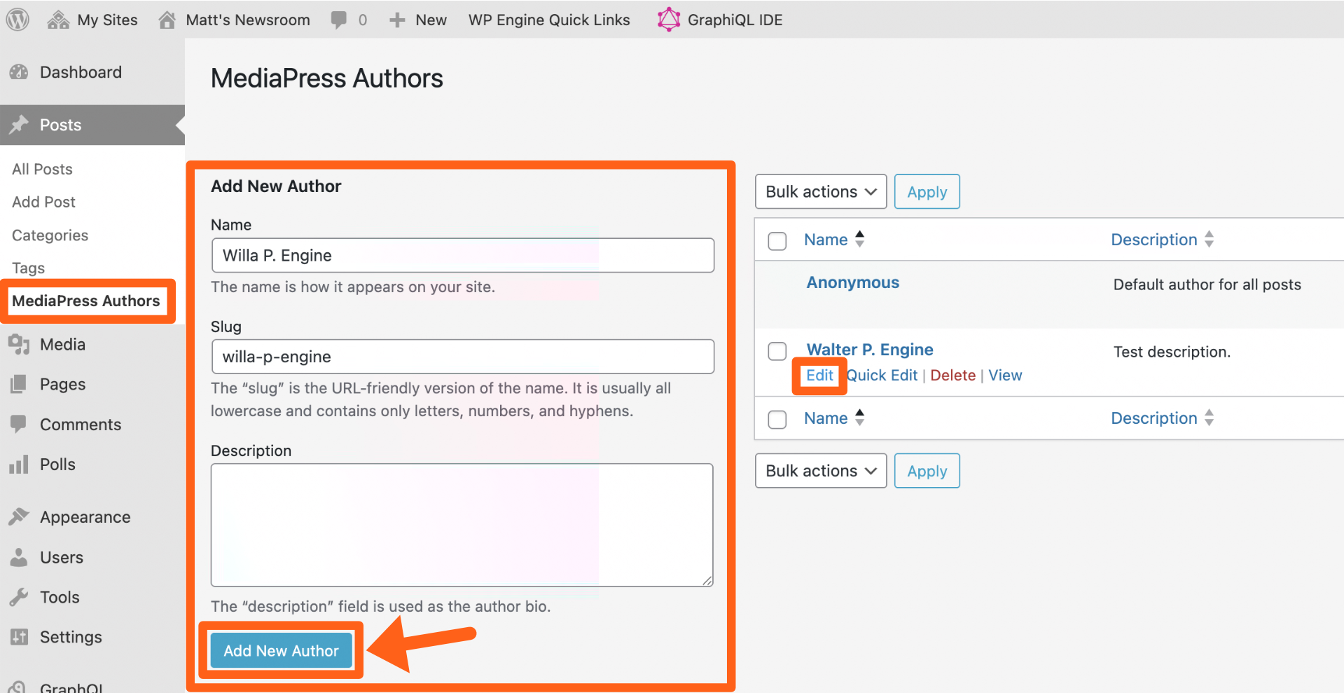
- Go to Posts > MediaPress Authors, in the WordPress sidebar.
- Fill in the Name and Slug fields and then click the Add New Author button.
- After saving, you’ll see the author name show in the table on the right. Click the edit link under the author name to add an avatar and an author job title.
Assign a MediaPress Author to a Post
- While editing a post, click the Meta tab near the top of the screen.
- If you don’t see the Editor Tabs, then enable them under MediaPress in the WordPress sidebar.
- If you don’t see the Editor Tabs, then enable them under MediaPress in the WordPress sidebar.
- Select Author Byline in the left sidebar.
- If you don’t see the Author Byline option, then enable the Use Demo Config option in the Fields tab under MediaPress in the WordPress sidebar.
- If you don’t see the Author Byline option, then enable the Use Demo Config option in the Fields tab under MediaPress in the WordPress sidebar.
- Click into the author byline box and start typing to see suggestions of existing MediaPress authors to select. You can add one or more authors and also use the Create Author button as pictured above if you want to add someone new.
- If you add a new author, you can update their byline in the author’s Title field under Posts > MediaPress Authors.
- Save your post to update the author selection.
Checklist
The checklist is a list of required elements for an article that must be present before an article can be published. The checklist is optional and can also be customized by a developer if needed.
View the developer customization instructions here.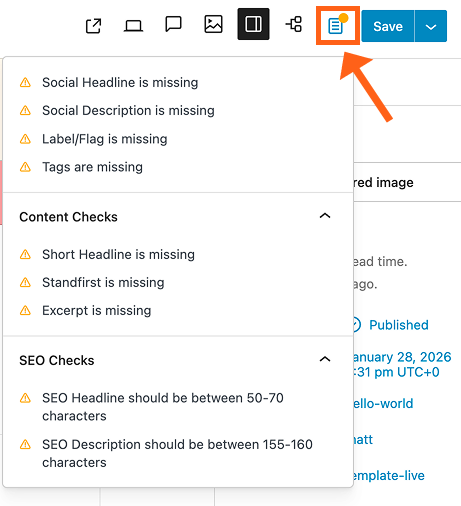
To enable or disable the checklist, go to the MediaPress menu in the WordPress sidebar and toggle the button next to Checklist.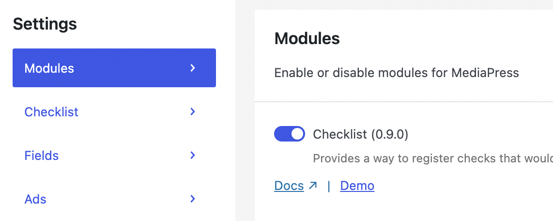
Also make sure the Use Demo Config option is enabled in the Checklist tab on the same page. This will enable the default checklist fields.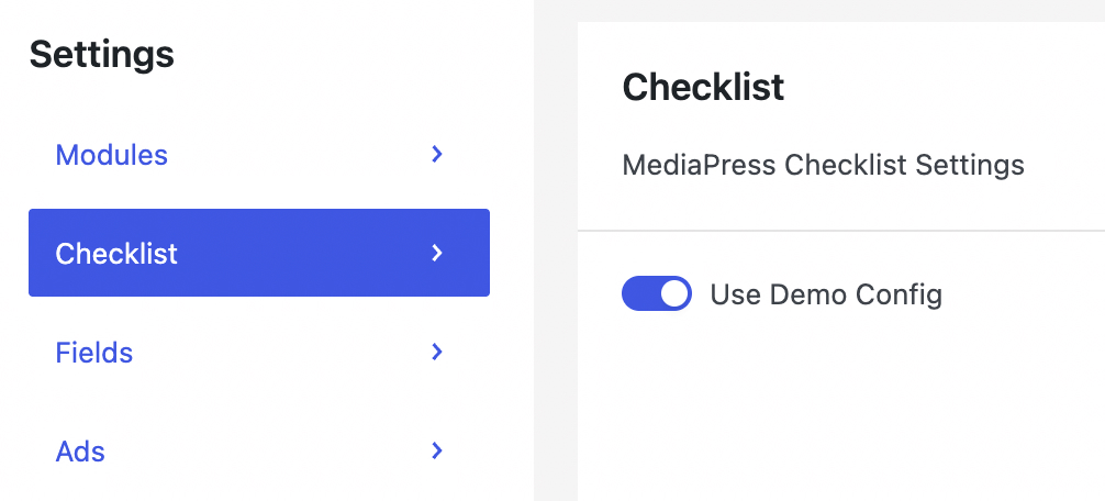
In addition to the checklist button in the top right of the editor (as shown above), you can also access the checklist from the editor sidebar under the Publication Checklist meta box.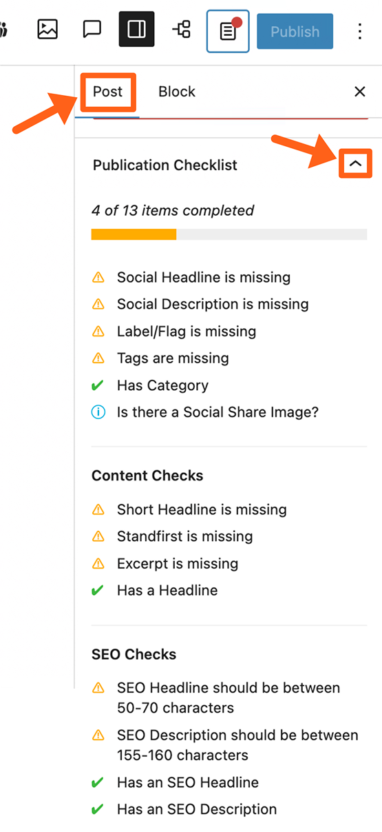
You’ll notice that some items have a red “X” next to them. These are hard blockers, and disable the publish button until these have been addressed. The items with warning symbols are not required but are recommended.
Comments
Comments allow you to add collaboration notes to a post. Comments can be added to an entire post, or inline within the post content. You can also mark the comment as resolved once it has been addressed.
To enable or disable comments, go to the MediaPress menu in the WordPress sidebar and toggle the button next to Comments.
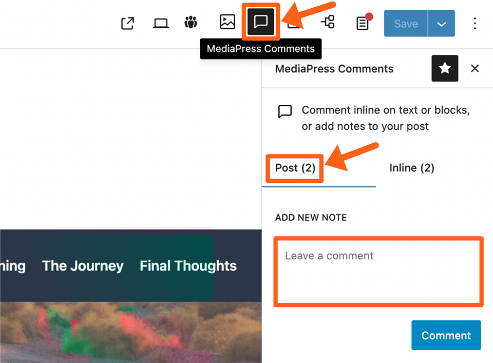
Add Comment to an Entire Post
- Click the MediaPress Comments icon in the top right of the post editor.
- Select the Post tab in the comments sidebar.
- Type your note in the textbox.
- Click the Comment button. You should then see your note added to the top of the comments list in the sidebar.
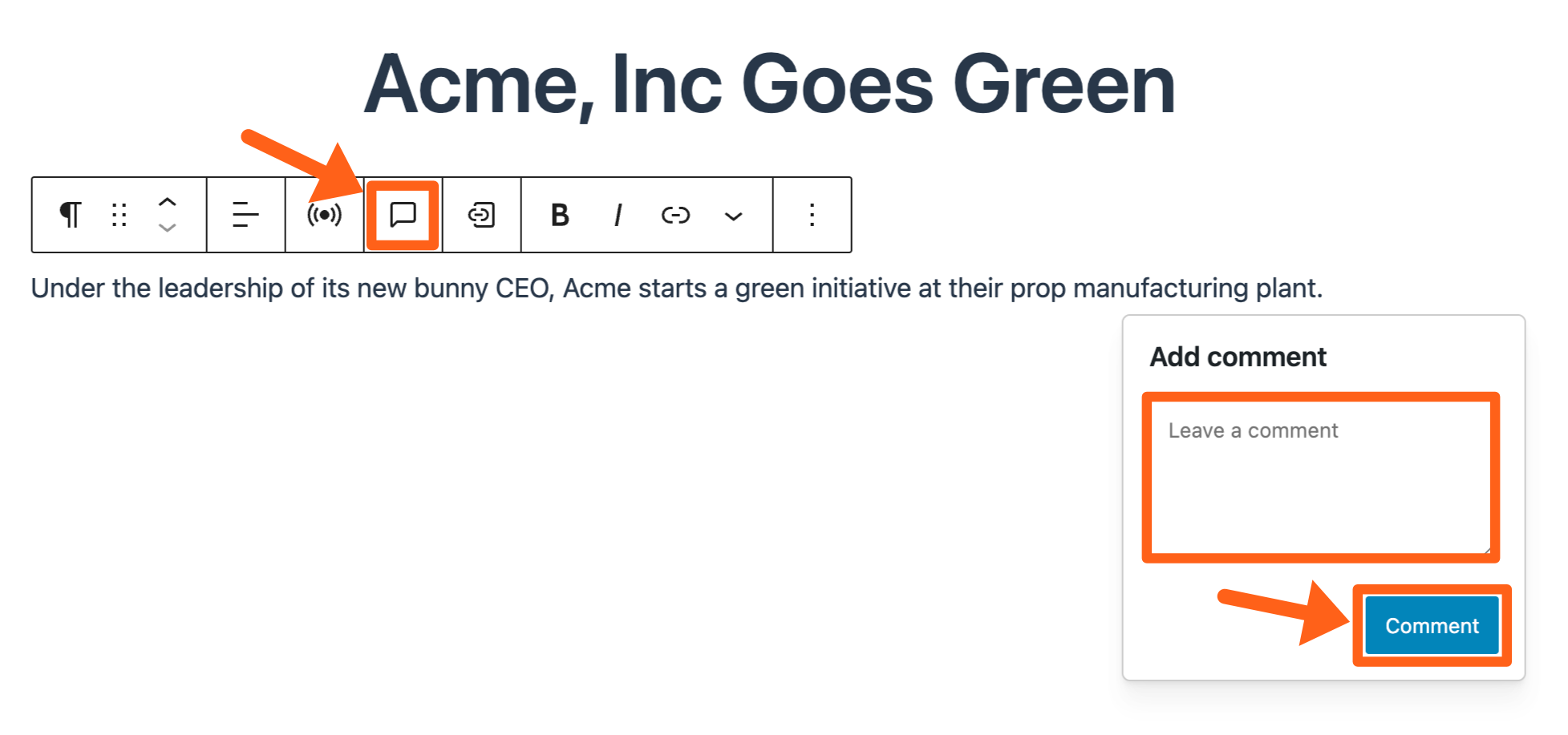
Add Inline Comment
- Click on the page content that you want to comment on which should bring up the menu bar for the selected block.
- Click the Add inline comment icon.
- Type your note in the textbox.
- Click the Comment button to save your note.
Review Comments
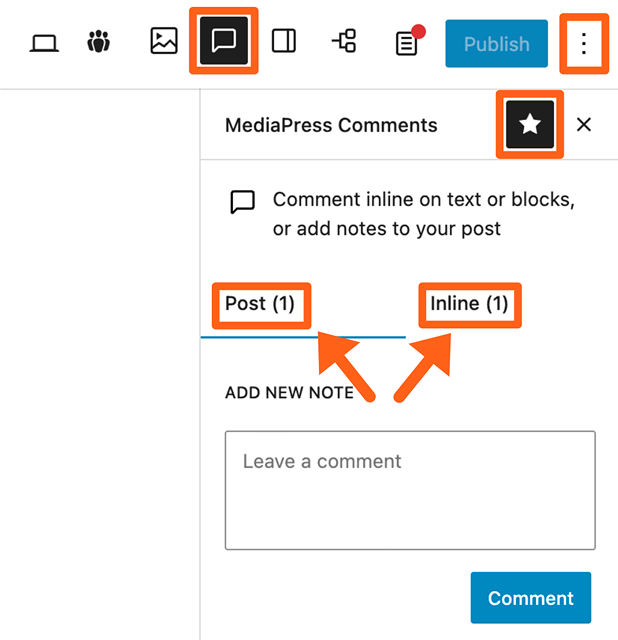
- Click the Comments icon in the top right toolbar of the post editor.
- If the icon is not there, then click on the 3 dot icon on the far right, and select MediaPress Comments.
- Once the comments sidebar is open, you can click the star icon to pin the comments icon to the top toolbar if it’s not already there.
- Click on either the Post or Inline tabs, to view the different types of comments.
- Click on a comment to see your edit options.
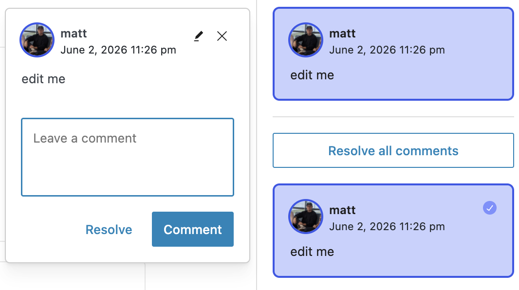
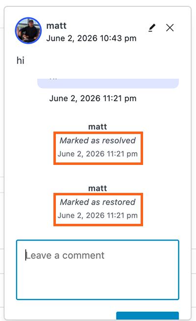
- You’ll see a pencil icon at the top to edit the comment.
- You’ll see a Resolve button at the bottom if the comment is pending.
- You’ll see a Restore button at the bottom if the comment was previously resolved.
- You’ll also see flags showing when comments were resolved or restored, along with the user that resolved or restored the comment.
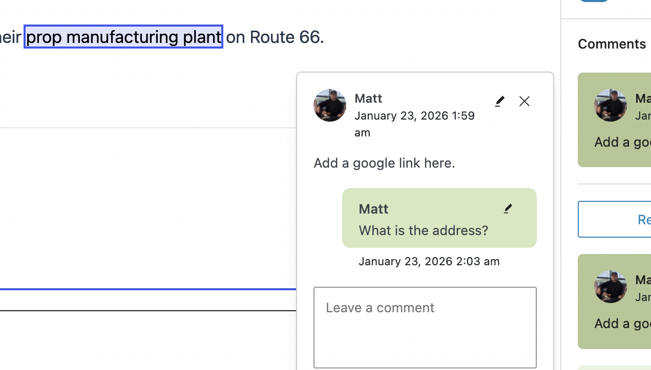
- Reply to comments. You can make threaded replies to inline comments and to post level comments. When you click on an inline comment, the content area should scroll to the highlighted content that was commented on. You’ll see a textbox under each comment where you can directly reply.
Linking
The Linking feature enables users to easily link to sources from within your website.
To enable or disable Linking, go to the MediaPress menu in the WordPress sidebar and toggle the checkbox next to Linking.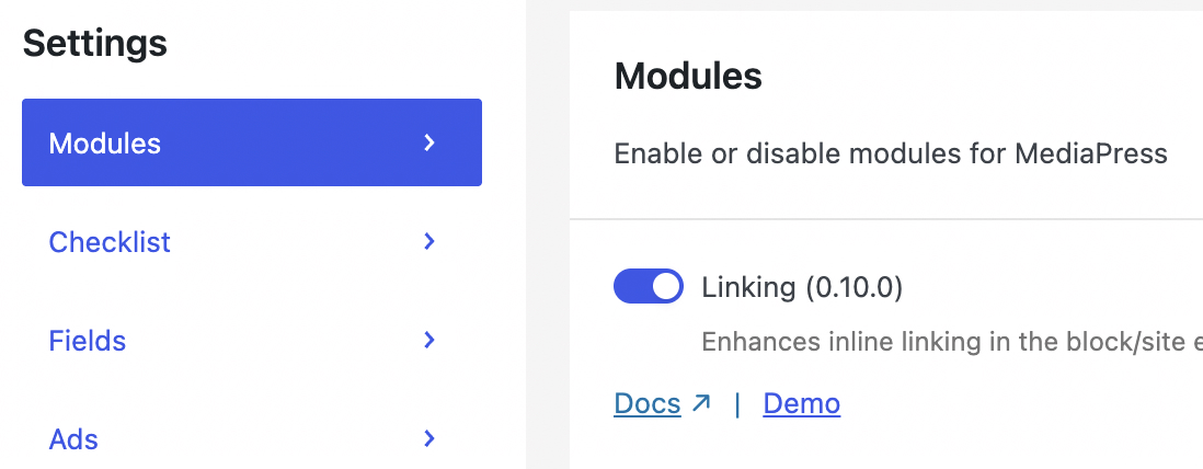
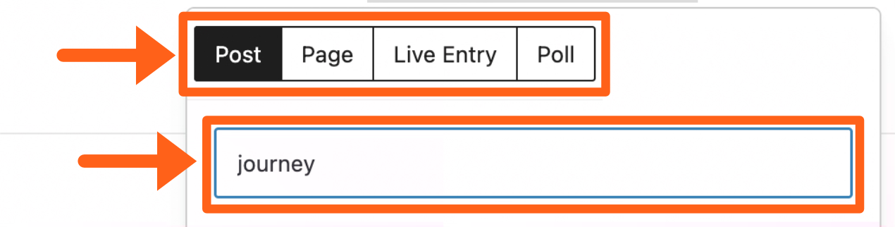
To add a link:
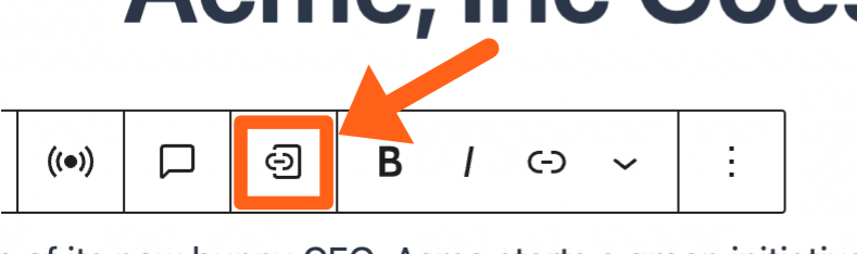
- Highlight the text that you want to link.
- Click the Entity linking button in the toolbar.
- Select the type of link that you want to search for. Choose from the available post types on your website.
- Type in your search phrase below the post type selector.
- Select filters to narrow down your search if needed.
The filters include start and end post publish dates, categories, and tags.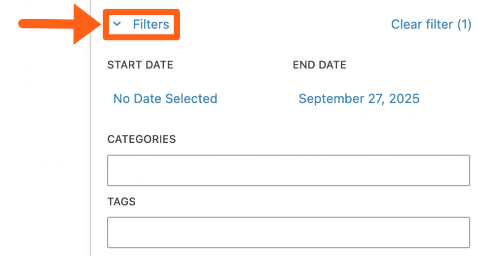
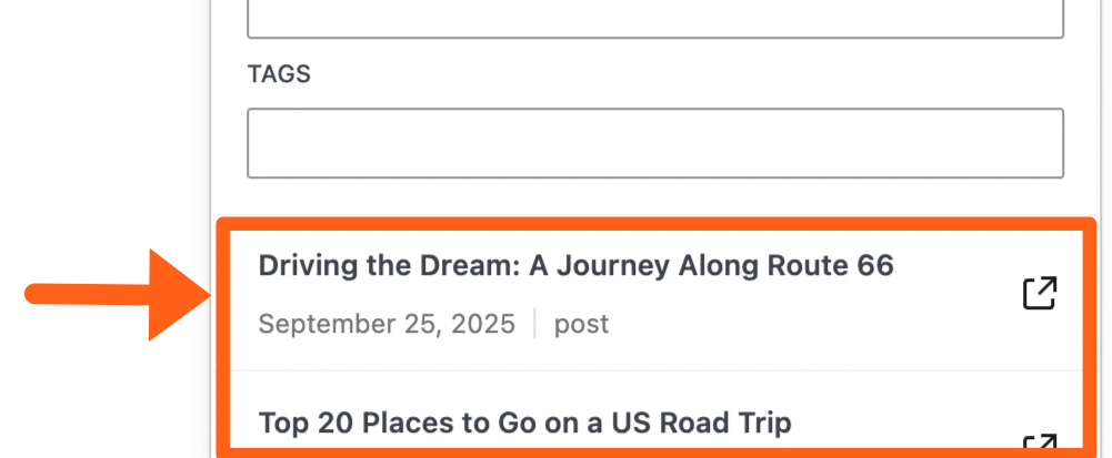
- Select a link from the search results list.
Revisions
Revisions allow you to see older versions of articles with a visual side-by-side comparison of the content and metadata.
To enable or disable visual revisions, go to the MediaPress menu in the WordPress sidebar and toggle the checkbox next to Revisions.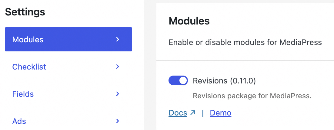
To see revisions, go to the Post tab in the editor’s right sidebar and then click the number next to Revisions.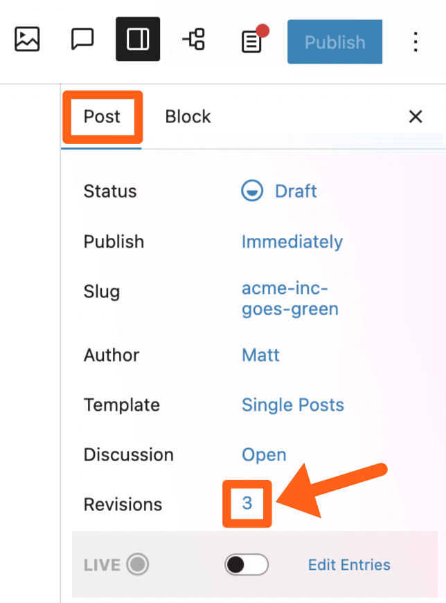
Revision Types
There are 3 types of revisions you can see for a post. Blocks which shows the page content as you would normally see it, Metadata which shows content like SEO text & featured images, and Code that shows the blocks shorthand code which is similar to WordPress shortcodes. To switch the revision type use the dropdown in the top right of the revisions screen.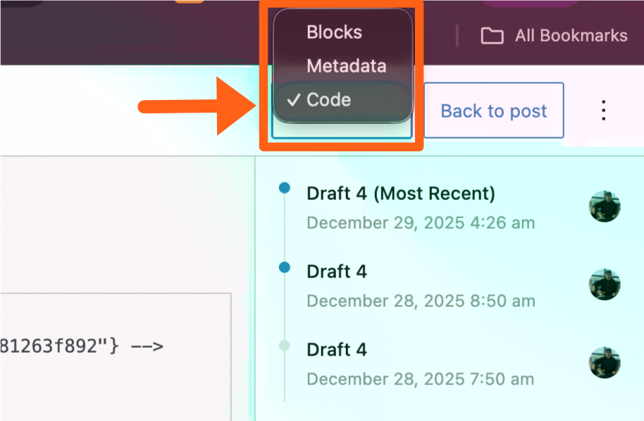
You can see examples of each revision type below. We’ve also added simultaneous scrolling to make side-by-side comparison easier.
Blocks: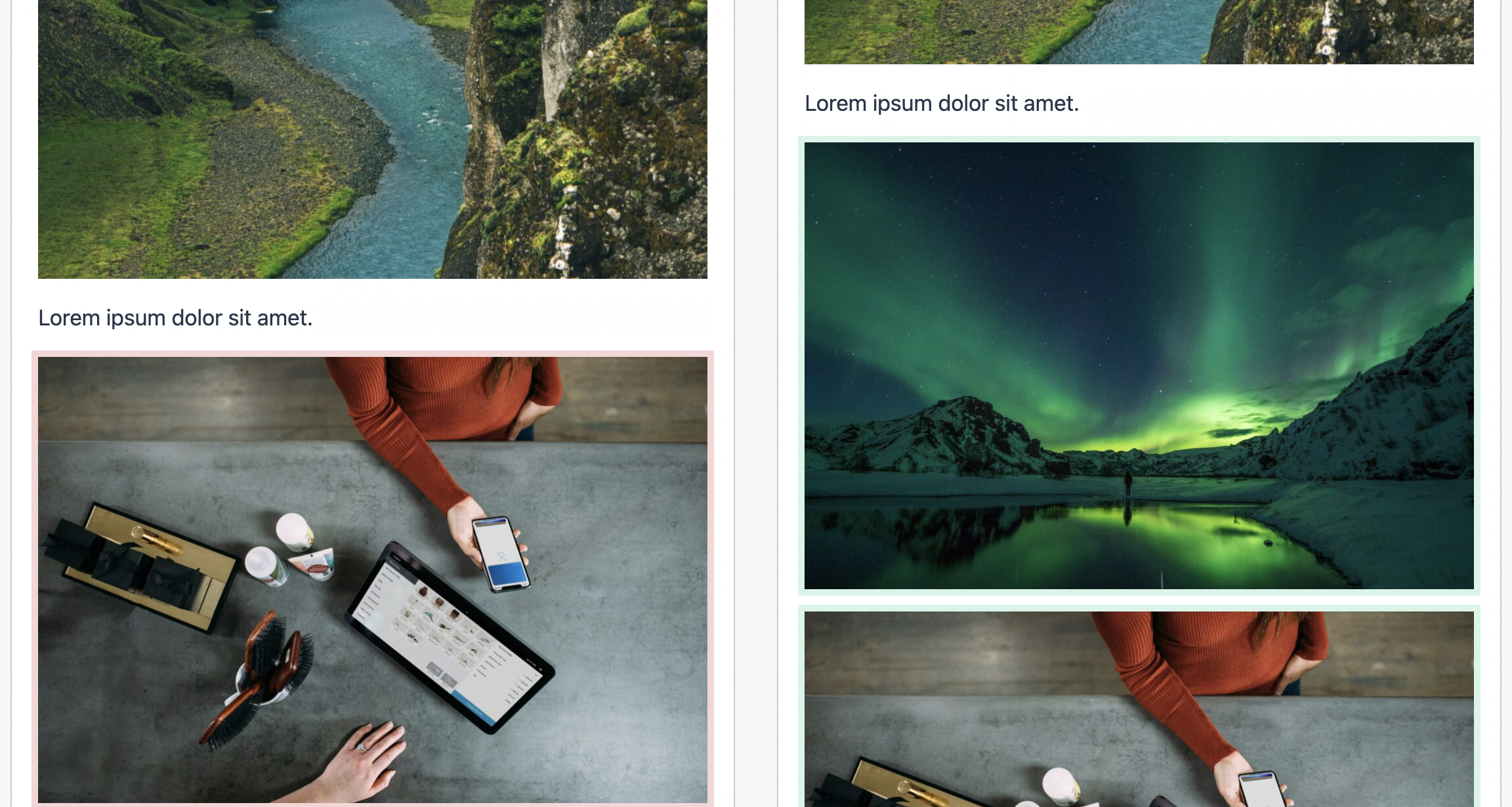
Metadata: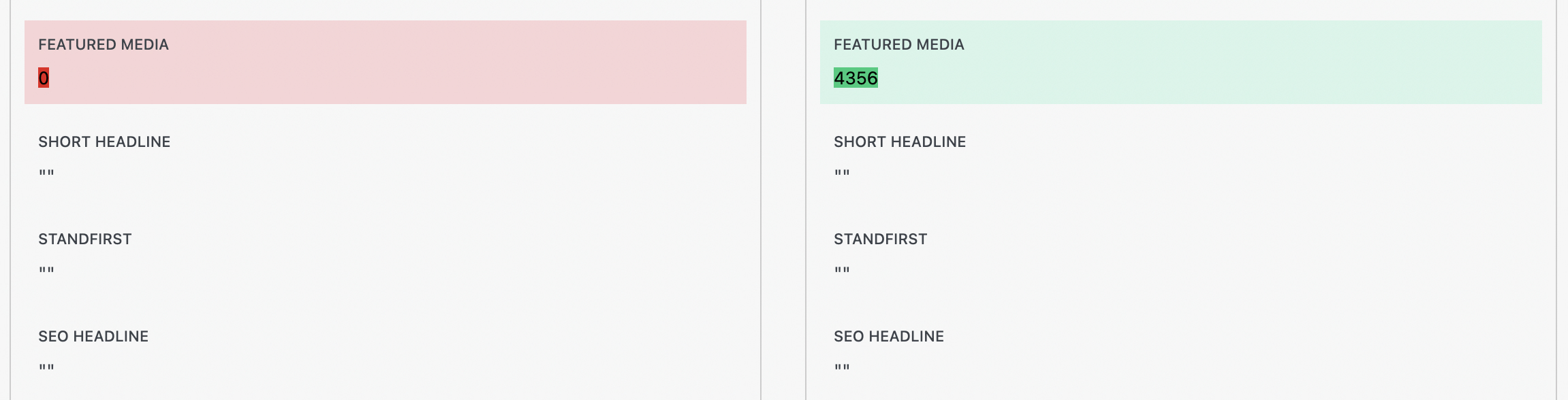
Code: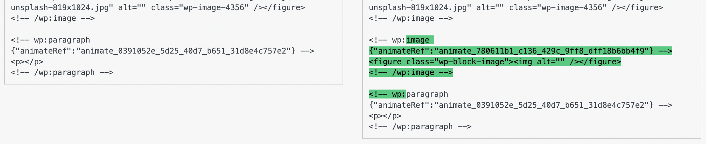
Revision Views
There are 2 types of revision views, Compare to previous, and Compare to latest. You can switch between the views by clicking the 3 dot button in the top right of the revisions screen.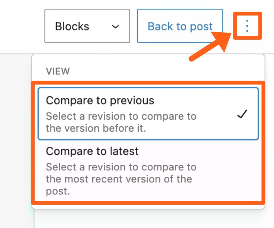
- The Compare to previous view lets you select a revision from the sidebar and compare it to the version before it.
- The Compare to latest view lets you select a revision from the sidebar and compare it to the most recent version.
Restore a Revision
On the revisions screen, once you’ve decided on a revision to restore, click the Restore button above the chosen version.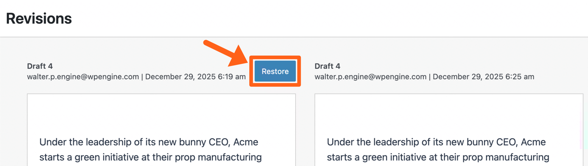
Workflow
The Workflow feature lets you schedule edits to be published on an already published post.
To enable or disable the Workflow feature, go to the MediaPress menu in the WordPress sidebar and toggle the checkbox next to Workflow.
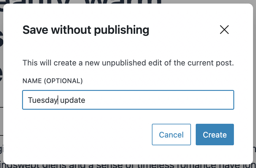
To save and schedule an edit to a post:
- Make your desired edits to the live post in the post editor.
- Click the dropdown arrow next to the Save button in the top right and select Save without Publish.
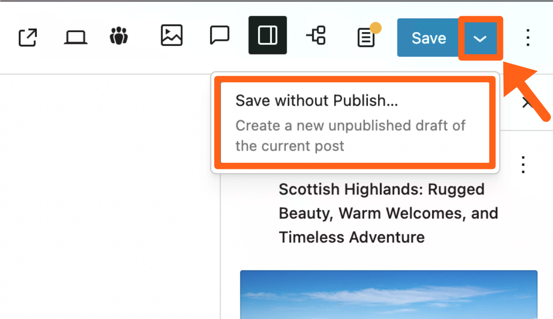
- Give your scheduled draft a name, and then click Create.
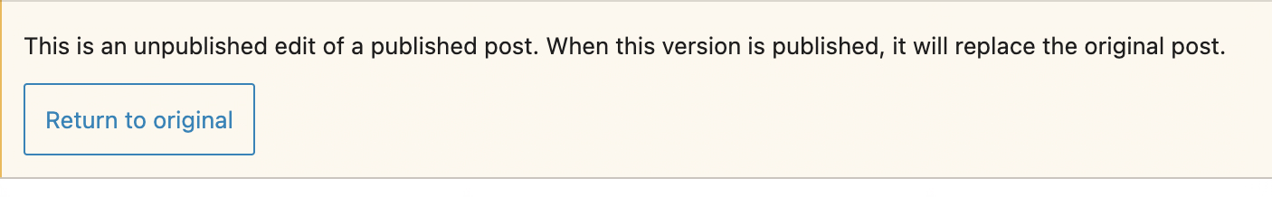
- Once you create your scheduled draft, you’ll be redirected to a new temporary post that’s in Draft status, which will house the changes for your scheduled post.
- When the scheduled changes are published the temporary post will replace the original.
- While in the new temporary post you’ll see a note about it with a link to the original post.
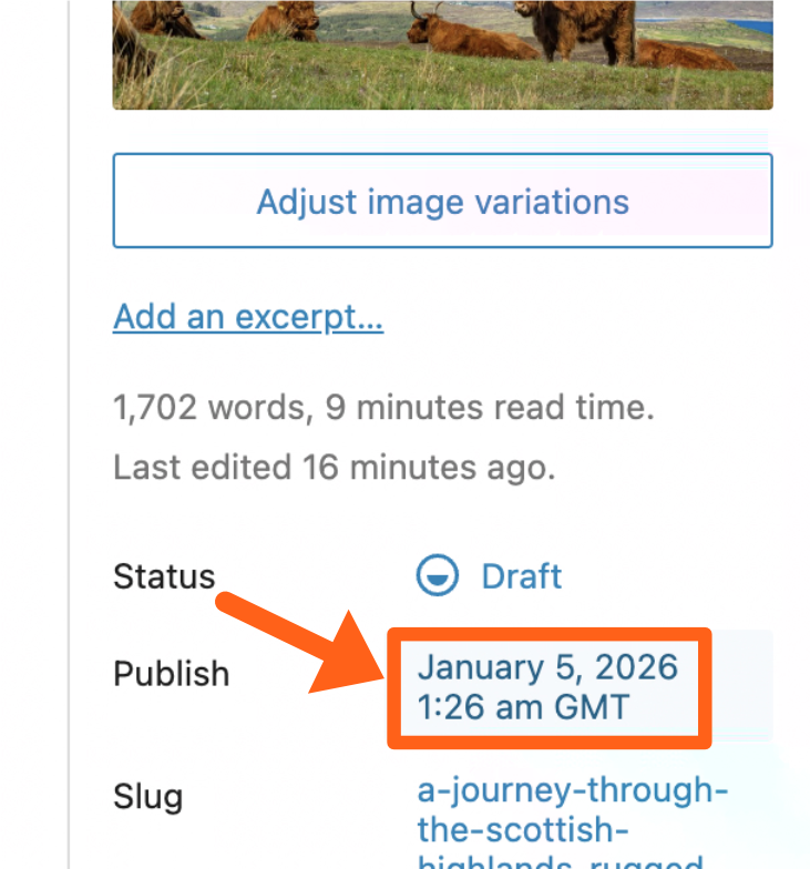
- Set your publish date while in the new temporary post, by clicking the date next to Publish in the post editor sidebar.
- Select the date and time that you want the edits to be published and click the Schedule button in the top right of the editor.
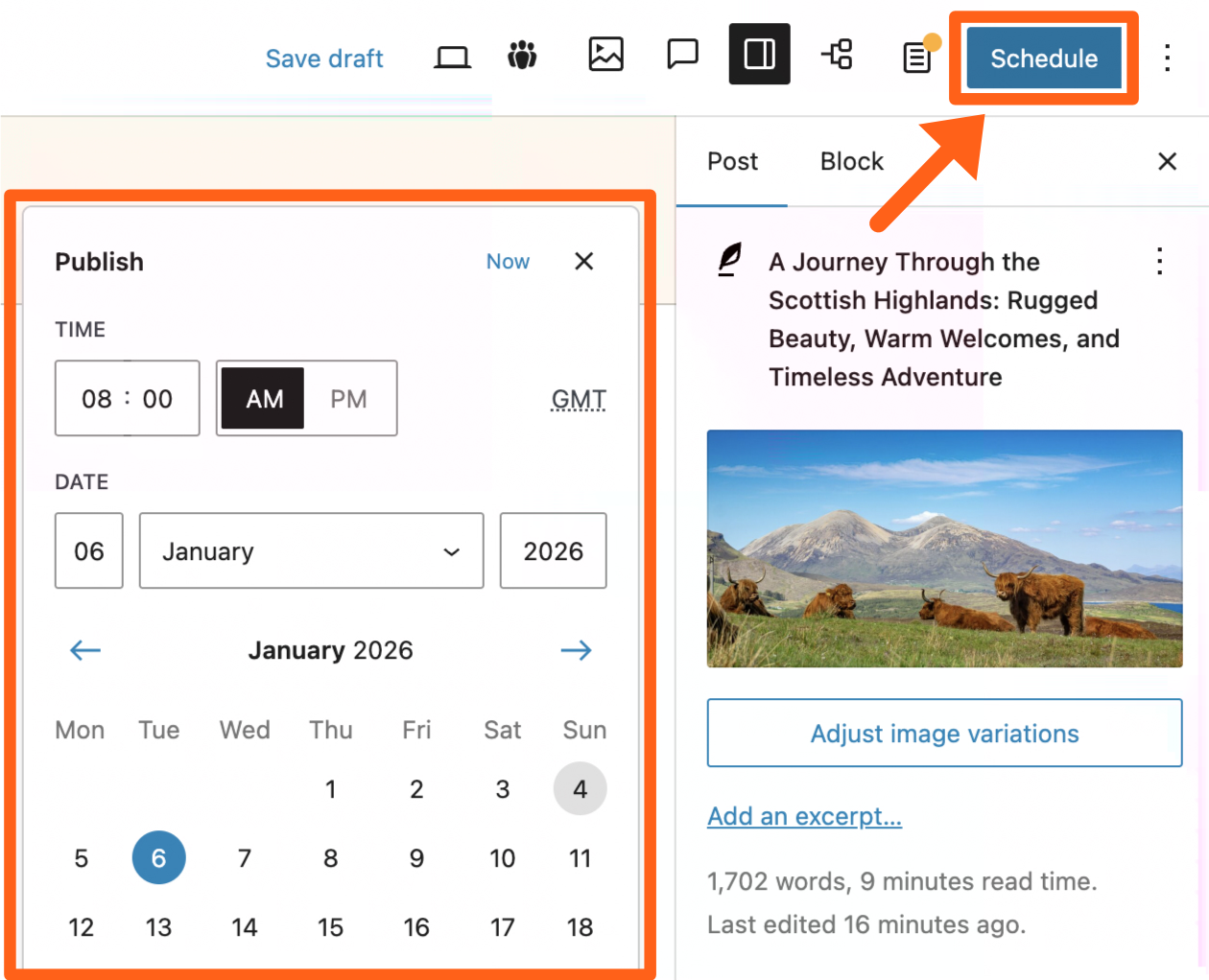
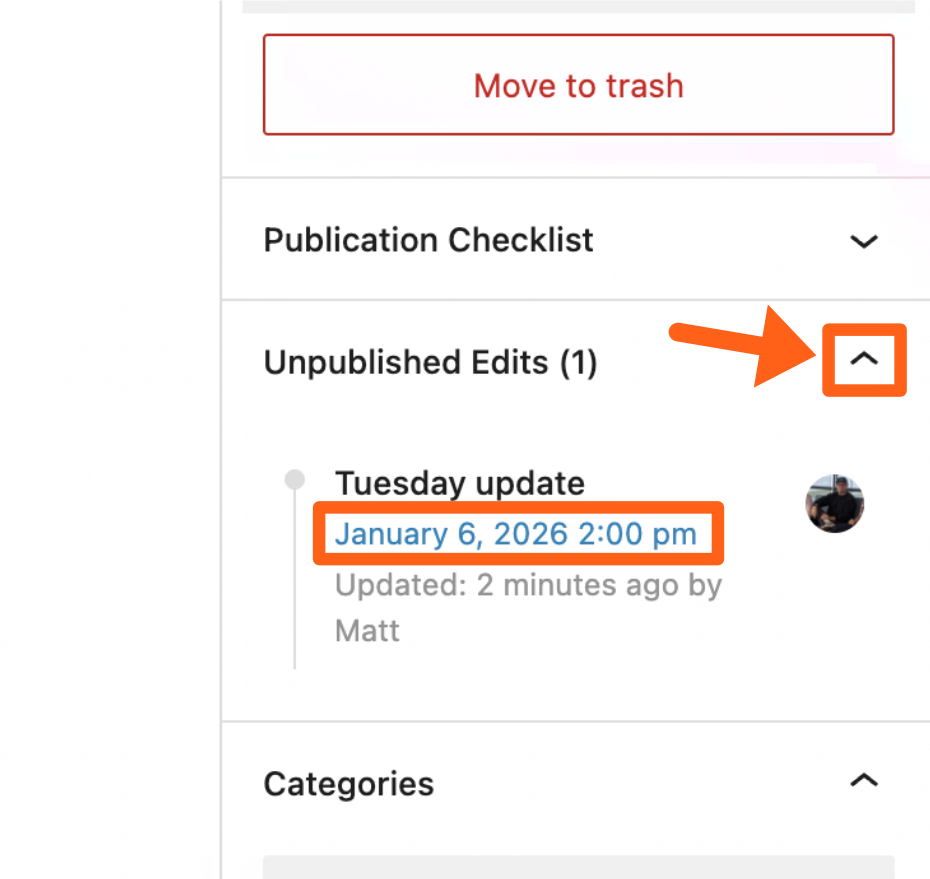
- Once you’ve scheduled your draft you can return to the original post and see your scheduled update under the Unpublished Edits meta box in the editor sidebar, with the date and time under the draft title.
Ads
The MediaPress Ads feature allows you to integrate Google Ads into your site, allowing you to easily embed advertisements into your posts and pages.
To enable or disable Ads, go to the MediaPress menu in the WordPress sidebar and toggle the checkbox next to Ads.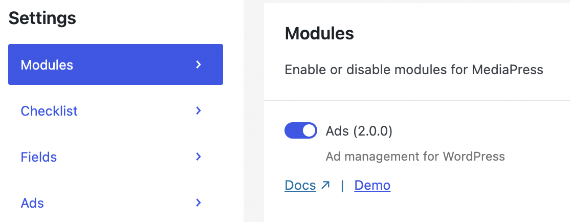
To add an advertisement in a post or page:
- Search the word “ad” when adding a new block in the post editor.
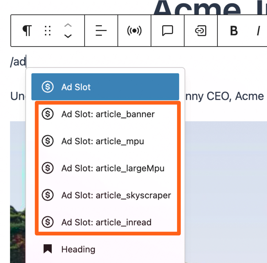
- Choose from the optional blocks for different ad sizes which include:
- article_banner: Wide rectangle, typically inserted above main content.
- Sizes:
320 x 50px / 320 x 100px (mobile)
320 x 50px / 320 x 100px / 300 x 250px (large mobile)
728 x 90px / 728 x 50px (tablet/desktop)
- Sizes:
- article_mpu: Medium rectangle expected to be placed in sidebars.
- Sizes:
300 x 250px (any device)
- Sizes:
- article_largeMpu: Tall rectangle which is a double height version of the article_mpu (medium rectangle).
- Sizes:
300 x 600px (any device)
- Sizes:
- article_skyscraper: Tall skinny rectangle expected to be placed in sidebars.
- Sizes:
160 x 600px (any device)
- Sizes:
- article_inread: Typically added within the article content.
- Sizes:
320 x 50px / 320 x 100px / 300 x 250px (mobile)
320 x 50px / 320 x 100px / 300 x 250px / 728 x 90px (tablet)
320 x 50px / 320 x 100px / 300 x 250px / 728 x 90px / 728 x 250px (desktop)
- Sizes:
- article_banner: Wide rectangle, typically inserted above main content.
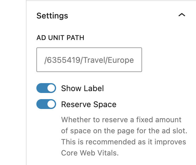
- In the block settings of the editor sidebar, type in an Ad unit path and an optional Unique ID.
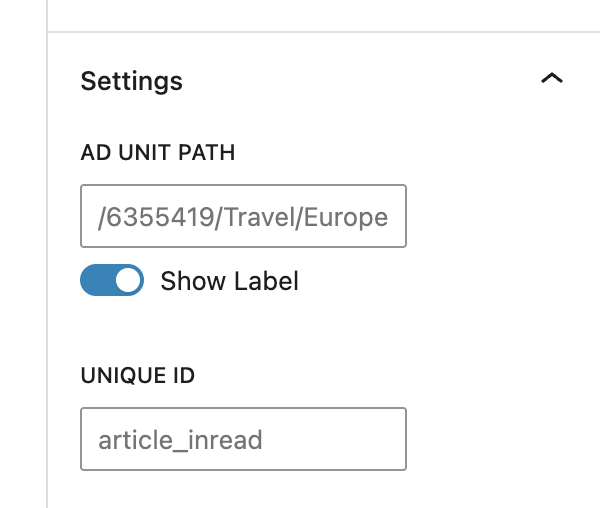
- In the pictured example path of
/6355419/Travel/Europe6355419is the network code or publisher IDTravelis the parent ad unit or categoryEuropeis a child ad under Travel
- In the pictured example path of
- Select the Reserve Space option. Choose whether to reserve a fixed amount of space on the page for the ad slot. This is recommended as it improves Core Web Vitals.
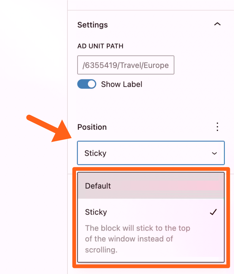
- Set the position of the ad in the sidebar settings to either default (scrolling) or sticky which pins the ad at the top of the page when it reaches the top of the viewport.
- You can also make an ad sticky relative to only one section of content if you group the ad block with the other blocks in the section.
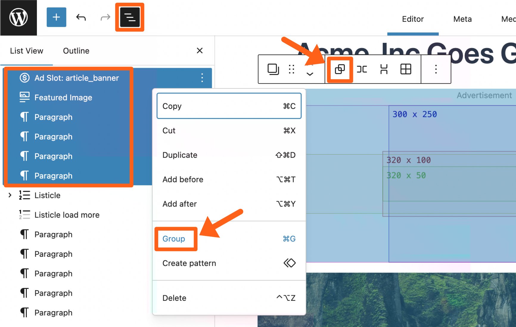
- To group blocks together you can hold the SHIFT key and then click all of the appropriate blocks. You can do this in the central editor screen or in the sidebar outline view. Then either click the group button in the toolbar of the main content area, or right click the blocks in the outline sidebar and then select Group.
- You can also make an ad sticky relative to only one section of content if you group the ad block with the other blocks in the section.
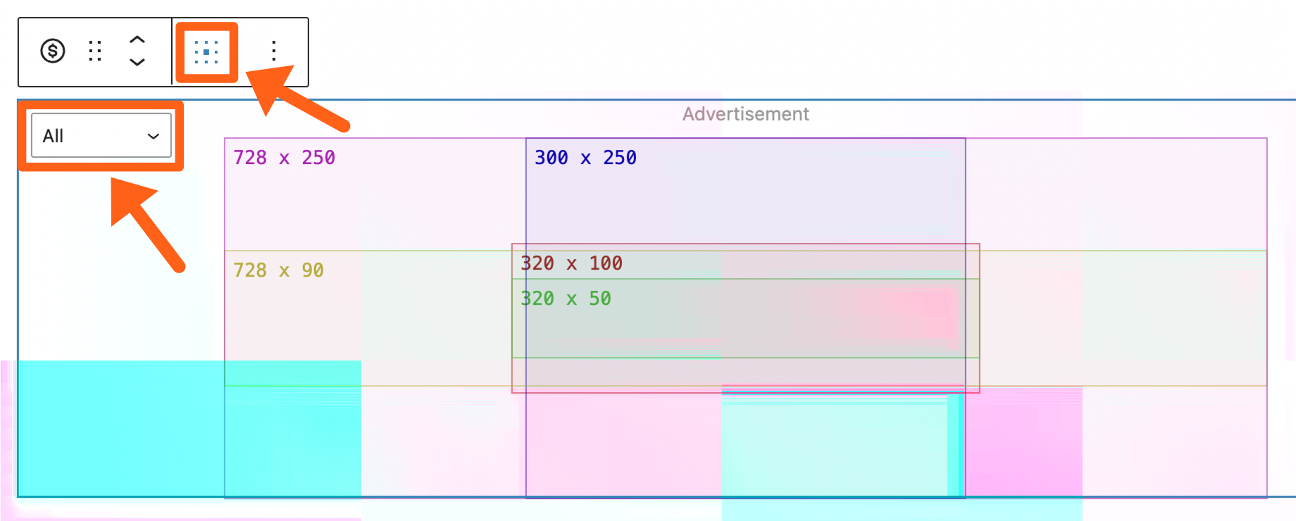
- Choose from the available ad box sizes, and select the placement within the box from the block settings as shown below.
Blocks
MediaPress blocks help to enhance the story that you’re telling and to increase user engagement. The features include animations, charts, image comparison, and sliders. Each feature is outlined below.
Block Animations
Animations add movement to blocks, such as fading and sliding in. This adds increased dimension and depth to posts and pages.
To enable or disable animations, go to MediaPress in the WordPress sidebar and toggle the button next to Animations in the Modules tab.
To add animation select the block on the post editor, and then in the block settings sidebar, choose an animation type. The animation types include fade in, slide in, and a combination of both slide and fade in.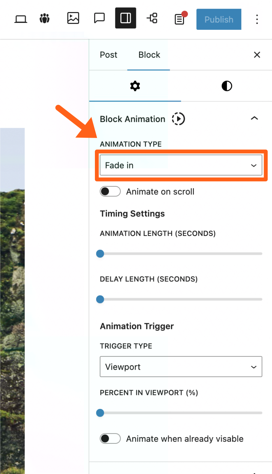
The animation settings pictured above include:
- Animate on scroll: When this option is selected the block will automatically fade in or slide in when you scroll up or down. You will not be able to select other animation settings when this automatic option is enabled.
- Animation length: This is the number of seconds the animation will last once it starts.
- Delay length: This is the number of seconds to delay the start of the animation after its animation trigger has fired.
- Trigger type: This is the action that starts the animation. Currently Viewport is the only trigger option which triggers the animation when the block is scrolled into the viewport.
- Percent in viewport: This sets the percentage of the block height that is scrolled into the viewport before the animation trigger is fired. For example, if you set this to 100, then the animation will not trigger until 100% of the block height is scrolled into the viewport.
- Animate when already visible: When a page is refreshed the viewport trigger will not fire for blocks that are already in the viewport. Enabling this setting will change that and animate the blocks that are already in the viewport on page refresh.
Charts Block
To add a chart search “chart” when adding a block and select the Chart block. When selected some default data will be applied and the default chart type will be a pie chart.
To enable or disable Charts, go to MediaPress in the WordPress sidebar and toggle the button next to Chart Block in the Modules tab.
The available chart types are:
- Bar (Horizontal)
- Bar (Vertical)
- Line (Horizontal)
- Line (Vertical)
- Pie
- Doughnut
- Radar
Add Chart Data
To add data you manually add chart labels and dataset numbers in the block sidebar, or you can upload a CSV file from a source like Google Sheets or Microsoft Excel. Both options are outlined below.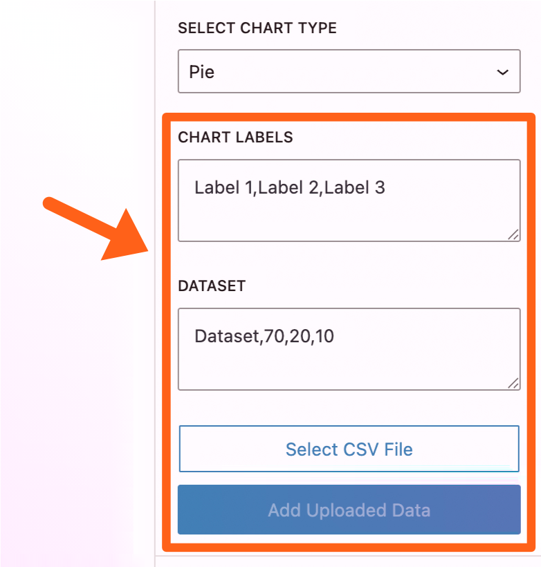
- Add data manually:
- Chart labels: Add labels for each category of dataset values, separated by commas. For example if you’re adding a bar graph for days of the week your labels would be:
Monday,Tuesday,Wednesday,Thursday,Friday,Saturday,Sunday - Dataset: Add the label of a dataset followed by a comma and then the numbers of the dataset separated by commas. For example, if your bar graph for days of the week is showing a dataset of the number of letters in each weekday name, your dataset could be:
Number of letters,6,7,9,8,6,8,6
From the above example your chart would look like the screenshot below.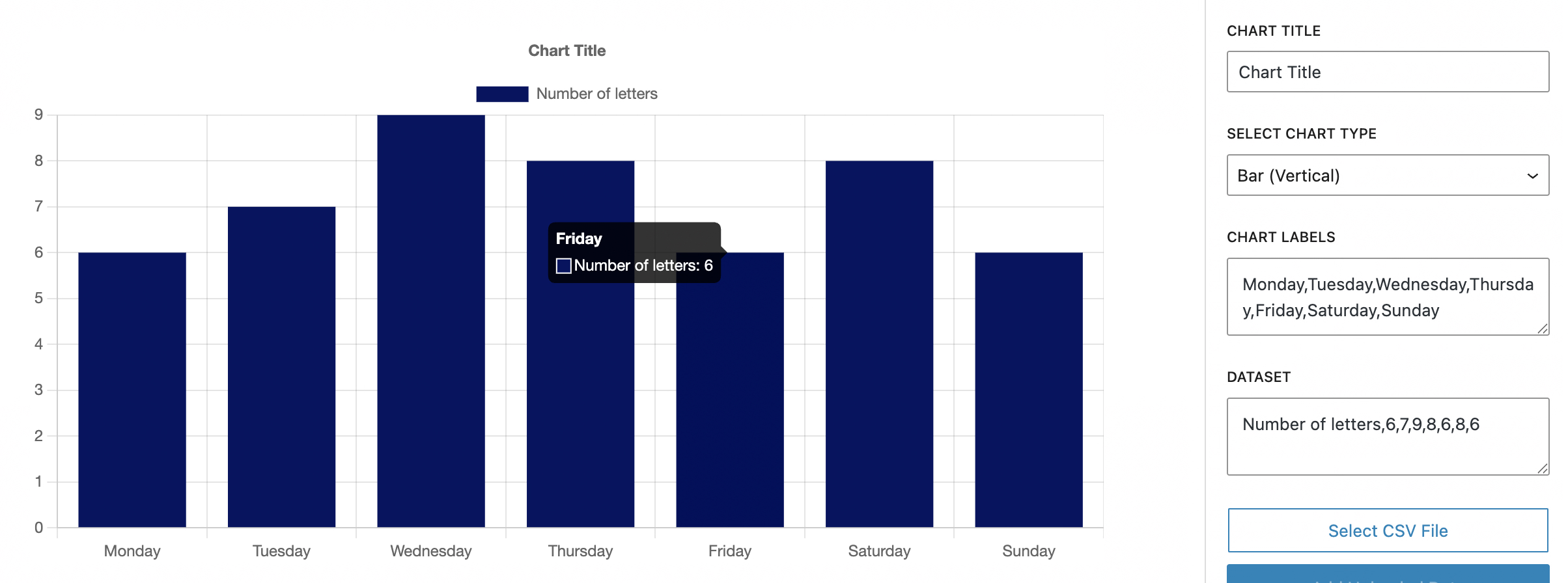
- Chart labels: Add labels for each category of dataset values, separated by commas. For example if you’re adding a bar graph for days of the week your labels would be:
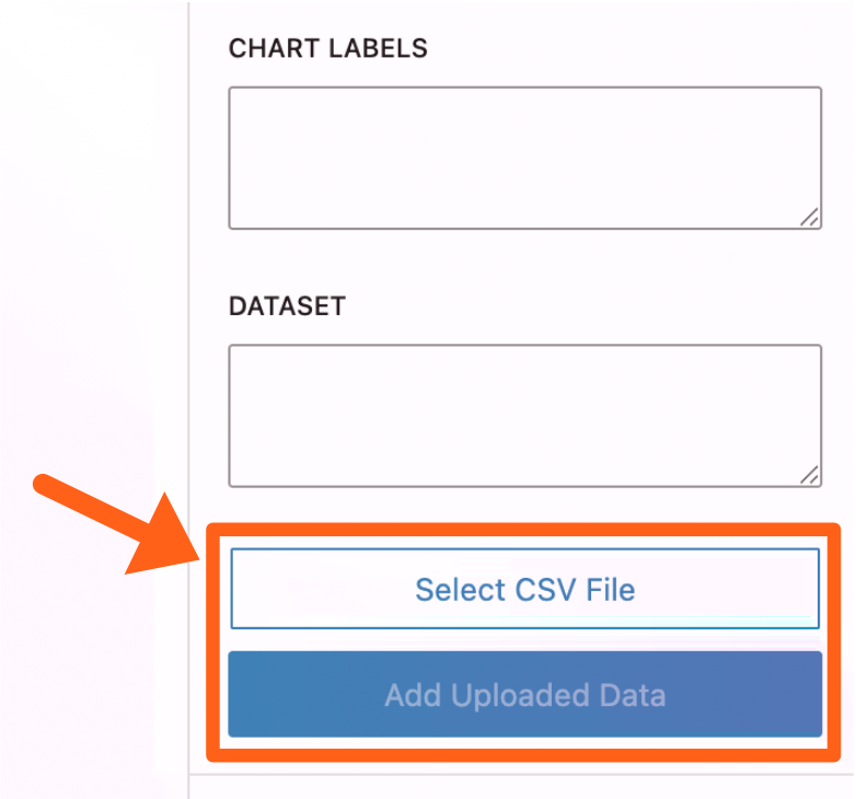
- Add data with a CSV file: To use a CSV file click the Select CSV File button in the block sidebar and then choose the CSV file from your computer. Once selected, click the Add Uploaded Data button to import your sheet. You should then see the data populated in the chart labels and dataset textboxes in the block sidebar.
- Format: For the format of your spreadsheet, you’ll leave the first cell blank (A1) and then add the labels as normal column headings in the first row starting at cell
B1. Then you’ll add any dataset names in theAcolumn with their respective numbers in the row next to each dataset name.
As an example, to replicate the exact same chart as the manually added example in the above image, your spreadsheet would look like the screenshot below.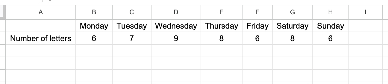
- Export spreadsheet: When you export your spreadsheet make sure you choose CSV (comma separated values) as the download or export type.
- Format: For the format of your spreadsheet, you’ll leave the first cell blank (A1) and then add the labels as normal column headings in the first row starting at cell
Image Comparison Block
The image comparison block allows you to compare 2 images by dragging a slider between them to reveal more of each image as you drag in each direction.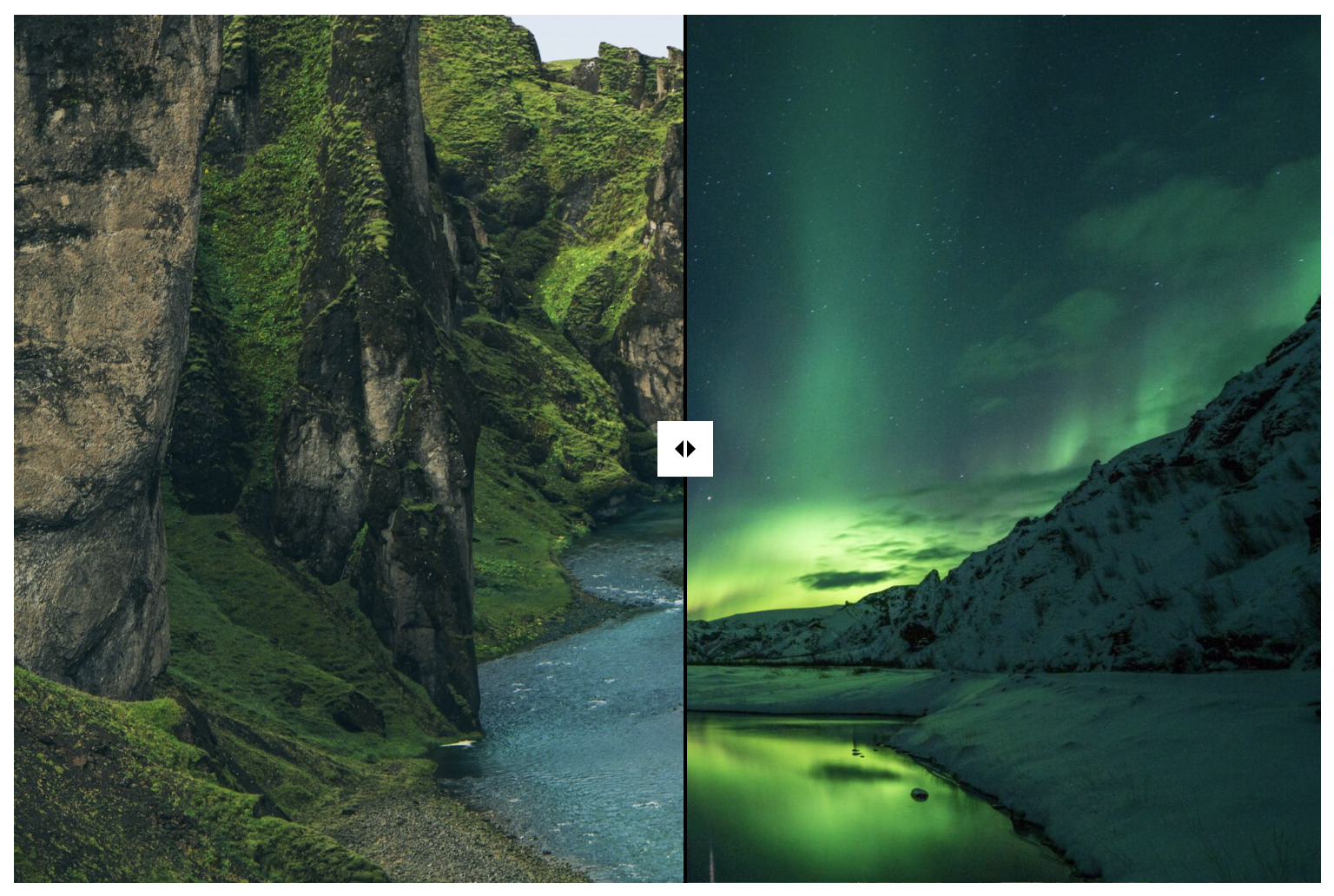
To enable or disable the Image Comparison block, go to MediaPress in the WordPress sidebar and toggle the button next to Image Comparison Block in the Modules tab.
To add an image comparison, search “image” when adding a block and select the Image Comparison block. After adding the block you’ll see 2 Select Image buttons to choose each image.
The settings available include:
- Overflow: Enabling this allows the drag handle to be visible when dragged past the end of the container.
- Width and height: This sets the size of the container for both images.
- Initial position: This refers to the position of the drag divider. The number is the percentage from the left or top of the container that the divider will start. By default it’s at 50% and starts in the middle.
- Divider axis: You can choose for the divider to divide the container horizontally or vertically.
Slider Block
The slider block is a versatile slider. Though it will often be used for images it also lets you add other kinds of blocks in each slide.
To enable or disable the Slider block, go to MediaPress in the WordPress sidebar and toggle the button next to Slider Block in the Modules tab.
Add a Slider
- Search “slider” when adding a block in the post editor and select the Slider (Curated) block. When added you should see previous and next arrow buttons.
- Paginate through the slides and add images or other blocks for each slide. By default there are 3 slides which can be changed in the settings.
- Edit the slider settings. You can click the block outline button in the top left of the post editor. Here you’ll be able to click the outer slider block which will bring up the main slider settings in the post editor’s right sidebar.
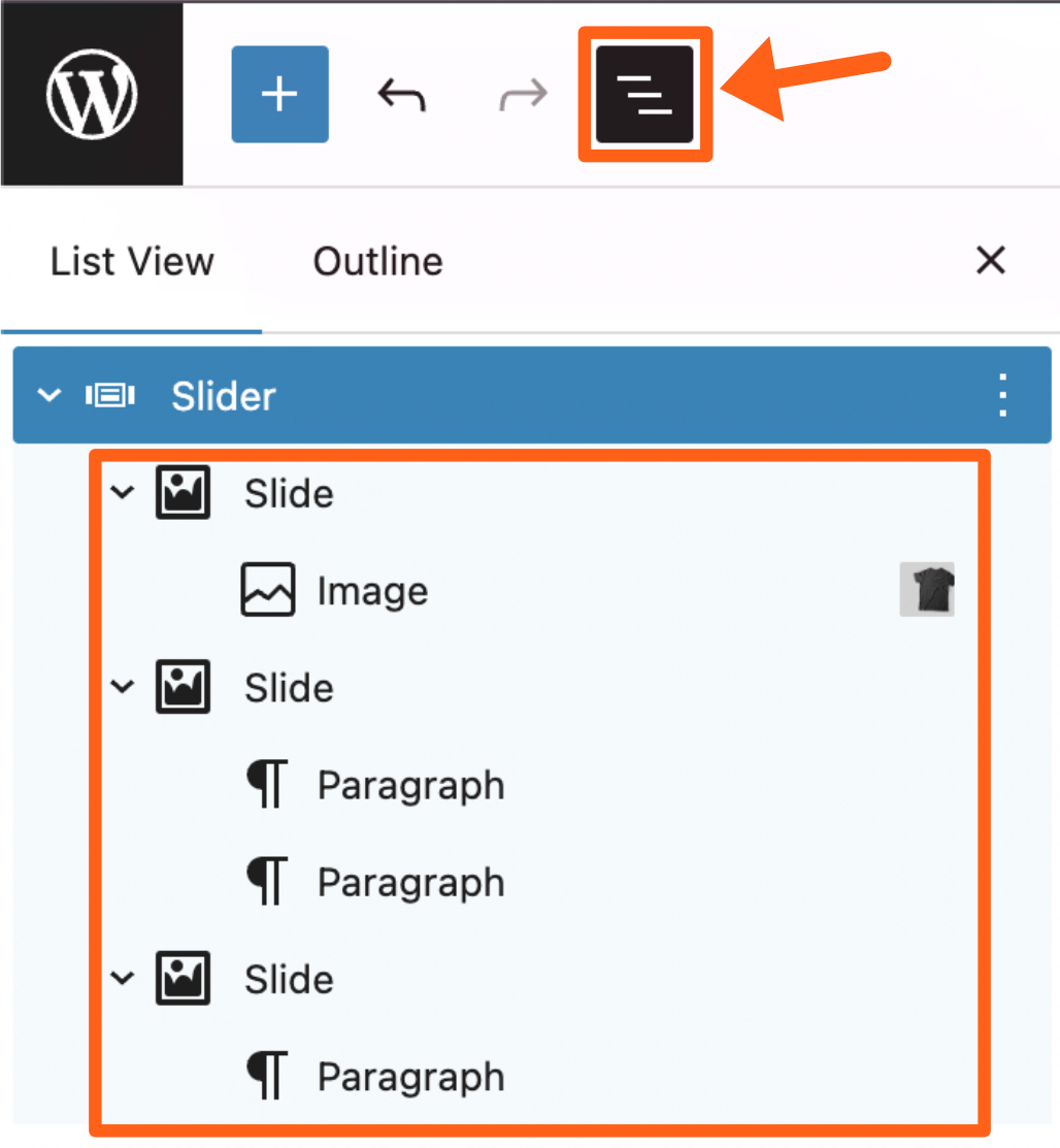
You can also click each individual block to adjust the settings for the block. You’ll notice in the block outline that each slide is a “Slide” block with blocks inside of it.
Slider Settings
Once the main slider block is selected from the block outline, you’ll see the settings in the post editor’s right sidebar.
The settings include:
- Slide Layout:
- Visible slides: This sets the number of slides that are visible at a time in the slider wrapper.
- Total slides: This sets the total number of slides that you want to have in your slideshow.
- Slide gap: This sets the gap between slide images. This can be useful for visual separation when you have the visible slides settings set to more than one slide.
- Autoplay: This will set the slides to automatically slide without user input.
- Slide Icon Settings:
- Navigation Button: This will enable or disable the slider navigation buttons. Disabling the buttons would only make sense if you have the autoplay setting enabled and do not want users to manually control the slides.
- Icon size: This number controls the height and width in pixels of the icons in the slider navigation buttons. Note: the button container size can be adjusted in the slider button settings section.
- Previous and Next Icons: Clicking either of these icons will let you choose a new icon from the list or even upload your own custom icon.
- Slider Button Settings: The slider button settings give you many options for adjusting the size and position of the slider buttons.
Share Button Block
The Share Button block adds a share button to your post that makes it easy for your users share your post on social media.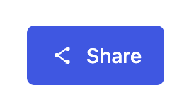
After adding the block, you’ll see an Add modal checkbox option. 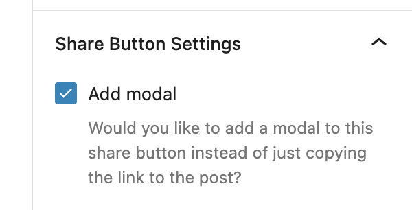
- When the modal is off, the share button will simply copy the link to the post when clicked.
- When the modal is on, the share button will open a popup with buttons for sharing the post on different social media platforms:
- X / Twitter
DAM
The DAM (Digital Asset Manager) is a connector between WordPress and digital asset management tools. It allows you to sync media, and to use tags for media organization.
To enable or disable the DAM, go to MediaPress in the WordPress sidebar and toggle the button next to DAM in the Modules tab.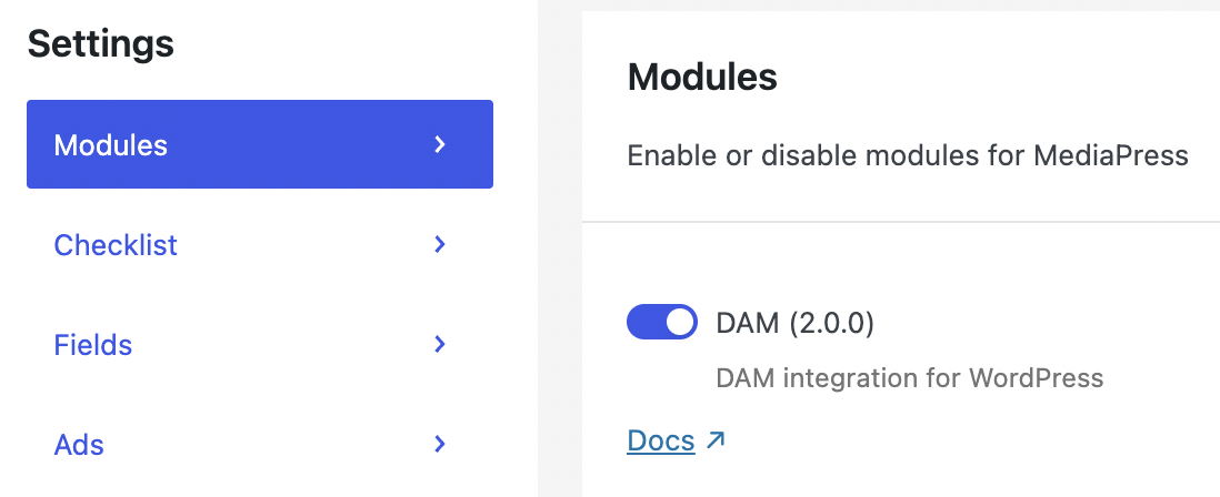
Connect to a DAM
You can connect to the digital asset manager tools Cloudinary and Bynder by adding URLs for either of them in the DAM tab under MediaPress in the WordPress sidebar. After entering your URL click the Sync Assets button.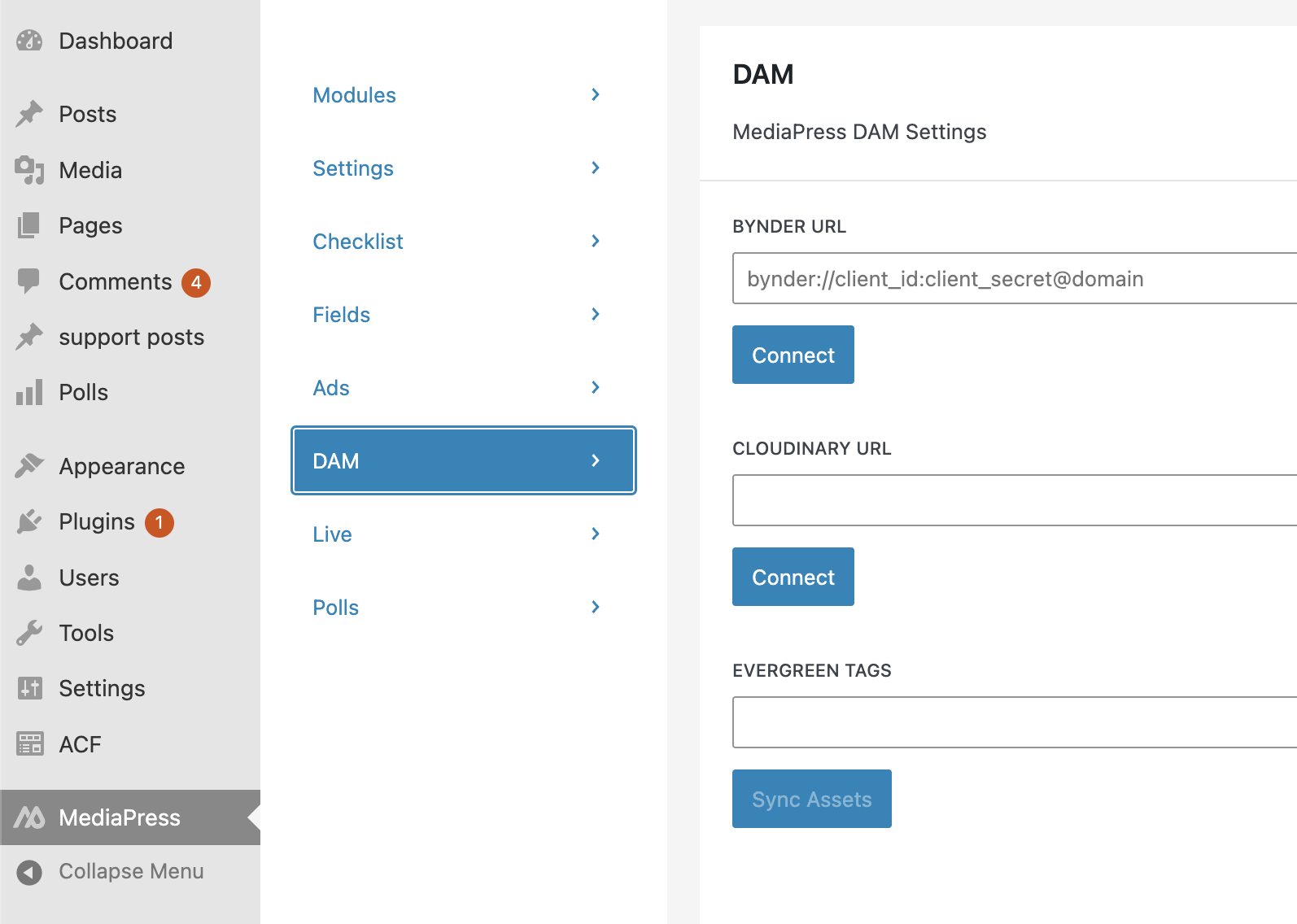
Import Evergreen Assets with DAM Tags
Evergreen Tags let you import content that will remain relevant for a long time for the whole website. This might include media such as brand assets for example.
Under MediaPress in the WordPress sidebar you can select the DAM tab, and you’ll see an input field labeled Evergreen tags. Here you can input tag names that you’ve used in the digital asset manager that you’re connected to. Hit the Enter key after typing a tag name to input another tag. Then you can click the Sync Assets button to import all of the media in your DAM with the same tags.
Import Assets to a Single Post with DAM Tags
While in the post editor select the Meta tab at the top of the page. From the DAM section in the left sidebar, you’ll see a DAM Tags input field. Type tag names from your 3rd-party digital asset manager to import content tagged for the specific post. After adding all relevant tags, click the Sync Assets button. After syncing you can go to the Media tab at the top of the post editor and see the imported assets in the Attached Media sidebar.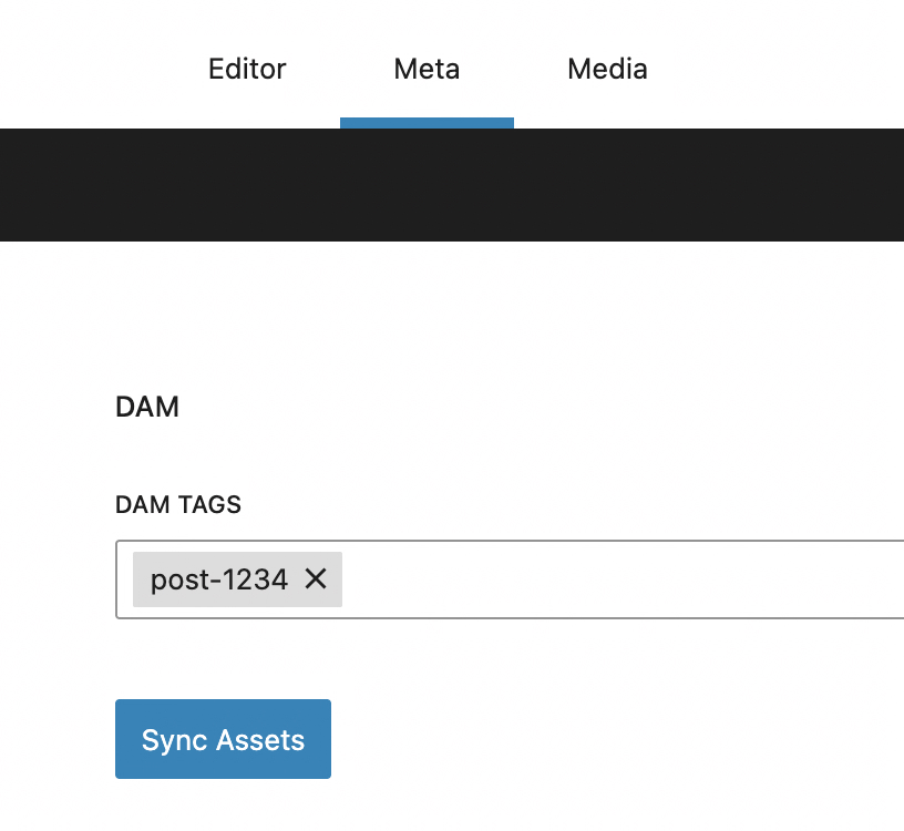
Listicles
A Listicle is an article structure where you have a list of similar items that each get their own highlighted section, such as a top 10 list, etc.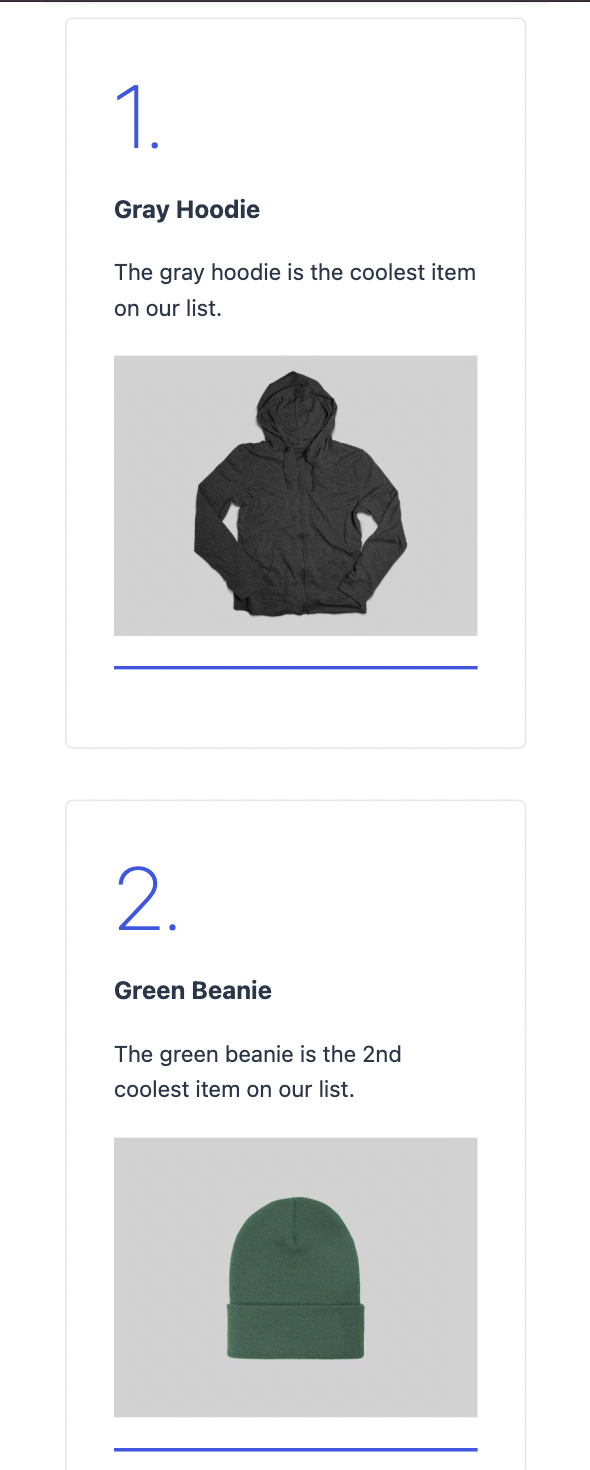
To enable or disable Listicles, go to MediaPress in the WordPress sidebar and toggle the button next to Listicles in the Modules tab.
To add listicles to an article:
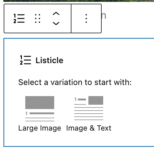
- Search for “listicle” when adding a block in the post editor and select the Listicle block.
- Select from the large image or small image variations.
- Add content for each listicle item. The content sections include:
- Heading
- Summary
- Image
- Description
- Click the plus symbol button under a listicle to add another listicle item.
Listicles Pagination
The Listicles pagination blocks allow you to restrict the number of listicle items that show at a time.
To use pagination for Listicles:
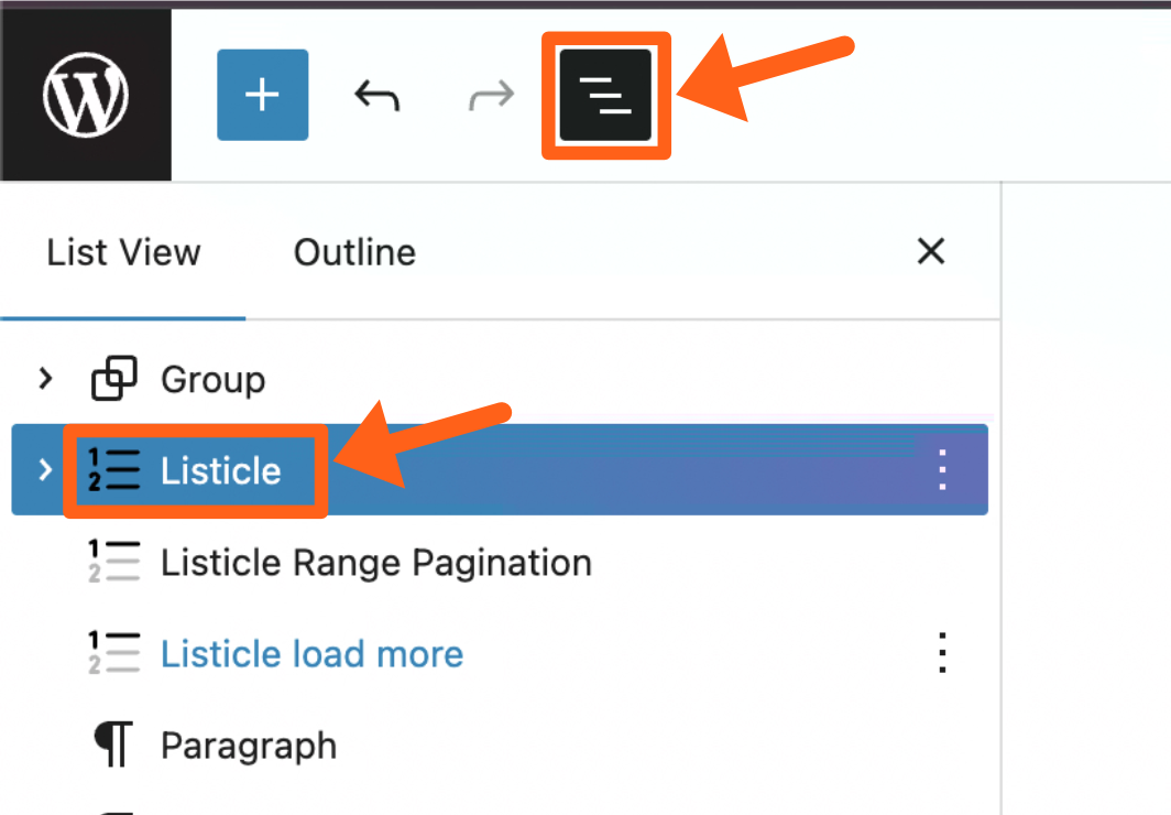
- Select the outer Listicle block. An easy way to select it is to click the block outline button in the top left of the WordPress post editor. Then you can find the Listicle block in the block and outline and click it.
- Once selected, you’ll see the settings for the block in the right editor sidebar. Find the setting labeled Pagination limit and type in the number of listicle items that you want to show at a time.
- Add a pagination block after the Listicle block. Search the word “listicle” when searching block types and either select one of the 2 pagination block types:
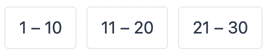
- Listicle range pagination: The range block will show clickable numbered ranges based on your pagination limit setting. The applicable range of Listicle items will be revealed when you click on the corresponding range.
- Listicle load more: The load more button loads the next set of Listicle items in the range. For example, if your pagination limit is set to 5, only items 1-5 will show and when the load more button is clicked it will reveal items 6-10.
- Listicle range pagination: The range block will show clickable numbered ranges based on your pagination limit setting. The applicable range of Listicle items will be revealed when you click on the corresponding range.
Live
The Live feature is an article structure that allows you to create timestamped updates about a single current event. After converting a post to a live post, you can add a Live Feed block anywhere in the post to display your live updates.
To enable or disable the Live feature, go to MediaPress in the WordPress sidebar and toggle the button next to Live in the Modules tab.
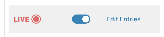
To convert a post to a Live post, set the toggle button to the on position next to the Live label in the post editor post sidebar tab.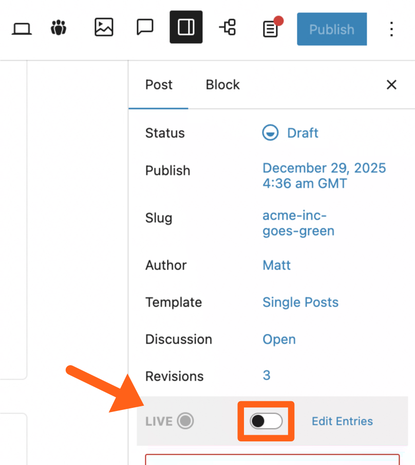
After selecting the live option, you’ll need to confirm your choice and then you’ll be taken to the live editor screen.
The live editor screen will be a scaled down version of the post editor with fewer blocks available where you can add live entries. You can add block content in the same way for each entry.
There will not be an “Add block” button but you can hit the Enter key to add a new block. Then you can type the “/” character as directed to search through the available blocks.
There is a back to post link in the top right to return to the main post editor and you can always click one of the 2 Edit Entries links in the post editor to return to the live editor screen as shown below. One is a top banner and one is in the post right sidebar.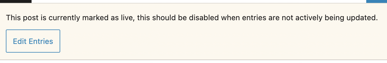
Add a Live News Update
To add a new entry:
- Click the New Entry button in the top right of the live editor screen.
- Add your title and content for the entry.
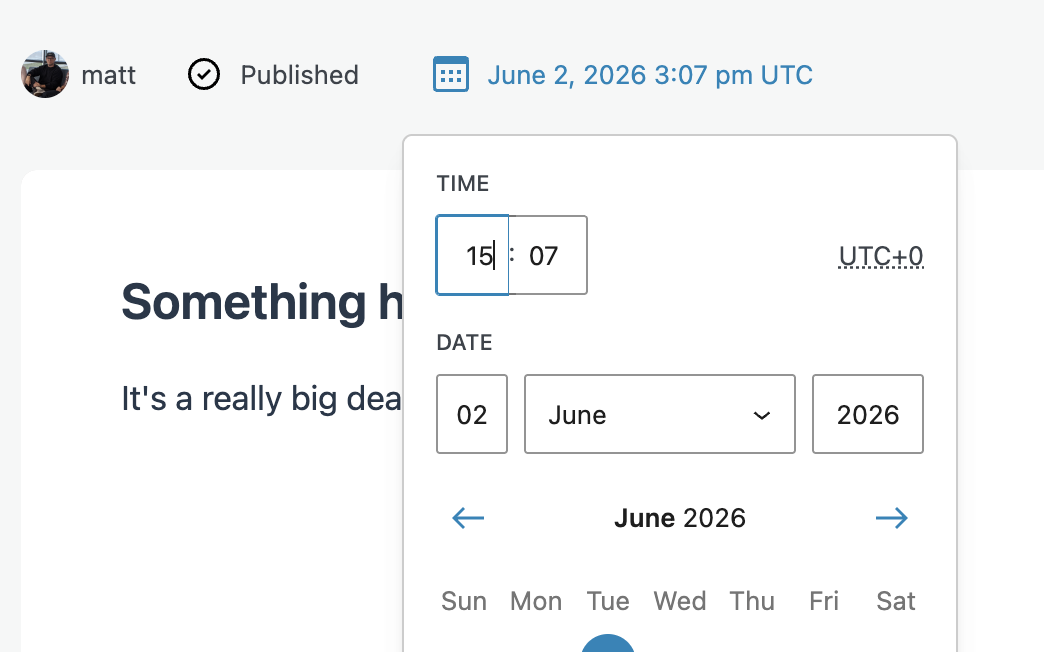
- Click on the calendar button above the entry and select a date and time. This will default to the current time. There is also a Now button at the bottom of the calendar picker to select the current date and time.
- Save the entry.
- Draft: If you want to save it as a draft then click the Save button above the entry.
- Publish: If you clicked the Now button in the calendar time picker, you’ll see a Publish button to publish immediately.
- Schedule: If you chose a time other than the current time, or left the default selected timestamp, then you’ll see a Schedule button. Selecting the schedule button will publish the entry at the selected time.
After adding a live entry you’ll see it show in the Entries sidebar. Click any of the entries in the sidebar to edit the content for the entry. After editing an entry click the Save button next to the Unpublish button.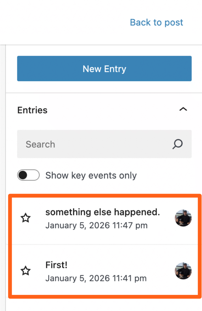
When adding a live entry there is a sidebar with unique options.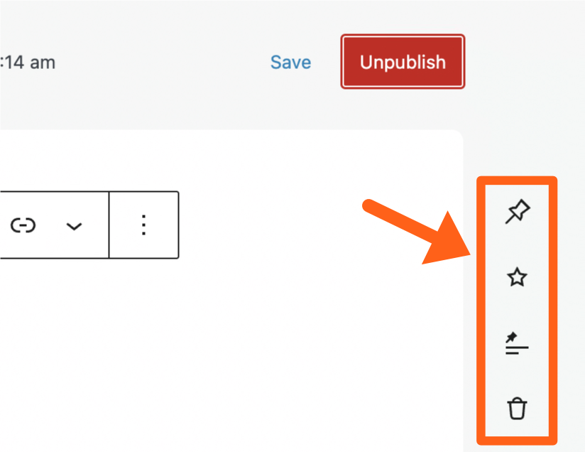
The sidebar options include:
- Pinned: 1 entry can be pinned to the top of the live feed. Click the pin icon to select it as the pinned entry. When you refresh the live article you should see the pinned entry highlighted at the top of the feed. The entry also still shows in its original position in the feed.
- Key Event: Marking entries as key events gives you the option to display all events or only key events in places like the Live Timeline block. Click the star icon next to a live entry to mark it as a key event and then click Save above the entry. You’ll then see the entry show in the Live Timeline block if you’ve added one to the article as shown below.
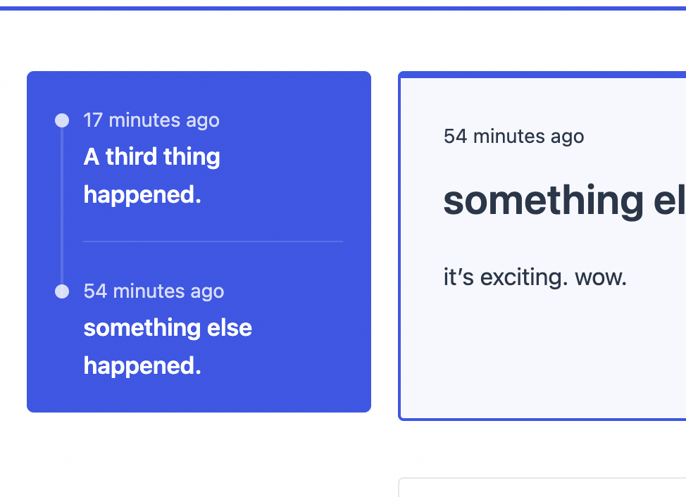
In the settings for the Live Timeline block you toggle between showing all events or just key events.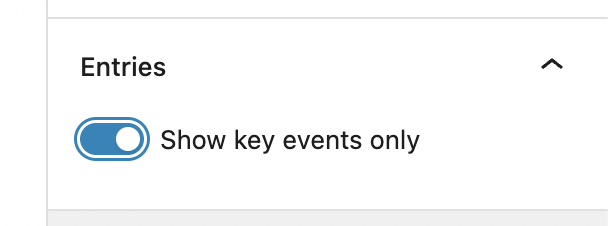
- Convert to Post: It may be appropriate to convert a particular entry into its own standalone post. This is simple to do by selecting the Convert to Post icon which is a pin with 2 lines under it. This will create a new post containing the content from the live entry at that point in time. No continued link will exist between the Live News Entry and the new post, so you can manage your new post independently.
- Delete: Delete the live entry from the feed. After deleting the entry will be removed from the feed on the live site.
Add a Live News Block to an Article
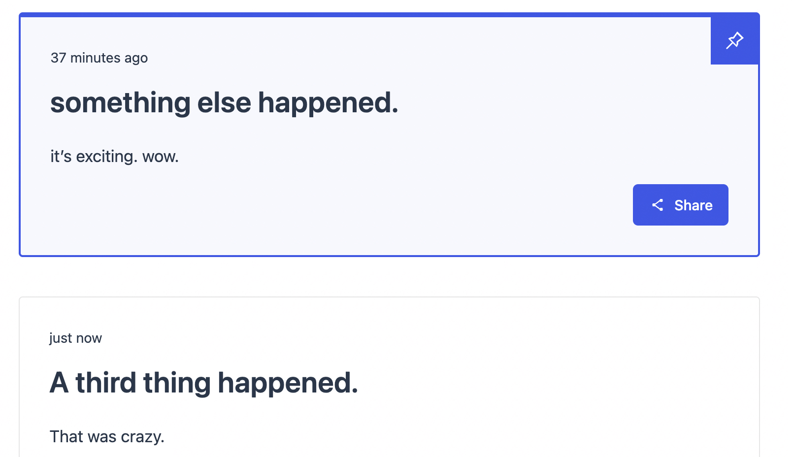
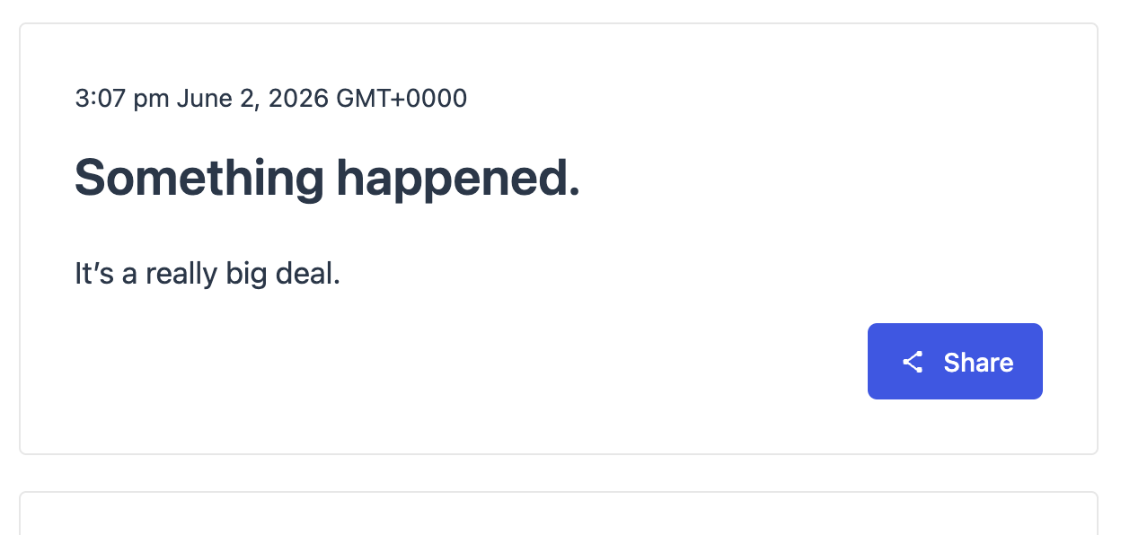
Decide where you want your live updates to show in an article and add a new block in the chosen space. Search “live feed” and select the Live Feed block. Once the block is added you can save your changes to the article and your live entries will show in the desired placement within the article. Every time a new live entry is published it will automatically show in the block on the live site without the user needing to refresh the page.
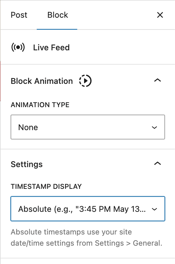
The settings for the Live Feed block include:
- Timestamp display: This setting lets you choose to show relative or absolute timestamps for live updates.
- Relative example: 8 minutes ago
- Absolute example: 2:23 pm June 2, 2026 GMT+0000
Polls
Polls and quizzes allow you to ask questions of your readers to increase engagement. Polls are basically questions that users can answer, and quizzes are a wrapper of poll questions that each have a correct answer. Quizzes also show results after all quiz questions are answered.
To enable or disable Polls, go to MediaPress in the WordPress sidebar and toggle the button next to Polls in the Modules tab.
Create a Poll
You can create polls from within the post editor or you can create a poll from the Polls post type in the WordPress sidebar.
When creating a post from within the post editor the only difference is that you’ll add a Poll block.
- Search “poll” when adding a block in the post editor and select the Poll block.
- There will be an input box to Search or create poll. Search for the name of an existing poll to use or type the name of a new poll that you want to create and then click the Create new poll button.
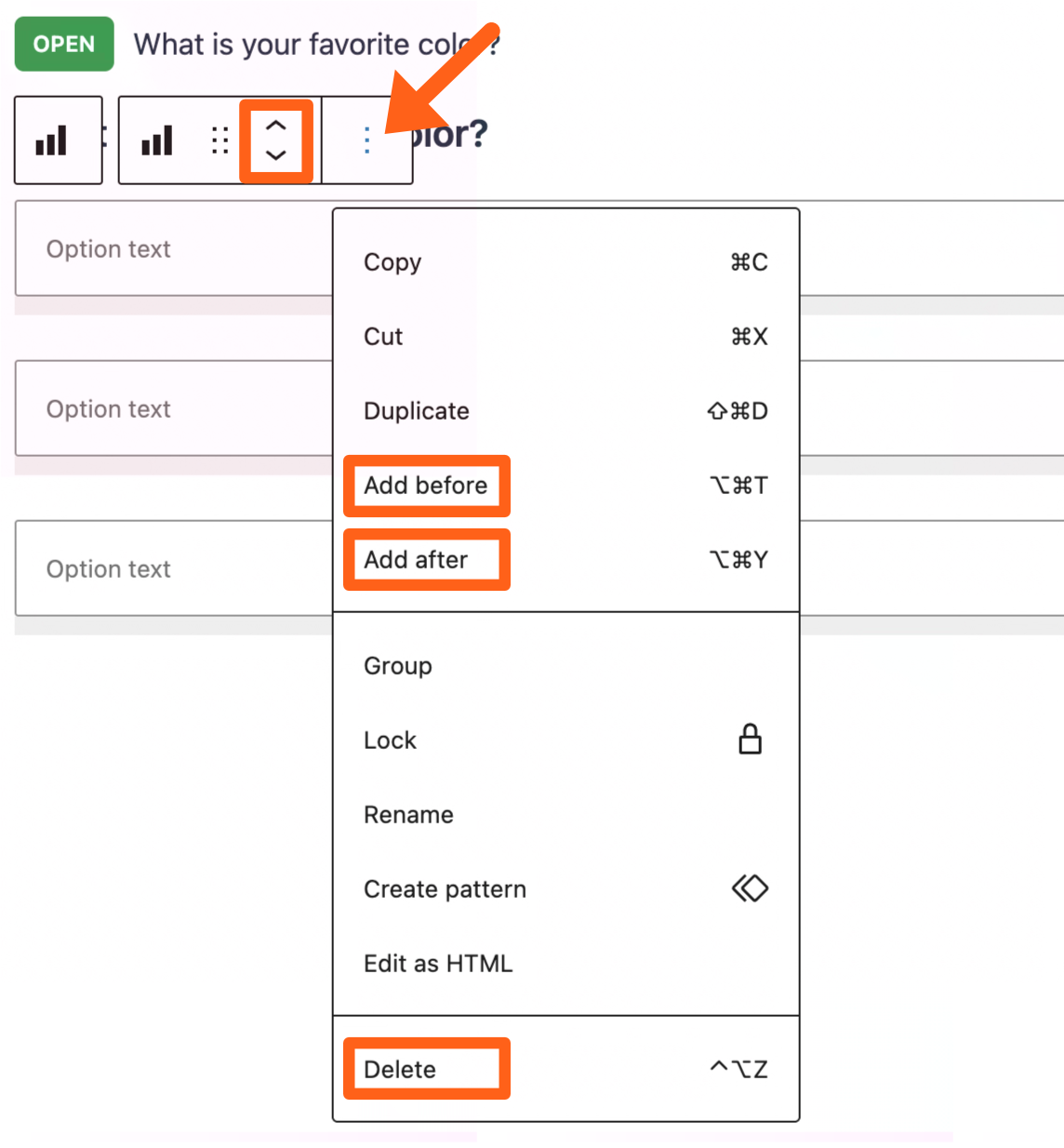
- By default you will see 3 option choices that you can fill out. These are basically normal Gutenberg blocks so you can use the top toolbar for an option to move it up or down, or to add new options, or to delete options.
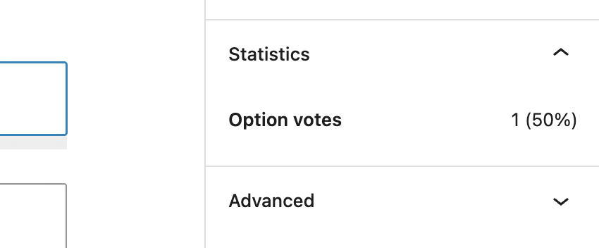
- After saving the changes to your post, the poll will show up in the article and allow users to answer. Their answer will be recorded and the number of each option selected will be shown in the Polls post type in the WordPress sidebar. Select the appropriate poll and click each answer to see its number of option votes and percentage in the sidebar.
Your users will also see their answer highlighted in the article after they make a selection and the percentage of users with the same answer will show next to the answer.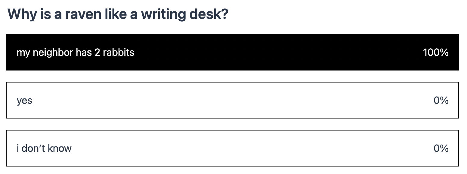
- When a poll is over, select the poll from the Polls post type in the WordPress sidebar, and then change the Poll Status in the sidebar to either Ended or Closed.
- Ended means that the poll is no longer receiving new answers but users can still see the poll on the website.
- Closed means that the poll is no longer visible on the website.
Quizzes
Quiz blocks add a wrapper around multiple poll questions and allow you to select a correct answer for each.
To add a quiz:
- Search “quiz” when adding a block in the post editor and select the Quiz block.
- Search for existing poll questions or add new poll questions with the same steps as adding a poll.
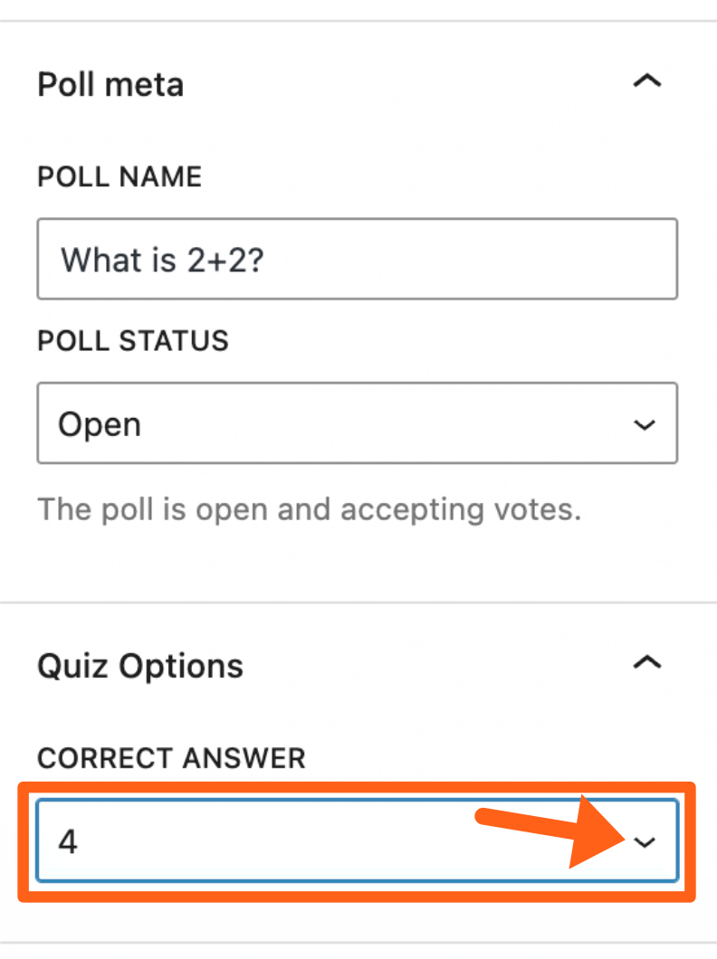
- Click on the poll question and then select a correct answer in the post editor sidebar.
- Use the plus sign button under the poll questions to add additional questions.
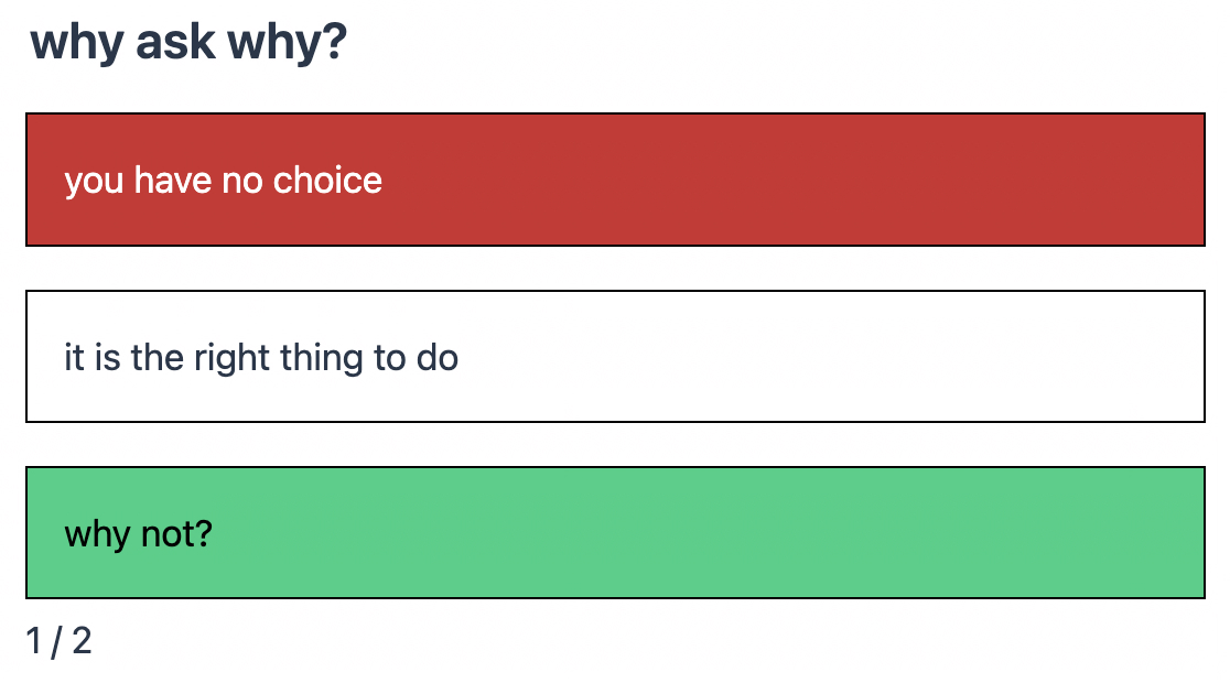
- Once you save the changes to your post your users will be able to answer the quiz questions in the article and see their results. If a question is answered correctly its answer will be highlighted in green. If it is answered incorrectly its answer will be highlighted in red and the correct answer will be highlighted in green as shown below. Users will also see the number of questions that they got right at the bottom of the quiz.
Developer Docs
Some available MediaPress customization options for developers are outlined below. We’ve also created a MediaPress starter theme for developers to use or review when making their own Newsroom themes.
MediaPress Starter Theme
The MediaPress Starter Theme provides a modern, media-focused design that seamlessly integrates with MediaPress plugins to deliver an exceptional user experience for content creators and consumers alike.
Download the MediaPress Starter Theme
Sample MediaPress Config Plugin
To customize some config options like the MediaPress Fields and Checklist, developers can add their own plugin with specific config files. To create your custom config plugin you can use this sample as a starting point and edit it based on the customization instructions below.
Download the sample MediaPress config plugin
Once you’ve customized the MediaPress config plugin you can install it on your Newsroom site to enable your changes.
Customize Meta Fields
The Fields under the MediaPress Meta tab can be edited and you can also add or remove fields.
To customize fields:
Step 1:
Download the sample MediaPress config plugin linked above.
Step 2:
Open the fields.json file in the config folder.
Step 3:
Review the 2 different groups of data in the JSON file. The groups are fields and fieldGroups.
Step 4:
Edit the "fields" section. You can edit the text for existing fields here, or to add a new field, copy one of the existing fields and add it to the fields list. Then update the copied field with the data for your new field.
The data for each field includes: name, type, label, description, and source like the example below of adding a field named “Custom Headline”:
    {
      "name": "custom_headline",
      "type": "text",
      "label": "Custom Headline",
      "description": "This is a custom headline used at the top of a post above the main post title.",
      "source": {
        "type": "postMeta",
        "key": "custom_headline",
        "registerFor": [
          "post"
        ]
      }
    },
"source" values:
- type: The supported values are
"postMeta","taxonomy","attribute", and"setting". - key: This value will be the name of the associated postMeta, taxonomy, attribute, or setting based on your
"type"value. If you’re registering a new post meta field like the above example, then you will choose a unique name that is not used by existing post meta fields. - registerFor: This is not needed if your
source.typeis"attribute". For the other source types:- postMeta: the name of the post types to register the meta for
- taxonomy: the name of the post types to register the taxonomies for
- setting: the name of the settings group to register the setting for
Step 5:
Edit the "fieldGroups" section. The fieldGroups section specifies the different tabs that show on the Meta panel of the post editor. You can rearrange, edit, and add tabs here. If you’ve added a new field to the "fields" section in Step 4, then you also need to add it here in the "fieldGroups" section for it to show up in the Meta tab of the post editor. Your new field should be added to the "fields" array of the desired tab.
Below is an example of the “Titles” tab with our example field custom_headline added to it:
    {
      "name": "titles",
      "label": "Titles",
      "fields": [
        "headline",
        "custom_headline",
        "short_headline",
        "standfirst",
        "excerpt"
      ],
      "context": {
        "type": "postType",
        "key": [
          "post"
        ]
      }
    },
Step 6:
Upload the plugin to your Newsroom site and activate it.
Step 7:
Toggle off the Use Demo Config option in the Fields tab under MediaPress in the WordPress sidebar. When the demo config is turned off, your new custom config will be applied.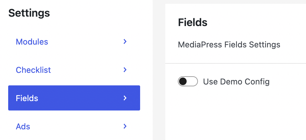
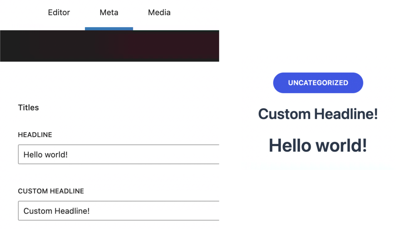
Step 8:
Navigate to the Meta tab within a post and confirm that your new custom field shows. In the below screenshot the new Custom Headline field shows below the Headline field.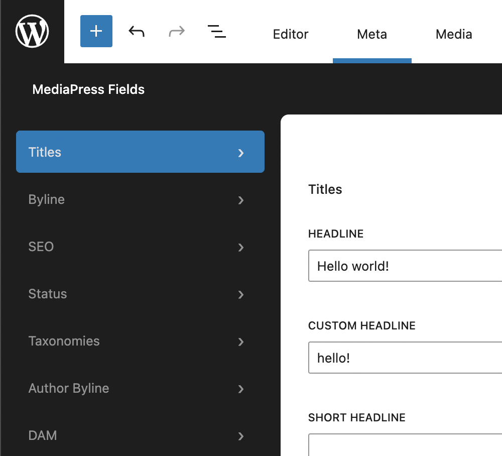
Customize the Checklist
The MediaPress Checklist can be edited and you can also add or remove items from the list.
Step 1:
Download the sample MediaPress config plugin linked above.
Step 2:
Open the checklist.json file in the config folder.
Step 3:
Add or edit checklist items. To add a new checklist item, copy one of the existing checklist items and add it to the "items" list. Then update the copied item with the data for your new checklist item.
Below is an example of adding a new checklist item for the custom_headline field that we added in the previous section:
    {
      "name": "has_custom_headline",
      "title": "Has a custom headline",
      "type": "blocking",
      "check": {
        "type": "exists",
        "sourceKey": "meta.custom_headline"
      },
      "messages": {
        "pass": "Has a Custom Headline",
        "fail": "Custom Headline is missing"
      },
      "postTypes": [
        "post"
      ]
    },
The "type" options include "blocking" or "non_blocking".
"blocking" makes it a required field to save or publish, and "non_blocking" makes it a recommended field and just shows a warning in the checklist.
The "check" types let you validate your field. The most common is the "exists" type which just validates that some value is present for the field. Another check.type option is the "range" type which validates min and max length for a field.
Below is an example of adding a checklist item with the "range" check type, to validate the character length of the seo_headline field.
    {
      "name": "seo_headline_length",
      "title": "SEO Headline has between 50-70 characters",
      "type": "non_blocking",
      "check": {
        "type": "range",
        "min": 50,
        "max": 70,
        "sourceKey": "meta.seo_headline"
      },
      "messages": {
        "pass": "SEO Headline is between 50-70 characters",
        "fail": "SEO Headline should be between 50-70 characters"
      },
      "postTypes": [
        "post"
      ]
    },
Step 4:
Upload the plugin to your Newsroom site and activate it.
Step 5:
Toggle off the Use Demo Config option of the Checklist tab under MediaPress in the WordPress sidebar. Once the demo config is turned off, your new checklist config will be enabled.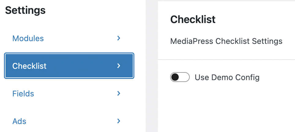
Step 6:
Navigate to a post and click the checklist icon in the top right to confirm that your new checklist item is present. Your checklist item will only show in the list if the validation for the field is still pending for the current post. You can also check the Checklist meta box in the Post tab of the editor sidebar as pictured below. This is a better place to validate your checklist item because it shows both items that have and have not been validated for the post.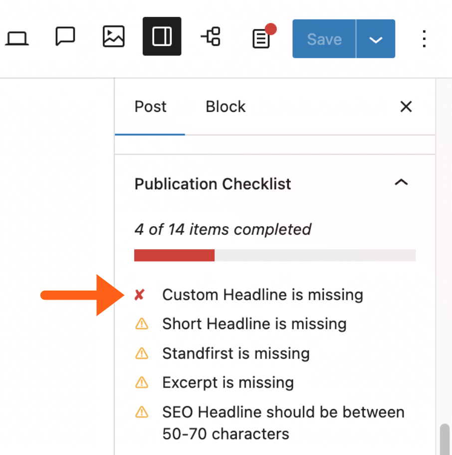
Add a Post Meta Field to a Page Template
When creating or updating a page template you may want to add one of your MediaPress post meta fields within the template.
In WordPress versions 6.7 and higher, there is a new block bindings UI for certain blocks that makes this easy.
Step 1:
Open the appropriate template under Appearance > Editor > Templates and add a compatible block like a paragraph or heading block. Choosing between a paragraph or different heading sizes will help you to control the font size of the field.
Step 2:
Open the Attributes section for the block in the editor sidebar, and then select Content.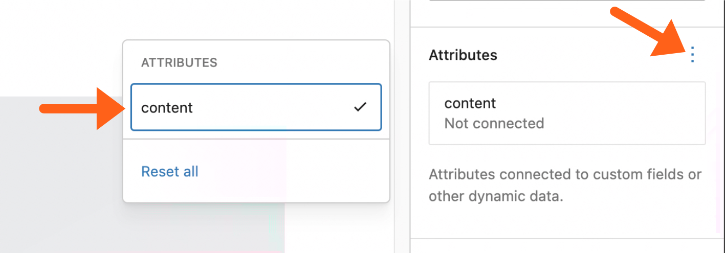
Step 3:
Click Content again under the Attributes label. Then hover over Post Meta and select your field from the list to bind its value to the block.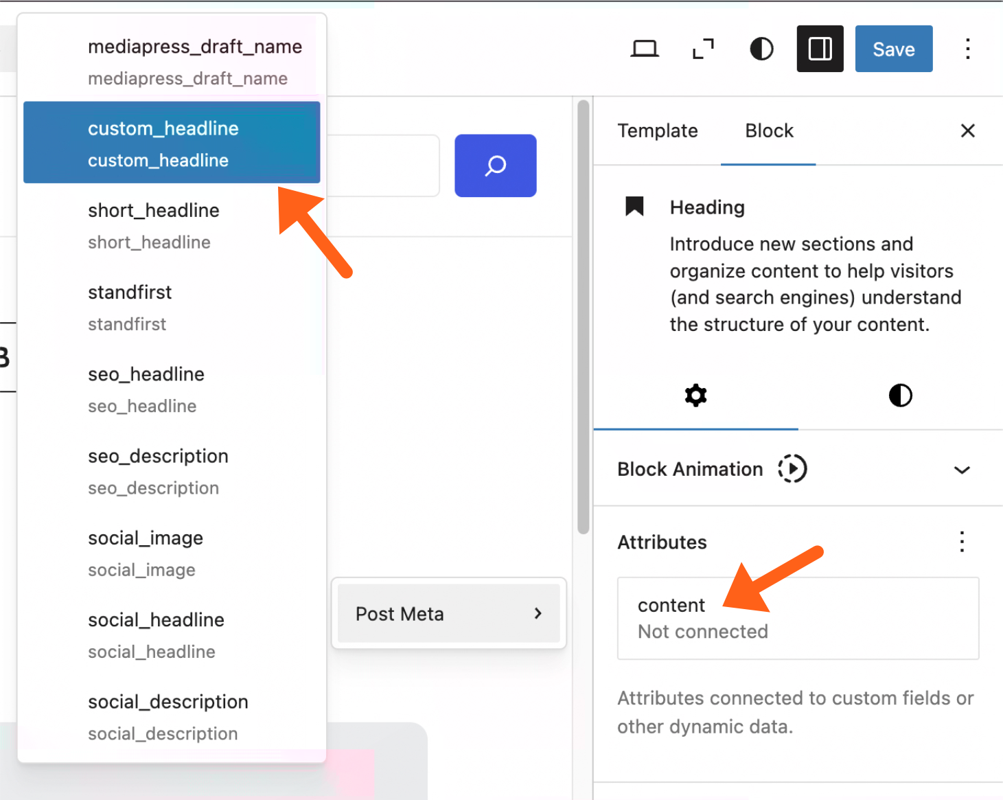
Step 4:
Save your changes to the template. Now you should see the field showing in your page template, and the value should update when a user changes the field in the MediaPress Meta tab.