Key Takeaways
A great website can win clients quickly. Your website is your virtual storefront, influencing client decisions.
Top freelancers showcase key elements on their sites. Unique value propositions, past projects, and clear calls-to-action are crucial.
Specialization enhances client attraction. Highlighting your specialty makes you more appealing to potential clients.
Clear, clutter-free design is impactful. Simple, efficient websites like Matt Olpinski’s can be highly effective for freelancers.
A great website can win you clients as quickly as a poor website can lose ’em. The virtual equivalent of a storefront, your website presents a brand and a service that are distinctly and uniquely yours, and can affect whether a client wants to work with you or not.
But as a freelancer, how do you create a great website that wins you clients? We’ve gathered a list of top freelancers who make great use of their respective sites.
Here are 15 inspiring examples of freelance business websites to help you start thinking about your own site.
“Bourn Creative” by Jennifer and Brian Bourn
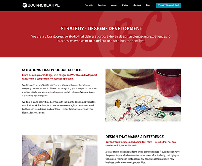
Technically a creative studio rather than a freelance site, Jennifer and Brian Bourn’s “Bourn Creative” has all the hallmarks of what makes a website attractive to clients. Unique value proposition (“We take a stand against mediocre results”), check. A prominent display of past projects, check. A strong, clear call-to-action, check. If you’re just making a freelance site, this one serves well as a guide.
Carrie Dils
If you’re searching for what a standard freelancer’s site should look like, take a peak at Carrie Dils’. Nestled beneath a bold headline is a short explanation of her experience, which builds rapport with potential clients right from the jump. And when clients are familiar and ready, she has her list of services linked and ready for clicking.
“Double Your Freelancing” by Brennan Dunn
Brennan Dunn is determined to help freelancers double their income. Incredibly self-aware, Brennan’s homepage is built to get freelancers to sign up to his free email course that includes his famous roadmapping strategy.
“Goins, Writer” by Jeff Goins
Jeff Goins’ “Goins, Writer” is a renowned blog on the craft of writing. Darren Rowse, CEO of Copyblogger Media, even said of his work: “Great copy connects at an emotional level, and Jeff writes from the heart.” His homepage opens with a heartfelt appeal to writers, begging them to ditch boring copy for something more profound.
Kaleigh Moore
“What’s your specialty?” If you’re being asked this question, it means you haven’t positioned yourself that well. At least not as well as Kaleigh Moore does in her website, which features a headline dedicated to that. You can imagine how attractive and convenient this is to clients.
Matt Olpinski
“Take your freelancing career to the next level.” That value prop sits at the header of Matt Olpinski’s site: bold, loud, and attention-grabbing. Reinforcing this premise is an impressive list of articles, which is presented in a gorgeous grid. As freelancer’s sites go, Matt’s makes a great example: clean, no-frills, and efficient.
Melanie Daveid
Designer websites, more than anything, exhibit the designer’s skill. And Melanie Daveid’s website does a great job of that. The site immediately opens with some of her most eye-catching designs, and two simple clickables—Work and About—complete her navigation.
“Next Draft” by Dave Pell
Dave Pell is a prolific writer. And I mean that to the extreme. Dave curates and annotates news every day, for which his site “Next Draft” provides a lovely home. This exhibits his skill as wordsmith, further reinforced by the dozens of testimonials posted on his homepage.
“Punchline Copy” by Lianna Patch
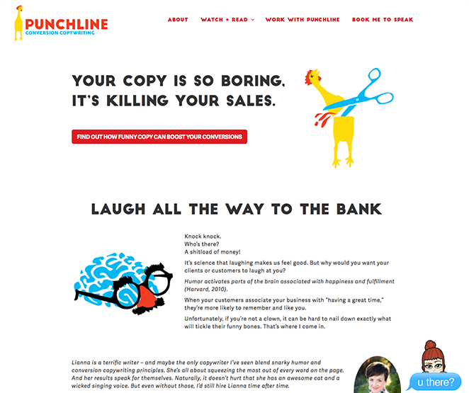
Lianna Patch’s approach to copy is less serious than most, and her website embraces this. Dubbed “Punchline Conversion Copywriting,” Lianna’s site is bright, colorful, yet clean. And if you think a rubber chicken isn’t a good mascot for a copywriting professional, Lianna uses it to great effect, making her brand stand out while weeding out campaigns that aren’t fit with her style.
Ryan Robinson
Ryan Robinson practices what he preaches. His homepage is decidedly clutter-free, adorned with a smiling headshot and simple copy, including one headline that gets right to the point: “No tricks. No hacks. No bullshit.”
Sean J Klassen
Sometimes simple is better. Such is the case with Sean J. Klassen’s website, which makes use of a unique, single-page layout. You’ll find his email and social media links conveniently placed at the top, with a succinct description of his role below. Talk about easy navigation!
“Social Triggers” by Derek Halpern
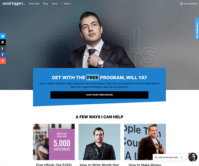
Derek Halpern sets out to do one thing with “Social Triggers”: to provide value. His site’s design supports this, dedicating a whole block that showcases three ways he can help his readers.
“The Story Of Telling” by Bernadette Jiwa
Bernadette Jiwa follows a different principle than her more aggressive contemporaries. “Story is our most persuasive technology. We should use it for good,” says the headline sitting atop the page, “The Story of Telling.” A generous branding expert herself, Bernadette optimizes her site presenting an approach that’s uniquely hers, from the color scheme and typography to the overall design of her site.
“UI Breakfast” by Jane Portman
As an expert in UI, Jane Portman’s site is clean, concise, and completely free of clutter. She should know, being the one behind the valued design resource, “The UI Audit.” Her site, “UI Breakfast,” greets you with a clear value proposition coupled with razor-sharp copy that ushers you to her products and services.
“Creative Revolt” by Jorden Roper
Jorden Roper’s site, “Creative Revolt,” perfectly surmises her brand as a creative professional. The intention is to communicate clearly that Jorden is different, a feat that her site does a very good job of. From the color scheme to the overall site design to the inclusion of her own photograph, “Creative Revolt” means different but serious business.
We hope you enjoyed this list of inspiring examples of freelance business websites! As you might have picked up, the design choices among these websites aren’t arbitrary. They are applied in line with the freelancer’s individual goals, be it booking more business or converting readers into subscribers—a key thought to keep in mind when building your own website!
And when you do build that site, make sure you build with WP Engine for the best possible WordPress hosting experience!


